
![]()
| Founded | June 6, 1925 |
| Founder | Walter Chrysler |
| Headquarters | Auburn Hills, Michigan, United States |
| Parent | Chrysler (formally, FCA US LLC) Divisions Dodge, Jeep, Ram, SRT |
| Owner | Fiat Chrysler Automobiles |
| Official Site | www.chrysler.com |
| Official Facebook Page | www.facebook.com/Chrysler |
Chrysler is one of the legendary American car brands, which was established in 1925 and named after its founder, Walter Chrysler. The company was one of the Big Three American automaking corporations, and today it is owned by Stellantis, an international auto-manufacturing group.
Meaning and History
![]()
The Chrysler Corporation appeared in 1925 as a successor of the Maxwell Motor firm. Over time, the corporation became one of the top three car manufacturers.
The merging with the company Daimler– Benz became momentous for it.
The Chrysler logo saw uncountable changes over its history. However, it is still one of the most well- known, exquisite and instantly distinctive car logos.
1924 – 1928
![]()
The primary edition of the Chrysler logo represented a graphical depiction of a wax stamp with a band on its lower right. Very soon it was removed from most of the Chrysler cars, though it was left on some Windsor models.
1928 – 1930
![]()
The redesign of 1928 switched the golden color palette of the Chrysler logo to the silver one and added two ornate wings to the top left part of the medallion. The wings were arched and had their ends pointed, looking very elegant and at the same time strong, and evoking a sense of speed and freedom. This version of the logo stayed active for two years.
1930 – 1936
![]()
In 1939 the Chrysler badge was changed again, coming back to the original version in gold and red with the wings removed. Another thing about the new logo was in the style — the initial version was voluminous and glossy, and the new one was drawn flatly and with the shades slightly muted.
1936 – 1950
![]()
In 1936 the predecessor of the logo, which becomes iconic in the 1990s, was introduced. It was the same wax seal in gold, placed on the thin horizontally stretched silver banner with the ends sharpened, resembling two stylized wings. This badge stayed with the automaker for more than a decade.
1950 – 1951
![]()
The redesign of 1950 created a crest, which was more associated with the French Peugeot company, as it was a logo in a shape of a shield with a lion rampant on it, standing on the right from a narrowed red crest with three rows of silver elements. This badge has only stayed with Chrysler for several months.
1951 – 1955
![]()
In 1951 the Chrysler badge was completely changed and for a few years, the company had been using a three-dimensional stylized bird in glossy silver, which had no lettering or decorative elements in other colors on it. It was a very elegant clan chic emblem, which showed the luxury side of the brand.
1955 – 1962
![]()
The redesign of 1955 has introduced a completely different Chrysler logo, set in a minimalistic style with just two elements on the badge. It was an image with two overlapping tick-style birds, placed horizontally and facing to the right. The red one was smoother and had its bars spread wide, while the black one, which was overlapping it, was thinner, sharper, and had longer bars.
1962 – 1980
![]()
In 1962 the abstract red and black logo got replaced by the iconic Chrysler Penta-star in blue and white. It was a light blue pentagon, with the peak pointing up, formed by five solid triangles, which crested a white five-pointed star in the negative space. The emblem was accompanied by the bold black uppercase logotype in a modern sans-serif typeface.
1980 – 1990
![]()
The redesign of 1980 brought minimalism and confidence to the Chrysler badge, which was now composed of only black lettering, set in the uppercase of a futuristic geometric sans-serif font with heavy characters and horizontally-extended contours. This version of the visual identity has stayed with the automaker for almost ten years.
1990 – 1993
![]()
The redesign of 1990 has created a modernized version of the emblem from 1936, and placed it under the bold uppercase logotype in a massive geometric sans-serif font, which looked more stable and traditional than the typeface, used in the previous version of the logo, even though, had some common things in the mood and character.
1993 – 1995
![]()
The logo was changed a few decades later, in 1993. It was created by Oliver Clark, who wanted to express prestige and excellence of the brand, the emblem became an allegorical representation of the state awards.
1995 – 1998
![]()
The redesign of 1995 has introduced a modern and minimalistic logo of the American manufacturer. It was bold black lettering set on a transparent background and executed in a custom sans-serif typeface with futuristic shapes and open colors of come letters. There were no additional elements or colors on this version of the badge, which only stayed active for three years.
1998 – 2000
![]()
The redesign of 1998 has used the original Chrysler seal in its composition again. It was now placed on a modern silver badge with two wings elongated to the sides. The narrow extended emblem was underlining the black uppercase logotype, set in a modern sans-serif typeface with straight cuts and sharp angles of the letters’ bars.
2000 – 2008
![]()
The Chrysler logo, used by the brand in the 2000s, featured an enlarged uppercase logotype in a bold geometric sans-serif font, placed on the right from a small emblem, depicting a Pentastar, which was composed of five silver triangles, placed in a pentagonal shape, and forming a thin sharp star in the center.
2008 – 2009
![]()
The redesign of 2008 has enlarged the Pentastar emblem and placed it above the logotype, keeping the typeface and the color palette from the previous badge. In the new composition the badge looked more balanced and professional, and despite that, this badge has only stayed with the company for several months.
2009 – 2023
![]()
Chrysler also brought in a few other concepts in the coming years, most of them showing thunderstones, “Z”s, which were said to be giving honor to the prototype car produced before Chrysler’s purchase of Maxwell, making a reference to the last name, “Zeder,” of the chief engineer Fred Zeder. The trademark experimented with stylized “blazons” from 1955 to the beginning of the 1980s. Some emblems depicting lions were shown from the 1955th to 1961 since some of the Chrysler engines were given names like “Golden Lion 413”.
The company brought in “modernistic” logos from the beginning of the 1980s. The “stamp” logo was restored at the beginning of the 1990s following the “second birth” of Chrysler. Initially implemented as a circle, the logo was eventually placed in “wings.” When Cerberus Capital Management was included in the Chrysler Group, the traditional pentastar was given a new life as the official corporate distinctive feature.
2023 – now
![]()
The redesign of 2023 has created a very laconic and progressive version of the Chrysler logo, using only thin flat lines in black, and minimizing the decorative elements. The new badge is composed of a medium-weight sans-serif inscription placed above the emblem drawn in just two lines, but repeating the shape of the o sonic winged emblem of Chrysler.
Font
The bold and stable Chrysler logotype, set in the uppercase, looks very brutal and professional., evoking a sense of confidence and reliability. Although the inscription of the American car brand’s logo is set in the custom typeface, it looks pretty close to such fonts as Joyride Wide and Vast XXXLBold.
Symbol
Looking at the history of the Chrysler make on one side, we see a pentagon and on the other side – wings. The pentagon is the most symbolic logo of the Chrysler Company. The problem is that the pentagon became obsolete, as it is usual and unattractive. If one speaks of wings Chrysler, what is their difference from wings of other brands? In his re-branding, its author, Gavin Potenz, created the abstract star with internal structure, which symbolizes accuracy and mastery. The essence of the new logo reflects dynamism and modernity of the company. Four vertices of this star symbolize four cars, which began the new era of the Chrysler renaissance. The arrows from the center indicate the importance of development and new directions.
Colors
![]()
The colors of the logo are a steel and a vivid blue. Brilliant steel color means flight of the fantasy above the daily reality. The blue one looks like an accent in the middle of the logo. It symbolizes hopes and purposeful aspirations to dreams, which are seen in the horizon of sad day-to-day reality.
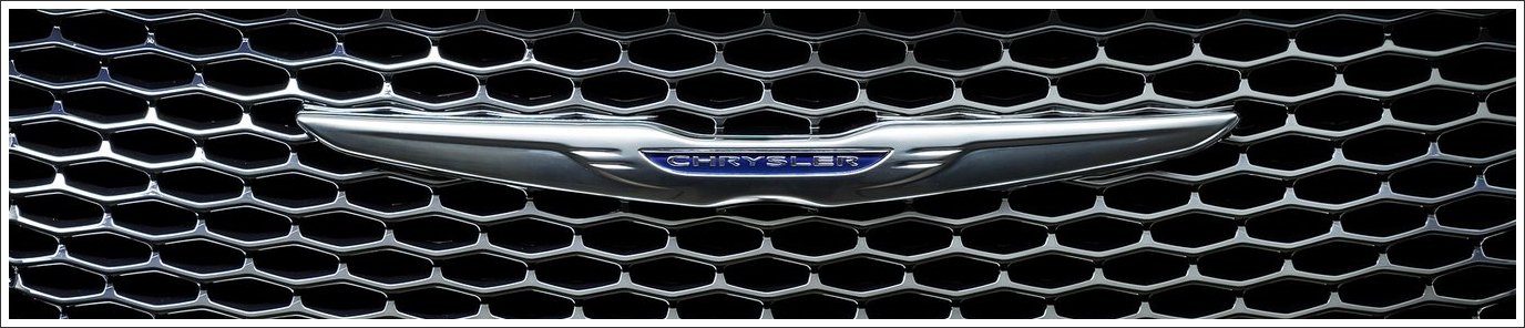
Emblem
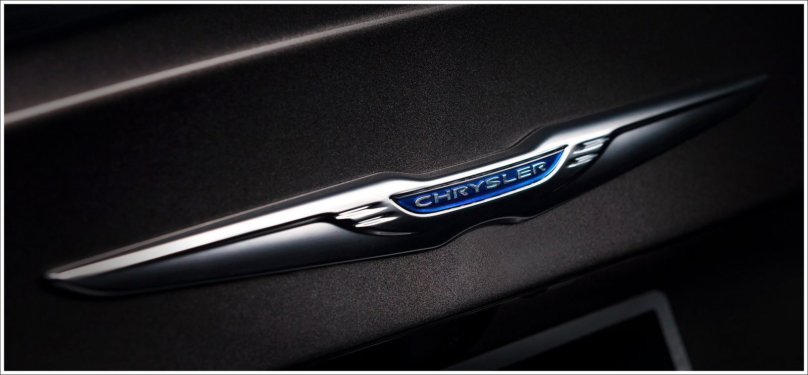
The new emblem retained the predecessor’s organic styles, but both «wings» began more modern, the name of the company is placed between them. The management of Chrysler timed this new emblem to the announcement of the new five-year product and financial plan, where for the most part all car maker’s efforts were aimed at reinforcement of positions of the brand.
What are the plans of the company for future?
The company has a plan of a full-sized crossover for 2017, and the production of a compact SUV and the next generation of 300C are planned for 2018. Sales growth is also expected.
![]()