
![]()
| Predecessor | Fargo Trucks |
| Founded | 2010 |
| Headquarters | Auburn Hills, Michigan, United States |
| Owner | Fiat Chrysler Automobiles |
| Parent | Chrysler |
| Official Site | www.ramtrucks.com |
The iconic Ram logo evolved from the ram’s head hood ornament that made its debut in the late 1920s. However, it had not become the brand’s standard badge until 1993. Originally, the logo belonged to the Ram Truck’s parent brand Dodge.
Meaning and history
![]()
According to a company legend, the ram head was first used as the brand’s symbol in the late 1920s. It was developed by one of the prominent American sculptors of the previous century, Avard Tennyson Fairbanks. Some of his most popular sculptures can be seen in the United States Capitol. He was also the author of “the Flying Lady” (“Floating Power”) radiator caps for Chrysler.
As Fairbanks recalled, once engineers from Dodge invited him to a meeting, where they told they needed hood ornaments for 10 thousand new vehicles. The engineers explained the design should be as appealing as that of the Rolls Royce hood ornament, yet go well with a vehicle that costs much less.
The first stage of developing the ornament took several days. At this point, Fairbanks created sculptures of several animals, from a tiger to a jaguar, using an animal book by William Hornaday as a guide. The idea to make a ram sculpture was not among the first thoughts to cross his mind. However, as Fairbanks was working on the ornament, he thought of new arguments in favor of this animal.
When he showed the sculpture to the Dodge engineers, they agreed that, as the King of the Trail, ram is a great choice. However, Walter Chrysler was hesitant about it. So, the sculptor asked, “What word would cross your mind if you saw a ram in the mountains?” “Dodge!” seemed a perfect answer. As Chrysler realized the symbolic potential of the ram sculpture, he grew enthusiastic about it.
One of the additional reasons for the choice could be the fact that ram, as the symbol of Aries, also has a variety of positive connotations, including force and authority.
1914 – 1969
![]()
The very first Ram logo was created in 1914 and featured a bold uppercase “Dodge Trucks” lettering in a custom rounded sans-serif typeface, which looked very friendly and welcoming, despite the heaviness of the characters and a strict minimalistic black-and-white color palette.
1969 – 1993
![]()
The redesign of 1969 made the badge of the automaker more complicated. It was now a solid black square with a wide white banner crossing it horizontally in the center. The too part of the logo featured a white Chrysler Pentastar emblem when the white “Dodge Trucks” inscription was written along the bottom black fragment in a narrowed italicized font. As for the white stripe in the center, it comprised a bold title case Dodge logotype in a corporate style.
1993 – 2009
![]()
The name Ram was officially adopted in 1993, and the new logo was created in the same year. The new design concept was built around a white geometric crest with a stylized image of the ram’s head set in red lines against a white background. The crest was accompanied by an extra-bold capitalized logotype in a modern sans-serif font, written under it in thick red lines.
2009 – 2023
![]()
The redesign of 2009 has changed the color palette of the Ram visual identity to black, gray and white, keeping the concept of the previous badge, but strengthening it. The Ram was now set in gray gradients over a solid black background of a crest, outlined in silver, with the bold Ram wordmark set under the emblem in the same geometric font as on the previous badge.
2023 – now
![]()
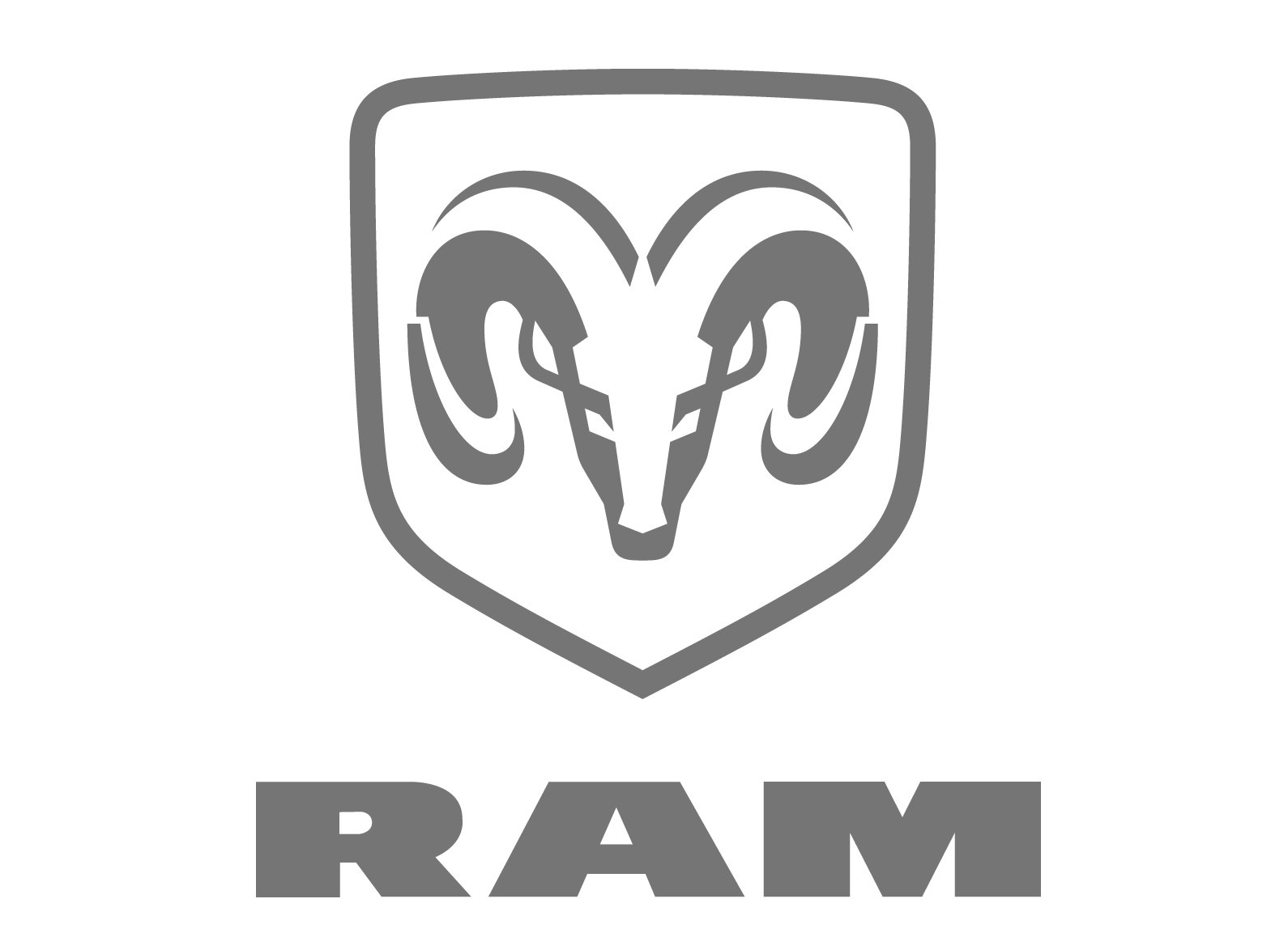
The brand presented probably one of its most stylish and striking logos thus far. It was just three letters forming the word “RAM”. The designers used a very geometric font with straight strokes and sharp, pointed cuts. It was just as daring and bold as the ram head seen in previous versions. One of the unique features of this logo was the use of one continuous line to write all the letters.
Font
The heavy and stable sans-serif lettering from the primary Ram badge is set in a modern geometric sans-serif typeface with very thick lines and straight cuts if the bars. The closest fonts to the one, used in this insignia, are Vast XXXL Black and Marsden Wide Super, but with some contours modified.
Predecessors of the head symbol
We should definitely point out that although the ram head was introduced rather early in the company’s history, originally it was just the hood ornament and was not used as the logo. Throughout the following several decades, Dodge went through a succession of logotypes, from a 6-pointed star and a deltoid logo to the iconic Chrysler Pentastar.
Earliest versions of the emblem
In the late 1980s, when Dodge started reviving its truck range, the company designers decided to make use of the sculpture designed by Fairbanks. It seemed a perfect way to emphasize such characteristics of the brand as power and aggressiveness.
It was then that the name Dodge RAM trucks appeared. However, at the time hood ornaments looked dated, so the company created a badge on this base. The badge could be seen on most Dodge trucks launched between 1993 and 2010.

And what about the RAM logo itself? Unlike the earliest version, it includes only the animal’s head. It has still preserved the appealing sculptural quality that links it to the original hood ornament created by Fairbanks.
Ram truck logo
![]()
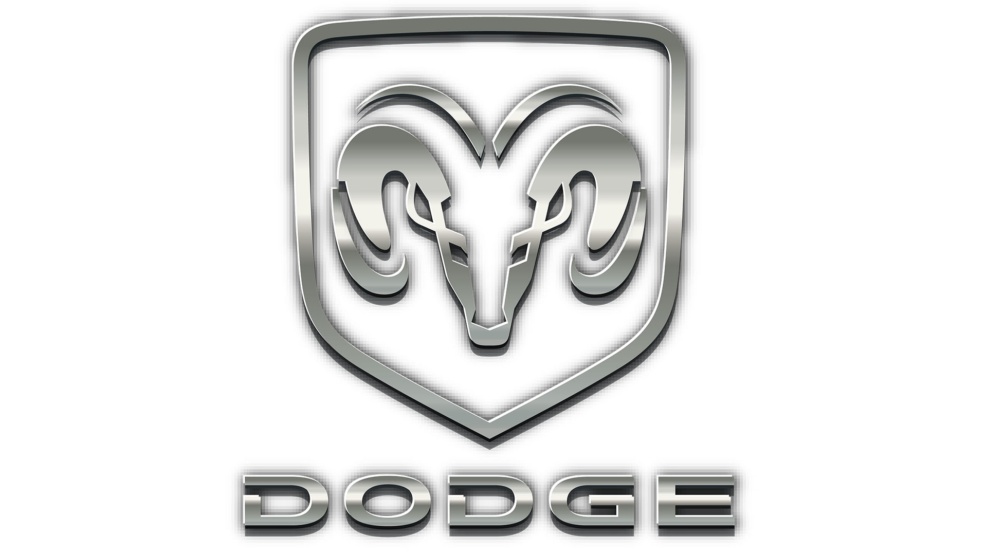
When Fiat purchased Chrysler in 2009, RAM was turned into a separate brand. It used the original Ram truck logo, while the Dodge brand got a completely new logotype. The minimalistic text-based Dodge badge with two hash marks was created by the Wieden & Kennedy ad agency.
Color
![]()
In addition to black and white, the dominant colors on the Ram truck logo, it includes various shades of grey. The dark and light metallic colors help to create a 3D effect.