
![]()
| Predecessor | Henry Ford Company |
| Founded | Aug 22, 1902 |
| Founder | Henry M. Leland William Murphy Lemuel Bowen |
| Headquarters | New York City, New York, United States |
| Owner | General Motors |
| Official Site | www.cadillac.com |
| Official Facebook Page | www.facebook.com/cadillac |
Cadillac is the name of a legendary American automaking band, which was established in 1902, and is considered to be one of the oldest car brands in the United States. Today the brand is owned by the General Motors Company.
Meaning and History
![]()
In 1902, Cadillac owed its appearance to the engineer Henry Liland and the businessman William Murphy.
The company received its name in honor of the ancestor of Henry – Le Sieur Antoine De La Mothe Cadillac – of the French administrator and military leader who founded Detroit in 1701. The family crest of Cadillac became the base of the old Cadillac logo. It looked like a blazon framed by a wreath. In 2014, the Cadillac Company officially introduced the new logo. It lost laurel wreaths adorning the coat of arms.
The one-cylinder A model, which appeared at the exhibition in New York in 1903, was the first car of the make Cadillac, but only the D model, which appeared in 1905, have already been fit with a 4 cylinders’ engine, earned real prominence of the company. The company also assembled the first in the history car with a fully closed bodywork of a coupe.
In 1909, Cadillac was bought by Billy Durant, the founder of General Motors. But the control over the company was retained behind Liland. In the same year, the production of one more model Cadillac 30 began. It remained in production for 6 years. In 1912, the first in the world electric starter was installed on this car.
In 1915, Cadillac 51 with the first in the world mass automotive production of the 8-cylinder engine of the V-like form, appeared in the line of company’s cars. Its later model created in 1949 established a standard for all the American automobile industry.
From the very beginning of its existence, the Cadillac Company considered making its cars as symbols of luxury, elegance, but at the same time, they had to be reliable and technological.
Cadillac LaSalle is the 1927 model. It was the first work of Harley Earl’s GM, which founded an art-designer section. The radiator grille, which is a hallmark of Cadillac cars, appeared exactly at it.
Cadillac 60 Special, produced in 1938, showed presentable appearance and for the first time was among the models of the make focused on pleasure from driving.
In the model of Cadillac DeVille, which was made in 1948, there were a lot of new design elements such as fins, the panoramic windscreen, a pile of chrome and stainless steel outside, as well as inside the car.
Cadillac Eldorado Brougham, the model of the 1953, became the first completely new executive car since times of the war. It became an embodiment of an «airplane» style so popular in America of the 50s.
In 1967, Cadillac Eldorado appeared – the first front wheel drive car of American production.
Cadillac Seville, the model of 1975, was the first relatively compact Cadillac of a European level.
Cadillac CTS is a model being produced since 2002. The hatchback possessed completely new design, to which now all the modern models of the company adhere.
1902 – 1905
![]()
The original Cadillac badge was introduced in 1902, with the launch of the company. The logo, which has become iconic by today, was initially based on the coat of arms of Le Sieur Antoine de la Mothe Cadillac, a person, who founded Detroit city. The crest, divided into four segments, depicts the birds, and merlettes, which are drawn in two groups of three, symbolizing the Holy Trinity. The crest on the very first Cadillac logo was enclosed into a rounded framed and accompanied by the name of the company written on top, and the “La Mothe Cadillac” tagline arched under the shied, inside the frame of the badge.
1905 – 1906
![]()
The redesign of 1905 has made the Cadillac badge rounded, and enclosed it into a black ornate frame with vignetted and curves. The roundel was decorated by an enlarged crown with nine peaks and spheres on their ends, and enclosed into a circular frame.
1906 – 1908
![]()
The original shape of the Cadillac logo came back in 1906, with the crest in black, and all the drawings in white. The shield was set on a transparent background and enclosed into a rounded wreath frame, with the “La Mother Cadillac” tagline arched under the crest in light sans-serif capitals. The lightweight contoured crown now had only seven peaks.
1908 – 1914
![]()
The crown was redrawn with nine peaks again in 1908, and the crest was redrawn and refined. It was now set on a plain white roundel and accompanied by the name of the company, arched above it, and the new “Standard of the World” tagline — under it. The lettering was set in bold uppercase of a fancy serif font.
1914 – 1915
![]()
For only one year in 1914, the American automaker has been using a badge with the horizontally oriented oval, a diagonally set cursive lettering, and the bold white “1914” addition, set on its bottom right part.
1915 – 1920
![]()
The traditional crest was brought back to the primary Cadillac bag in 1915. It was set on a white circular medallion, decorated with a fancy crown on top. The roundel was accompanied by two ornate leafy elements on the sides, which could also be seen as the wings, so often used on the logos of the automaking companies.
1920 – 1925
![]()
The Cadillac badge was refined and redrawn in a more minimalistic way in 1920. All the additional elements were removed from the bag, and now the crest was set on a roundel in a clean circular frame with a thin striped pattern. The crown was redrawn more geometrically, with only seven peaks and clean white circles on their tops.
1925 – 1926
![]()
The Cadillac roundel with the crest in the center was placed on a flat silver octagon in 1925. Inside the circle, the shield was accompanied by the “Cadillac” lettering on top, and the company’s motto, “Standard of the World”, at the bottom. This version of the logo was only used by the company for a year.
1926 – 1930
![]()
In 1926 the Cadillac crest was redrawn in a smaller size, and placed on another shield with the widened and sharpened upper border, and the triangular bottom part, pointing down. It was a very edgy and sleek badge, which represented the brand as a progressive and luxurious one.
1930 – 1932
![]()
All the additional elements were removed from the Cadillac logo in 1930, and the fancy traditional crest with the crown on top became the only star of the badge. The crest was wide and had its bottom part arched and softened, with the small sharp triangular element in the center.
1932 – 1933
![]()
The redesign of 1932 introduced a new design concept for the Cadillac visual identity. The crest, which was redrawn more geometrically and strictly, was placed on a solid black roundel in a triple silver outline, accompanied by two elongated silver wings, coming from it to the sides.
1933 – 1939
![]()
The roundel was removed from the Cadillac badge in 1933, and the cleaned and refined geometric wings were now coming out of the straight and distinct sides of the geometrically drawn iconic crest. It was a very modern and strong badge, which stayed with the American automaker for another six years.
1939 – 1942
![]()
The wings were removed from the Cadillac badge in 1939, and now the colorful crests placed the top part of a thin vertically oriented triangle, pointing down. The triangle was set in gold, with a thick glossy framing and a textured pattern of the body. The white and gold crown on the top of the Cadillac crest was coming out of the top border of the triangle.
1942 – 1947
![]()
The wings came back to the badge in 1942 but were now directed up, executed in silver metallic, and coming out of a red horizontally extended element, on white the iconic Cadillac crest was set. The crest was all gold, while all the surrounding elements featured cold silver shades.
1947 – 1949
![]()
With the redesign of 1947, the Cadillac crest gets placed on a triangle pointing down again, This time the whole composition is set in a dark silver color palette, with the sharp element at the bottom of the badge being three-dimensional and edgy. The main body of the new element has its surface decorated with contrasting horizontal lines.
1949 – 1952
![]()
In 1949 the triangle was replaced by the tick, extended horizontally, and placed under the widened Cadillac crest. Both elements were now set in a glossy gold color palette, with the tick executed in extra-bold three-dimensional lines. That was a very fancy logo, which showed the automaker as an expert in the production of high-end cars.
1952 – 1953
![]()
For the 50th anniversary of the Cadillac brand, the new logo was introduced in 1952. It was the badge, designed in 1949. Placed on a flat roundel, with the “1902 — 1952” datemark on the sides, and the “Golden Anniversary” tagline arched under the golden tick, complementing the iconic Cadillac crest.
1953 – 1956
![]()
The composition of the Cadillac logo gets simplified to just one crest in 1953. The crest gets horizontally extended, with its borrow part and the sides of the top line sharpened. The crown with seven peaks was stretched too and has seven glossy white circles on the ends.
1956 – 1960
![]()
With the redesign of 1956, the Cadillac crest gets extended horizontally even more and is again underlined by a gold voluminous tick, with its sides stretched too. The crest keeps the structure and color palette of the previous version, but due to the extension, it looks more flat and smooth.
1960 – 1963
![]()
The tick was gone and the crest turned silver in 1960. Now the iconic Cadillac shield was repeating the shape of the tick itself, with the triangular part pointing down and the top line extended and sharpened to the sides. It was a sleek and progressive badge, showing the company as a modern and innovative one.
1963 – 1964
![]()
The colorful Cadillac crest in its traditional square shape with the pointed bottom was set on a thick vertical line in silver, coming out of the rounded leafy wreath, which Ade up a circular frame for the Cadillac logo. This badge only stayed in use for a few months but became a basis for several more redesigns.
1964 – 1965
![]()
For another year, starting in 1964, the American automaker has been using a very minimalistic version of the logo, with the iconic crest executed in silver. The three-dimensional shield was the only element of the badge, and had no additional lettering, framing, or underlining.
1965 – 1971
![]()
The redesign of 1965 Brough back the colorful Cadillac crest and the golden tick, which was now enlarged compared to the small size of the refined shield. The tick got more triangular, with its bars spread more upwards, than before. The golden shades of the badge gained some darker, green gradients.
1971 – 1980
![]()
In 1971 the Cadillac logo became vertically oriented, with the crest set at the bottom of the new composition. Two stylized geometric wings were coming up from the crest, drawn in straight smooth lines and merging into one element. The badge was set in a silver color palette.
1980 – 1985
![]()
In 1980 the birds were removed from the Cadillac crest, and now the whole surface of the iconic shield was formed by rectangles of different sizes, set in gold, black and red colors, with silver outlines. The new abstract crest was set on a transparent background and enclosed into a circular leafy wreath frame, also in silver.
1985 – 1995
![]()
The concept remained the same, but the color palette of the Cadillac logo was switched from silver to gold after the redesign in 1985. The contours of all elements were refined, with the wreath getting more detailed and elegant. The shade of red on the crest became pinker, which created a lively palette and contrast with the dark gold shade.
1995 – 2000
![]()
The Cadillac logo was redrawn flatly and brightly in 1995. The crown above the crest got nine peaks again. The birds can back to the composition, and the wreath was redrawn in light gray, very airy and fresh. The new badge was accompanied by the “Cadillac” lettering in a fancy cursive font, with the title case characters set in solid blue color.
2000 – 2009
![]()
The redesign of 2000 has removed the lettering from the primary version of the Cadillac badge, and made the crest and framing three-dimensional again. The silver color palette was bright back to the badge, and the birds, on the contrary — were erased. The geometric pattern on the crest was set in black, yellow, and red rectangles, with the silver and blue separation element, composed of four rectangles, set diagonally.
2009 – 2014
![]()
The colors of the Cadillac badge got intensified and darkened in 2009, with more volume added to the composition and more gloss — to all the silver elements. All contours and lines of the logo were refined and strengthened. The new badge stayed with the company for almost five years.
2014 – 2021
![]()
The leafy framing was removed from the Cadillac logo in 2014, and the lettering was brought back to the bottom of the badge. The crest was refined and extended, and the inscription was now set in Black, which was balanced by some black shades on the body of the Cadillac shield.
2021 – now
![]()
The redesign of 2021 has introduced the most minimalistic badge of the American luxury automaker ever created. The new concept is built solely on the iconic Cadillac crest, which is drawn in s flat black-and-white color palette, with no additional elements.
Font
Although the current primary logo of the American automaker doesn’t have any lettering on it, sometimes the Cadillac emblem is still accompanied by the logotype.The Cadillac logotype is set in the smooth custom cursive font with medium-thick lines, elegant tails, and smooth loops of the letters.
Color
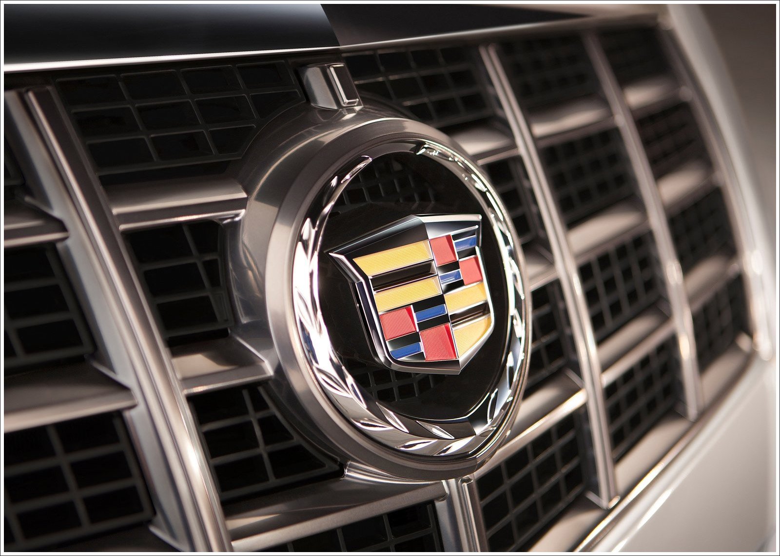
The new official logo of the company is set in beck-and-white, but on the bonnets of the Cadillac cars, we can still see the emblems in yellow, red, and black, with silver and blue additional elements. This color scheme stands for the variety, professionalism, and passion of the American automaker for what it does.
Symbol

The updated symbol of Cadillac without laurel wreaths displays new language of cars’ design. They grew shorter, longer and more aerodynamic. The purpose of this update of the symbol is a demonstration of the simultaneous evolution of the make Cadillac and its core values.

Discontent of customers became one of the key reasons for the design change of the symbol. At surveys, a large part of potential buyers expressed negativity towards the design of the previous variant of the symbol, in the feature of laurel wreaths. The updated symbol was for the first time shown to the public on the concept of Elmiraj in 2013.
Emblem
In 111-year history, the Cadillac emblem was changed around 40 times. Laurel wreaths on it appeared in the 1980s. The new emblem appeared on series models of the make in the second half of 2014. The coupe ATS and the sedan CTS received it first.
![]()
Today, the main production facilities, which manufacture cars Cadillac under the auspices of General Motors are in the USA, but branches of the company, including producing Cadillacs can be found in all the leading countries of the world.