| Founded | 1945 |
| Headquarters | Mumbai, Maharashtra, India |
| Parent | Mahindra Group |
| Subsidiaries | SsangYong |
| Official Site | www.mahindra.com |
| Official Facebook Page | www.facebook.com/MahindraGroup |
Mahindra & Mahindra began its history in 1948 on the basis of an already existing company, specializing in the production of machinery, automotive and agricultural, as well as spare parts for cars.
Subsequently, the company expanded its production capabilities, started producing gasoline engines, flow meters, and other industrial process control devices
Meaning and History
Mahindra & Mahindra – is more than two dozen models of motor and road transport, which were developed taking into account the expectations and wishes of each of the company’s customers. Moreover, the concept of the company’s work tends to exceed customer expectations.
The last change in the visual identity of Mahindra & Mahindra occurred in 2013, and it was connected … with a crisis and a decline in sales. In connection with such unfavorable circumstances, the company was simply forced to update the logo, launch a project to train young entrepreneurs involved in transportation, and significantly expand its dealer network in India. And in the novelty of the Mahindra & Mahindra – a sports truck Quanto Compact SUV, taking into account the specific wishes of the Indians, there were “places for yoga.” And all this – because of the crisis.
And in the Manifesto of the company, there were such words: “Today is a perfect day to do more, break one more barrier, do not hold back the past, but focus on the future.”
The company has been operating since 1948, and in 2016 the volume of annual production was from 150 to 200 thousand units of equipment. And modern technology, the cost of which compares favorably with the development of producers of richer countries.
In 1994, a group of companies that are part of Mahindra & Mahindra underwent a reorganization. Six independent or almost independent enterprises were singled out, among which the automakers, manufacturers of agricultural machinery and spare parts for this equipment proved to be the most successful.
In 2007, the company’s products were awarded even to the Japanese medal “Quality” – the only one of all Indian manufacturers.
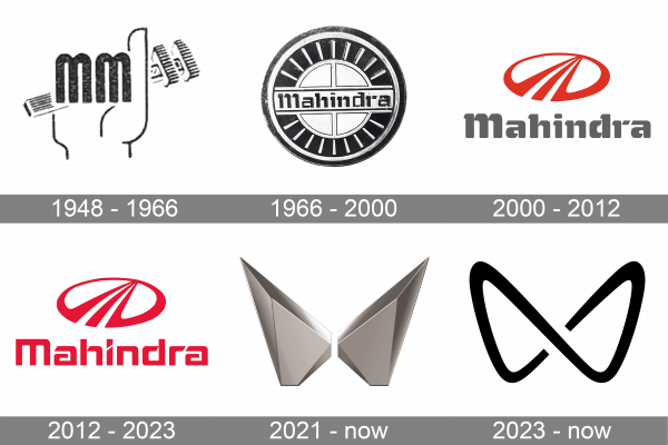
1948 – 1966
This vintage logo features a stylized hand gripping a tool, represented by two vertically stacked “M” letters designed to resemble fingers clasping the implement. This design highlights themes of mastery and manipulation in technological and mechanical fields, symbolizing a company deeply rooted in manufacturing and engineering. The clever use of letters to form the hand not only reinforces the brand’s identity but also ensures it remains distinctive and memorable.
1966 – 2000
The badge, designed for Mahindra in 1966, and used by the company for more than fifty years, featured a circular medallion in silver and black, with the design resembling a steering wheel. The central part of the badge featured a solid silver Wordle, horizontally crossed by a black BBK title case lettering in a fancy custom typeface. The wide black framing was decorated by thin silver lines.
2000 – 2012
The redesign of 2000 has introduced a completely different badge, composed of a red graphical emblem, accompanied by a bold gray logotype, set in the same typeface, as could be seen on the previous badge. The emblem boasted a horizontally oriented oval frame, which was cast at the bottom by three red lines, forming a triangle by the top, and looking like a road, going to the horizon.
2012 – 2023
The graphical emblem was removed from the primary logo of Mahindra in 2012. The new badge features a bright red title case logotype in a geometric futuristic typeface. The red on the Mahindra badge stands for passion and power and makes this laconic logo stand out on the list of competitors.
2021 – now
In 2021 an additional badge was created for Mahindra. It is a three-dimensional geometric emblem, formed by two mirrored elements turned face-to-face and making up an interesting and sharp figure, which resembles a futuristic space butterfly with its wings speed to the sides and sharpened at the top parts. The emblem is set in dark, gradient metallic shades.
2023 – Today
The current logo is a minimalistic, modern design defined by two symmetrical arcs merging in the center to create an abstract ‘M’. Its bold, clean lines impart a sleek and contemporary feel, while the use of black enhances its assertiveness and visibility. This logo epitomizes a forward-thinking company that values simplicity, clarity, and balance. The emblem reflects the company’s commitment to excellence and innovation, underscoring its leading role in the industry.
Emblem
The emblem of Mahindra & Mahindra was changed in 2000, and these changes were associated with the successful entry of the Mahindra Scorpio into the market. At first, the car was presented as a concept, and since 2002, it went to the series. In turn, this meant exporting and an urgent need to create a memorable visual image – emblem, logo.
In 2009, the brand was recognized as one of the most authoritative on the world scale, and one of the 20 largest enterprises in India.
Symbol
The Mahindra & Mahindra symbol for a long time was and remains a stylized letter M, more like a road going into the distance. And this is not surprising: this symbol has several meanings. It means a bright future, which is already around the corner. And the prospects for technological innovation (because in India, not all roads even roughly resemble the highway, which hints at the symbolism of the enterprise). And the ambitions of each customer, supported by the company.
Font

When developing the logo, the font which is distinguished by the smoothness and fine lines was used at first. However, when changing the logo and adding the word Rise, the emphasis was on a rhythmic, well-fitting geometry and at the same time a very dynamic font with diagonal bevels. The new font gave the whole logo an originality and a context of direction to the future, characteristic of the renewed brand.
Color
Orange color was used at first for the company’s logo, the most popular and considered a favorable color for both clothing and home, and in the twentieth century – for technology. In Indian culture for men, orange is the color of courage, for women – the color of a successful marriage and a stable family, and so on. However, only the logo was originally orange, while the name remained gray. Subsequently, gray – the color of stability and “grounding” is preserved, but the brightness of the logo was given a red color, symbolizing the sun.


