
| Founded | 1899 (Buick Auto-Vim and Power Company) 1903 (Buick Motor Company) |
| Founder | David Dunbar Buick |
| Headquarters | Detroit, Michigan, United States |
| Owner | General Motors (1908–present) |
| Official Site | www.buick.com |
| Official Facebook Page | www.facebook.com/Buick |
Buick is the name of the iconic American automaker, which was established at the end of the 19th century, and owned by General Motors since 1908. The auto marque is considered to the one of the oldest in the United States.
Meaning and History
![]()
The future founder of the make David Dunbar Buick for the beginning was engaged only in the production of enameled baths.
In 1902, David Buick founded the automobile industry company Buick Motor Car Company, having invested in it 100 thousand dollars received from the sale of his former enterprise.
Soon Buick met William Durant with whom he began to develop a joint car enterprise.
Sometime later, in 1903, the first car with Buick logo was produced. But there was a great conflict between partners and Buick left the executive post, but was for five more years an acting member of the board of directors.
However, the car model developed in 1904 and produced under the name Buick В brought the first immense success to the company.
In 1908, the Buick Motor Car Company signed an agreement about accession to the General Motors Corporation, but as an autonomous company. From this period, Buick started the production of the tenth model of the car.
The epoch of six-cylinder “Buicks” began five years later, in 1914. The cars of the Buick firm found an ever larger number of admirers among representatives of the American elite.
In the 1920s, the Buick Company announced an innovative solution and became the first serial producer of cars with disc brakes. Within ten years the enterprise completely switched to cars with 6-cylinder motors and in 1925, Buick produced the model 25 with an open bodywork of a tourist type on the Standard Six chassis.
In the period from 1919 to 1924, Buick entrenched behind itself the fourth position in the nationwide rating among automotive producers.
Since the beginning of 1931, Buick Motor constructors put 8-cylinder engines into production and already from that moment all the cars were produced with new equipment. In 1934, the company presented the model 66S.
Since 1946, the new prewar bodywork, which was changed at the expense of radiator facing and simplified board finishing, was taken as a basis. And a new emblem of Buick – “a little bomb in a ring” – became the brand sign. In 1948, a new model Roadmaster appeared, and the car Skylark debuted by a company’s jubilee as well.
From 1954 to 1961, Buick every 2-3 years produced its updated models.
In 1973, cars of average sizes of the General Motors Corporation on an A-like platform were produced under the new name.
Then in the 80s and 90s, some modifications of Buick’s cars took place.
In the new millennium, the Buick company created the new model development program, which counts four families of cars on two base platforms – a chassis with a front wheel drive assembly and crosswise located powertrains fit only with gasoline V6 engines and automatic hydromechanics four-step gearboxes.
Starting from 2001, the company’s management decided for the production of cars of a middle class for the US market. And the perspectives of development of the enterprise can be called sufficiently significant today.
1903 – 1905
![]()
The very first Buick logo was created in 1903 and stayed with the company for a bit less than two years. It was a very ornate and detailed drawing, which didn’t look much like a logo of the automobile brand. A man in a suit and a cylinder hat pulled a trolley above the globe. On the globe, there were two independent lettering parts. The “Known All Over the World” in the enter, and the name of the company arched along the bottom side of the roundel.
1905 – 1911
![]()
The first emblem for the Buick cars was created in 1905. It was a classic and elegant roundel, With the silver name of the brand, written in sophisticated letters with vignettes over a solid black background, and enclosed into a double silver framing with “The Car of Quality” inscription along the upper part.
1911 – 1913
![]()
The redesign of 1911 introduces a cool and modern badge, with the enlarged stylized letter “B” as the core, and the “uick” written inside it, across its horizontal bar. The whole logo was executed in cold silver metallic and looked sharp and unusual for its times.
1913 – 1930
![]()
In 1913 the Buick logo gets another redesign, with a completely new composition and color palette. The new concept is built around a blue horizontally-oriented rectangle in a wide white frame and thin gold outlines. The name of the automaker was written diagonally in bold cursive letters, with the characters, going up-right, set in white color, outlined in gold, and executed in a fancy script font.
1930 – 1937
![]()
The redesign of 1930 kept the diagonal orientation of the wordmark but changed everything else. The lettering was now set in red characters of a custom sans-serif font and placed on transparent background with no framing. The stylized numeral “8” formed of two solid circles was placed under the connection of the letters “C” and “K”.
1937 – 1939
![]()
The crest era of the Buick visual identity started in 1937, with a traditional and bright version, which was only used by the brand for a couple of years. It was a vertically oriented rectangular badge with the sharpened bottom part, in scarlet-red, with a glossy silver outline. The red body of the Buick crest was diagonally divided by a thick line with a checkered pattern in blue and white. In the bottom left corner, the goldcrest was set, while the gold deer was drawn over the bottom right part of the logo.
1939 – 1942
![]()
The Buick crest was redesigned in 1939, getting thinner and smoother. The basic concept has remained the same, but the colors were intensified, and the red background gained a thinly-striped pattern. The white on the separation line was replaced by silver, which balanced the frame of the logo, and made it look more elegant and chic.
1942 – 1947
![]()
The redesign of 1942 has introduced the most elegant and ornate Buick badge, with the wide crest set on a solid back circle and accompanied by silver vignettes above it. All elements on the crest were refined and redrawn more classically, with all gold and white elements replaced by silver ones, and the framing emboldened.
1947 – 1949
![]()
In 1947 the Buick badge becomes sharper and more modern. The crest is now set on a transport background, with a thin silver outline and straight horizontal lines of all the elements. The original color palette returns to the logo, with the cross and the deer set in gold again. The elegant wide crest got an interesting element decorating it on top.
1949 – 1959
![]()
The redesign of 1949 intensified the color palette of the Buick crest and enclosed it into an extra-thick voluminous silver frame. All the gold details were replaced by the silver again, and the top part of the logo got a thin wide element, resembling a car grille, and replacing the hypothetical crown.
1959 – 1977
![]()
The predecessor of the current Buick badge was first introduced in 1959. It was a composition of three thin vertically stretched crests in red, white, and blue, which were slightly overlapping each other and set diagonally on a transparent background, and enclosed into a glossy silver rounded frame.
1975 – 1976
![]()
For just one year in the middle of the 1970s, Buick was using a badge without any lettering or usual crests.It was a silver badge with an eagle facing to the right and enclosed into a circular frame. The wings of the bird were overlapping the framing in its upper part.
1976 – 1990
![]()
In 1976 the bird on the Buick badge was redrawn with lots of details and placed above the letter “I” of a bold uppercase logotype in serif metallic letters, with its wings spread to the sides. The whole composition was set on a solid red rectangular background.
1990 – 2002
![]()
The three-crest design concept was brought back to the Buick visual identity in 1990. The emblem from 1959 was redrawn in a modern and minimalistic way, with three crests outlined in light gray and enclosed into a flat gray circular frame, set above the blue serif logotype in a fancy extended serif font.
2002 – 2015
![]()
The lettering was removed from the primary logo version of the American automaker in 2002. The emblem was now three-dimensional, executed in voluminous silver contours with glossy gradients, and transparent bodies of the crests. No colors, no additional details.
2015 – 2022
![]()
The three crests of the Buick logo got their tricolor palette back in 2015. The emblem was now set in a smaller size, on the left from the enlarged logotype in black capital letters of a modern and clean sans-serif fonts with medium-thick lines and a lot of air.
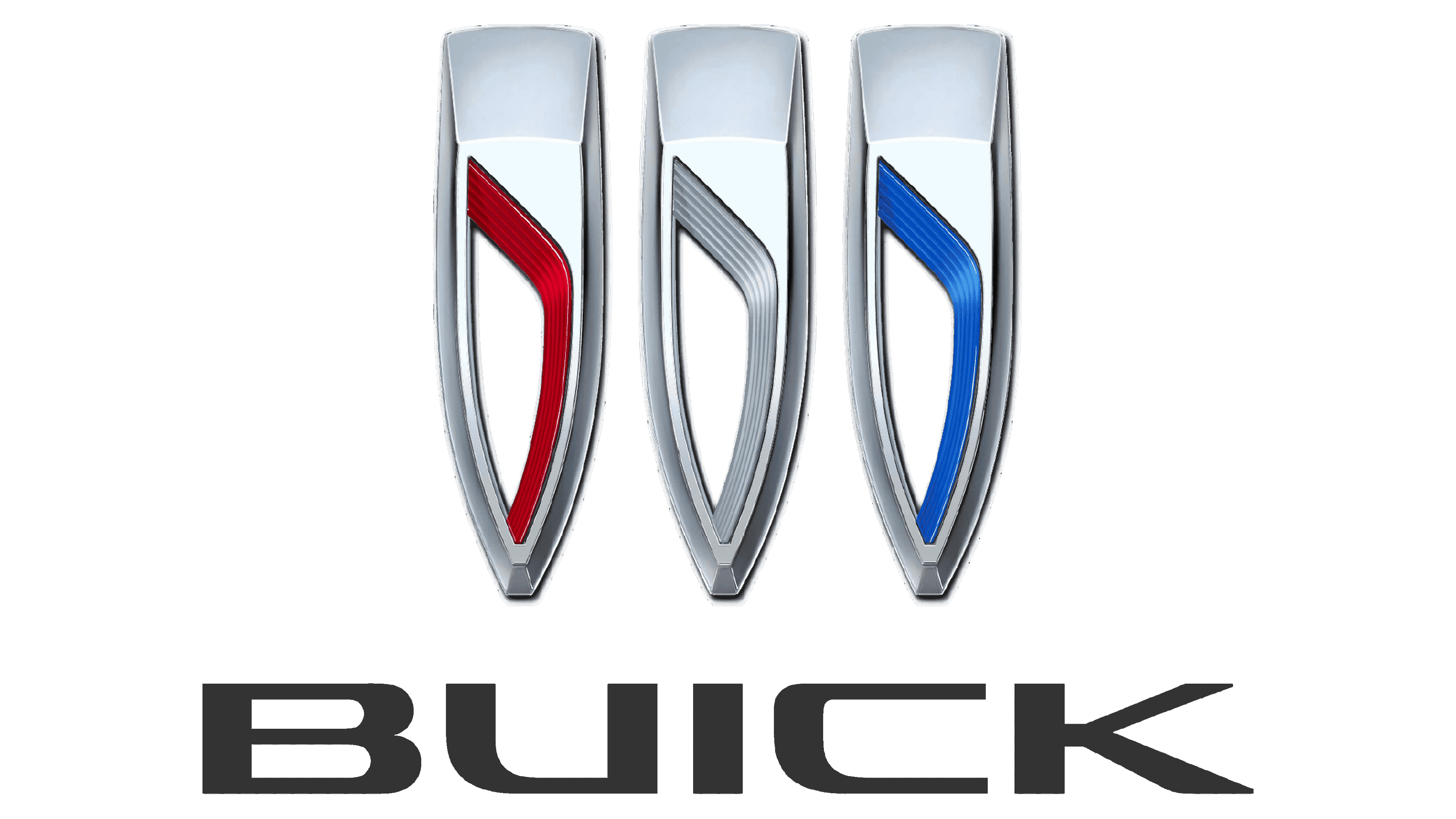
2022 – now
![]()
The logo represents stylized shields, which have been used by the brand since 1960 and are rooted in the family heraldry of company founder David Dunbar Buick. The shields on the new logo are placed in a single line and are not enclosed in a circle as before. The colors of the logo remained the same: red, white, and blue. The emblem is accompanied by an inscription “Buick” that is done in black using all uppercase letters. The font features smooth, thick strokes and goes well with the luxurious lines of its automobiles.
Font
Although the primary version of the Buick badge has no logotype on it, sometimes the modern monochrome emblem of the automaker is accompanied by the lettering, and in this case, the company uses a clean and modern sans-serif typeface, with thick black lines of the characters.
Color
The iconic and patriotic blue, white and red tricolor of the Buick logo was replaced by a black and white color palette in 2022. The new concept makes the logo look more modern and chic, adding more power and confidence to the mood of the badge.
Symbol

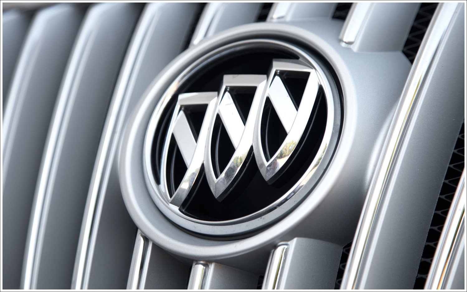
The very first symbol contained a red shield with a checkered silver and azure diagonal line. There was a stag above it, and a punctured cross was placed below it. The Buick logo was modified in 1960. The single shield was replaced by three ones in red, white and blue colors. Replaced by the Buick Hawk in the 1970s, the logo was used again in the 1980s a simplified form of the “three shields.”
![]()
Emblem
The silver color in the Buick emblem signifies purity, dignity, sophistication, and nobility; the black color represents the dynamic attitude and excellence of the trademark.
![]()