
![]()
| Founded | 24 June 1910 |
| Founder | Nicola Romeo Ugo Stella Alexandre Darracq |
| Headquarters | Turin, Italy |
| Parent | FCA Italy |
| Owner | Fiat Chrysler Automobiles |
| Official Site | www.alfaromeo.com |
| Official Facebook Page: | www.facebook.com/Alfa.Romeo.cars |
Alfa Romeo is the name of the iconic Italian car marque, which was established at the end of the 19th century in Milan. Today the brand is synonymous with the Italian automaking industry.
Meaning and History
![]()
“ALFA” stands for “Anonima Lombarda Fabbrica Automobili” – the name of the very first plant, which was acquired by Cavalier Ugo Stella in 1910.
At that very moment, Alfa Romeo history started. Cars made by this Italian brand are famous for sporty driving characteristics and passionate styling. They started to appear in the US in 1950s.
Alfa Romeo has been a part of Fiat Chrysler Automobiles since 1986. Italian company’s racing resume is impressive. It includes 5 world championships and 4 Le Mans, over 15 European Championships and more than 10 Mille Miglias.
1870 – 1910
![]()
The very first Alfa Romeo badge, designed in 1870, was completely different from all the following versions in everything, from shape to graphics. It was a rectangular banner with an arched topline, executed in a black and white color palette. The central part of the logo was taken by a solid black circle with the bold white “Alfa” written on it in a stylized sans-serif font. The circle was surrounded by vignettes and two white flowers on the sides, and underlined by the “Anonima Lombarda Fabrica Automobili Milano” inscription, decorated by thin horizontal lines.
1910 – 1915
![]()
The round version of Alfa Romeo logo was created in 1910 by Romano Cattaneo, who was inspired by the emblem he had noticed in Castello Sforzesco. The board approved his sketch, and Cattaneo was entrusted with making final design.
1915 – 1925
![]()
With the redesign of 1915, the color palette of the circular Alfa Romeo badge was enlightened. The heraldic elements remained in their places, and nothing has changed in terms of the composition, but the badge started looking differently due to the new hues and a more modern style of the lettering, written around the frame.
1925 – 1933
![]() In 1925 the dark colors were brought back to the Alfa Romeo badge, and the logo got enclosed into one more frame, with white leaves all over the deep blue background. The badge kept its size, which means all the central elements were now smaller. So was the lettering part.
In 1925 the dark colors were brought back to the Alfa Romeo badge, and the logo got enclosed into one more frame, with white leaves all over the deep blue background. The badge kept its size, which means all the central elements were now smaller. So was the lettering part.
1933 – 1946
![]() The frame turned all silver and voluminous in 1933. The rich gold outline of the inscription turned thin and elegant, so now the gold metallic shades were prevailing on the logo. The color palette of the main heraldic elements on the emblem also got colder, with blueish shades, and this made the logo look more distinctive.
The frame turned all silver and voluminous in 1933. The rich gold outline of the inscription turned thin and elegant, so now the gold metallic shades were prevailing on the logo. The color palette of the main heraldic elements on the emblem also got colder, with blueish shades, and this made the logo look more distinctive.
1946 – 1947
![]()
1947 – 1948
![]() For just one year the Italian automaker has been using a very unusual badge — the serpent and cross set in plain silver on a solid red roundel, with silver lettering written around its perimeters with no framing. It was a very minimalistic and sleek badge.
For just one year the Italian automaker has been using a very unusual badge — the serpent and cross set in plain silver on a solid red roundel, with silver lettering written around its perimeters with no framing. It was a very minimalistic and sleek badge.
1948 – 1950
![]() The traditional blue, white, red, and green Alfa Romeo badge was brought back in 1948, with intense colors, bold details, and a double golden outline of the medallion. The lettering was set in white capitals of a modern rounded sans-serif typeface, which looked clean and confident.
The traditional blue, white, red, and green Alfa Romeo badge was brought back in 1948, with intense colors, bold details, and a double golden outline of the medallion. The lettering was set in white capitals of a modern rounded sans-serif typeface, which looked clean and confident.
1950 – 1971
![]()
1971 – 1972
![]() The “Milano” part of the lettering was removed from the badge in 1971. The renewed logo looked very minimalistic and modern, with a lack of texture details and patterns, just clean contours and plain flat colors of all the parts.
The “Milano” part of the lettering was removed from the badge in 1971. The renewed logo looked very minimalistic and modern, with a lack of texture details and patterns, just clean contours and plain flat colors of all the parts.
1972 – 2000
![]() The golden outline came back to the Alfa Romeo logo in 1972. The concept remained the same as on the previous version of the logo — minimum details and clean shapes, but with the thick golden lines, everything became brighter and more intense. The wordmark was also set in gold, written along the upper part of the frame in a strict sans-serif typeface.
The golden outline came back to the Alfa Romeo logo in 1972. The concept remained the same as on the previous version of the logo — minimum details and clean shapes, but with the thick golden lines, everything became brighter and more intense. The wordmark was also set in gold, written along the upper part of the frame in a strict sans-serif typeface.
2000 – 2015
![]() The redesign of 2000 brought some gradients to the Alfa Romeo badge and made the golden outline of the elements a bit thinner, which created a fresher and airier composition, with lots of light-blue hues.
The redesign of 2000 brought some gradients to the Alfa Romeo badge and made the golden outline of the elements a bit thinner, which created a fresher and airier composition, with lots of light-blue hues.
2015 – now
![]()
The Alfa Romeo badge was redesigned again in 2015, with all the golden shades replaced by silver, and the central circle gaining plain silver background without any separation lines. The enlarged green serpent now overlaps the horizontal bar of the red cross. The lettering also turned silver and got its sans-serif typeface replaced by a sharp and elegant serif one.
Description
This logo includes two heraldic elements associated with Milan, where the automaker’s history started: a red cross (symbol of Italian capital) and the biscione (comes from the coat of arms of the family that ruled Milan seven centuries ago). Originally this badge was made of enameled brass and had a round shape.
![]()
In 2015 an all-new emblem was introduced. This logo, designed by Robilant Associati, differs from the original one in colors (green, red, dark blue) and typeface. Also, you can notice a silver textured background, which has replaced white and light blue field.
Symbol
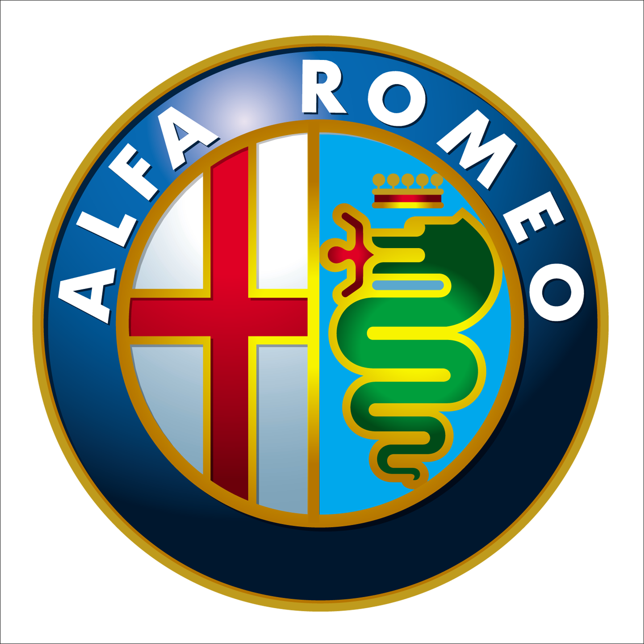
Company’s symbol is a quadrifoglio (green cloverleaf with four leaves) placed into a triangle. It can be spotted on Alfa Romeo racing cars since 1923. Since the 1940s, it appeared only on the upscale autos. In most models, it is placed on the side panel of an auto or on its front wings.
Emblem
In 1925, following Alfa Romeo’s victory at the first World Championship, a golden laurel crown appeared on the company’s logo. It stayed there for over half a century. In 1982, the company’s designer team decided that the laurel crown should be removed. In addition to this, one more change was introduced simultaneously: the diameter of the logo was increased.
Font
The typeface of the Alfa Romeo logo, designed in 2015, features wide clean shapes of the letters with small triangular serifs coming out of the upper parts of the letters to the left. It is a custom font, but the shapes of the letters are based on Aviano Sans Black or ITC Blair Pro Bold.
Color
![]()
Every element of the emblem has its specific color, from the Red Cross associated with Milan and crusaders to the green snake. Due to the use of two shades of gray the logo has a 3D contrast of illumination and shadows. The machines that made emblems were destroyed during the World War II, so in 1946 a single-color version was created. It was used until 1950 when every color of the Alfa Romeo Logo returned to its place.
![]()
![]()