| Founded | Jul 11, 1899 |
| Founder | Giovanni Agnelli |
| Headquarters | Turin, Italy |
| Parent | FCA Italy |
| Owner | Fiat Chrysler Automobiles |
| Official Site | www.fiat.com |
| Official Facebook Page | www.facebook.com/fiat |
Fiat is one of the oldest European automaking bands, which was established in Italy in 1899. The company has its economic vehicles exported all over the globe, which makes Fiat one of the most recognizable European car brands outside Europe. Since 2021 the brand is owned by Stellantis.
Meaning and History
The Italian company Fiat was set up in 1899, and its first plant was opened in 1900.
The retired officer Giovanni Anyelli who became the managing director of the company in 1902, was its key figure and the co-investor. Strange though it might sound, Renault of license with a “De Dion” engine was the very first car that exited from the plant gate. And Tipo Zero became the first authentic model of Fiat.
Fiat is an abbreviation meaning Fabbrica Italiana di Avto mobili Torino (Italian car Turin plant). In addition, this abbreviation can be translated from Latin as “let there be.”
The make Fiat became first in the world in some indicators. For example, Fiat manufactured the first car fitted with heating and ventilation systems. Fiat was the first car fitted with a cardan transmission. Fiat Campagnola, produced in 1951 was the first off-road vehicle with a supporting bodywork. The Fiat and Alfa Romeo companies were the first in the history of the automobile industry to start to turn for the help of independent bodywork studios.
Now plants producing cars of the makes Alfa-Romeo, Ferrari, Lancia, Maserati, and Flat belong to Fiat.
1899 – 1901
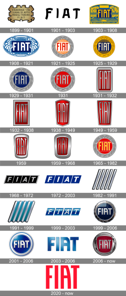
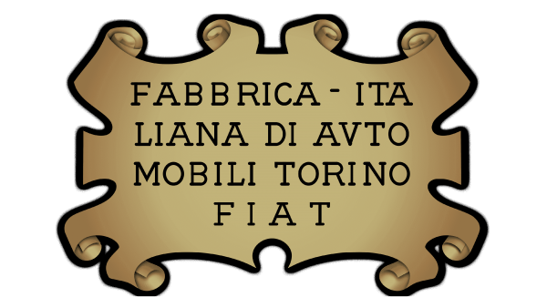
Carlo Biskaretti invented one of the first logos in 1904. It was a metal plate styled on a sheet of parchment, where the name of the venture was engraved.
1901 – 1903

The redesign of 1901 has introduced a very simple yet cool and playful badge with just the black uppercase “Fiat” lettering on it. The inscription was set in a custom sans-serif typeface with bold lines and straight cuts on their ends. This badge stayed with the company for just two years.
1903 – 1908
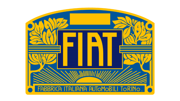
In 1903 a very ornate and elegant logo in art-deco style was created for the Italian car manufacturer. It was a horizontally oriented rectangular badge with the arched top part, executed in a fancy and bright blue and gold color palette. The yellow uppercase logotype was set on a smaller rectangle, with a dark blue background, set in the center of the logo.
1908 – 1921

The shape of the Fiat logo was changed to an oval after the redesign of 1908. The new badge was drawn in a blue and white color palette, with the logotype banner surrounded by thin and elegant vignettes. This emblem stayed with the car marque for more than a decade.
1921 – 1925
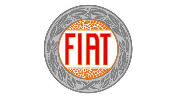
The redesign of 1921 has changed the shape of the Fiat logo again, making it circular this time. The new emblem featured a thick gray framing with a leafy pattern, and the Bold red logotype, set in the center of the roundel, on a white background. The bright shade of the lettering was supported by two abstract orange inserts above and beyond it.
1925 – 1929

The composition of the Fiat badge remained the same, but the color palette was switched in 1925. Now it was a gold roundel, with some ornaments in a darker shade, and the blue banner in the middle, with the white “Fiat” logotype in the uppercase, where every letter was outlined in gold.
1929 – 1931

The company decided to come back to the gray framing from 1921 but kept the dark shade of blue for the central part. Now it was a solid blue circle with the gray Fiat logotype, accompanied by two thin gray lines.
1931
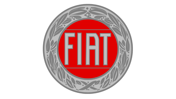
The redesign of 1931 changed the colors of the roundel again. The Gary framing was now contrasting with the solid red circle in the middle, and the iconic uppercase logotype was dawn in light gray, with each letter outlined in dark gray. That was a pretty intense color-wise insignia, which only stayed with the automaker for a few months.
1931 – 1932
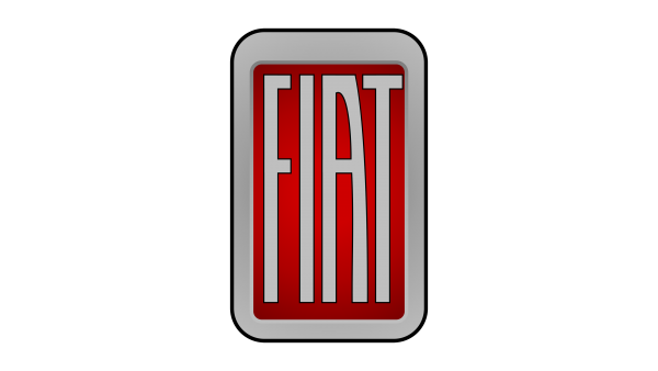
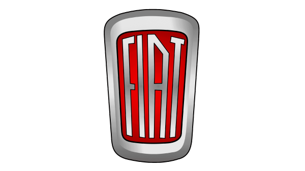
The gray and red color palate stayed with Fiat after the redesign of the later 1931. The new concept featured a vertically oriented rectangle with rounded corners, with the main part colored in red, and the thick outline and condensed logotype — in gray.
1932 – 1938
The contours of the rectangle got straightened and the letters gained some metallic gradient shades after the redesign of 1932. As for the red background and the gray framing of the badge, they were still colored in flat hues, creating a pretty interesting contrast with the inscription.
1938 – 1949
The rectangular shape of the Fiat badge was refined in 1938, with the bottom part slightly narrowed and sharpened, getting a triangular shape, and the top — arching up, which made the badge look like a contemporary geometric crest. Everything else, including the logotype and the color palette, remained unchanged.
1949 – 1959
The arched top and triangular bottom of the fiat crest got flattened after the redesign of 1949. Now it was again a rectangle, which got a bit narrower to the bottom. The dark-red and silver-gray color palette was kept by the designers, so no crucial changes this time.
1959
The redesign of 1959 has introduced another version of the Fiat badge, with a thick smooth framing in silver, and more light-red gradients on the background of the main part. The lettering became more geometric, with straight lines and angles of the characters. This badge only stayed in use for several months.
1959 – 1968
Later in the same year, the Fiat logo was refined again. This time it was more about the red background of the badge, which gained a glossy surface and a pattern, formed by thick horizontal lines in a darker shade of red. The frame was also slightly changed, getting wider and flatter than on the previous version of the Fiat badge.
1965 – 1982
In 1965 the company decides to come back to its circular logo, with a thick framing, leafy ornament, and the letters — a bit wider. The new emblem used a light shade of gray for the frame, darker gray for the decoration, and scarlet-red for the central part, while the inscription was set in yellow, and had a white outline of each letter.
1968 – 1972
In 1968, the logo received a square shape: the idea came to the mind of the company’s leading designer when he was passing past the plant, where electricity was switched off, and saw a neon signboard with the company’s name against the background of the dark sky.
1972 – 2003

The geometric Fiat badge was refined in 1972, with the dark parallelograms turning bright-blue, and the silver outline removed. Now all geometric figures with the white letters on them were placed at a slight distance from each other, which made the logo look cleaner and lighter. This badge was in use by Fiat until the beginning of the 2000s, along with several more badges, created over the years.
1982 – 1991
The most minimalistic Fiat badge was introduced by the Italian company in 1982. It was a geometric composition of five tall diagonal lines, set in parallel to each other, and executed in gradient silver. The three-dimensional emblem was super simple but still looked cool and modern, showing the brand from the new side.
1991 – 1999
The five lines got lighter and gained a matte surface after the redesign of 1991. Now they were set at a larger distance from each other and placed on a bright turquoise background. The ends of the lines got softened, and now the emblem resembled a car grille.
1999 – 2003

The emblem with four parallelograms was redesigned in 1999. Now each element was drawn three-dimensionally, with a glossy surface and blue gradients, and the white capitals of the Fiat logotype were slightly sunk into the blue parallelograms, and also had some gradient hues, which made them look silver.
1999 – 2006
In 1999, the Fiat logo was renovated in commemoration of the 100-year jubilee of the company, and now its new version of rounded shape decorates all the company’s products. At that time, the logo letters were located on a blue background.
2001 – 2006

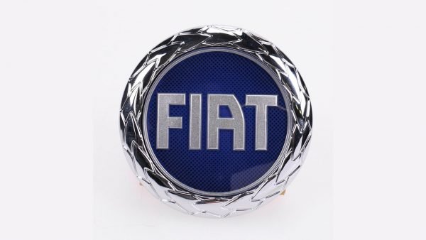
The rounded shape of the logo and the typeface of the logotype on it remained the same after another renewing of Fiat’s visual identity in 2001. Although the new page features a brighter color palette and more minimalistic finishings. It was a glossy blue circle with a wide silver frame, decorated by a thin blue line, and the voluminous silver logotype in the center.
2003 – 2006

For three years, startingin 2003, the Italian automaking brand has been using a three-dimensional logotype set in the recognizable Fiat typeface, and executed in gradient blue, with bright and lively hues. The inscription was set on transparent background with no additional elements.
2006 – now
In 2006 Fiat introduced a new badge, with a thick circular frame, which has its interiors contour more square. The glossy silver framing is balanced by a glossy red central part, with a vertically-striped pattern. The Fiat logotype is set with matte silver capitals over the red background, with a thin shadow around the letters.
2020 – now

In 2020 the company has designed one more badge, which today is used along with the version, created in 2006. The new concept is all about minimalism and laconic design. The Fiat badge depicts bright-red flat lettering on a transparent background. No volume, no gradients, no frames.
Font
The iconic Fiat logotype has been using one custom typeface since the early years of the corny. The letters could slightly change their contours from time to time, but the main characteristic of the font remained. There is no commercial analog for the Fiat typeface, but some letters look more or less close to the letters from Rogue Sans Nova Demi Bold Condensed.
Symbol Description
The actual Fiat symbol was developed in 2006 jointly by the Robilant Associati agency and Center of Fiat’s style. It originated from the famous firm “panel” of Fiat, which had decorated concern cars from 1931 to 1968. At the same time, the letters acquired the shape typical for the 1901 emblem and are placed on a ruby-red background in an elegant chrome frame. The symbol has a three-dimensional effect and signifies floating of foregrounds of technologies, the design of Italy, dynamism, and individuality. This is a very strong symbol; it reflects an idea of a constant update, the rebranding of the great past in the new way, which is the essence of Fiat today.
Colors
The current logo was represented in 2006. It is a chrome shield-like symbol. The “ongoing change,” showing the company’s denomination in chrome color on the red background is depicted by it.
Emblem
The letters of the name on the Fiat emblem are vertically elongated. 12 times in the entire history, models with the Fiat emblem became “Car of the year in Europe.” This is a record.
What are the plans for the current Fiat Chrysler alliance for future? Having taken into consideration record low fuel prices in its long-term strategy, the management of the concern believes that the attractiveness of crossovers and off-road vehicles will increase. For example, in 2017-2018, Fiat is going to introduce one more new crossover (most probably, the talk is about the completely reworked model Fiat Panda).

