| Founded | 2015 |
| Headquarters | Seoul, South Korea |
| Parent | Hyundai Motor Company |
| Slogan | “Luxury Evolved” |
| Official Site | www.genesis.com |
| Official Facebook Page | www.facebook.com/GenesisMotorAmerica |
When the Hyundai Genesis sedan was unveiled in 2008, it surprised many by having a different logotype than other cars of the Korean brand. In the course of time, it turned out that this was a prudent approach as the company was going to make Genesis a start of a standalone marque, Genesis Motors.
Meaning and history
Initially, the Genesis cars sold in the United States had the same “H” logotype as other cars manufactured by Hyundai. However, the vehicles sold in other countries had another badge based on a pair of wings. When buying a Genesis, Americans had an option: to install the regular “H” logo or the new “winged” Genesis logo. Eventually, it turned out that only 20% of the customers opted for the regular badge.
Back in 2008, quite a few auto industry experts claimed that Hyundai was going to turn Genesis into a separate brand. However, the company did not announce it officially until November 2015.
The carmaker’s representatives mentioned several reasons for turning Genesis into a standalone marque, including the fact that the car was one of the top three sellers in its segment.
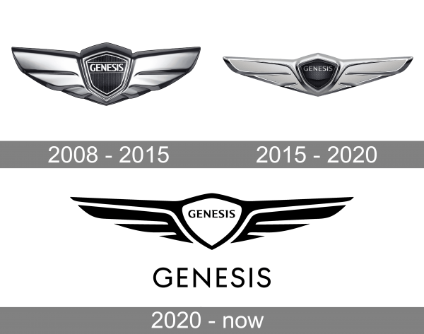
2008 – 2015
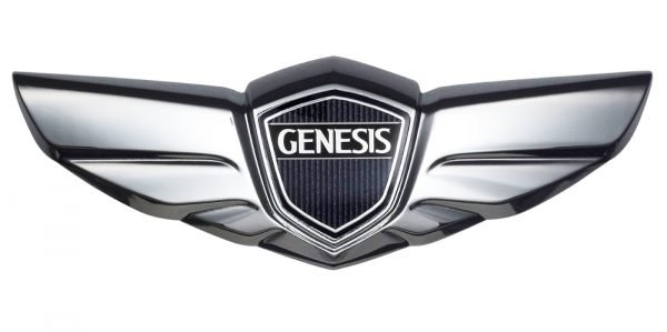
Although Hyundai is not the only brand to use a winged emblem for its automobiles, it made sure to make the emblem look unique. The original version presented a shield with the model name and short, wide wings. The shield had a nice, multiple-line framing and thin vertical lines that created an attractive texture. It had a solid banner running across with “Genesis” printed in a white, serif font and featuring close spacing. The whole emblem was done in metallic silver and black colors with just a bit of white. Such a color palette is often used by companies to create an image of a technologically advanced brand.
2015 – 2020
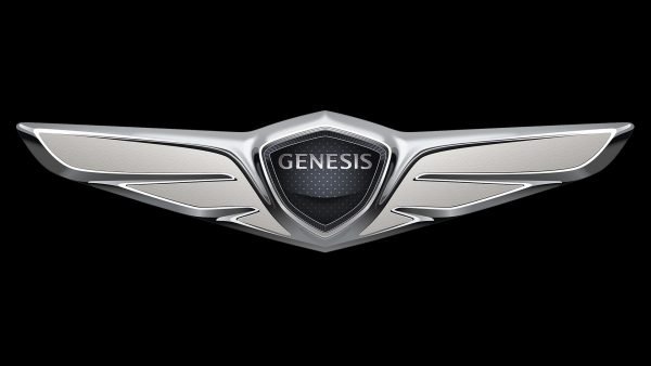
The updated logo not only has a warmer metallic silver shade but also has a very different emblem shape. The wings were stretched out horizontally and acquired a sharper and more stylish shape. The logo looked lighter thanks to lighter shading and highlights. The shield has also undergone some changes. It had a different pattern and border, and most importantly, the name was now printed without a banner behind it and featured a metallic silver color to go with the rest of the emblem.
2020 – now
A stylish, modern look was introduced in 2020. It was an abstract, black-and-white version of the previous logo. The emblem now looked flat and had a solid white shield in the center with no multiple lines for the border. The company preserved the style of the name inscription but has done it in black. Underneath the winged symbol, the logo now had “Genesis” printed in large, uppercase, sans-serif letters of a black color. The inscription looked simple, yet sophisticated and was a perfect addition to the minimalistic look of the emblem.
Symbol
Between the two wings, a black hexagonal shield with a striped pattern is placed. Inside the shield, there is the word “Genesis” in capital letters. It is given against the black background between two horizontal lines. The logotype features an elegant monochrome palette including several shades of grey.
Genesis vs. other “Winged” car emblems
The wing symbol, which is the base of the Genesis logo, is used in many other car badges, including Bentley, Chrysler, and Aston Martin, to name just a few. The obvious reason for using the wings is that they are a symbol of speed. However, some auto market analytics point out that in this way Hyundai was also trying to emphasize that its brand was to become a high-end one and compete with other “winged” cars.


