| Founded | 1945 |
| Founder | J. R. D. Tata |
| Headquarters | Mumbai, Maharashtra, India |
| Subsidiaries | Jaguar Land Rover Tata Daewoo Tata Hispano |
| Slogan | “More Dreams Per Car” “Inspired by people” |
| Official Site | www.tatamotors.com |
| Official Facebook Page | www.facebook.com/TataMotorsGroup |
Tata Motors Limited is a multinational automaker “worth” $42 billion. The product range varies from cars and SUVs to buses and trucks. Tata Motors logo is close to the emblem of Tata Group.
Meaning and history
Tata Motors is an Indian multinational automobile manufacturer, part of the Tata Group, founded in 1898. The company includes the production of cars of various levels, from cheap Indian brands to global brands, as well as types of vehicles from various fields: from trucks to military vehicles.
Tata Motors started producing commercial vehicles in 1960 with the release of the first car, a copy of Daimler Benz. It took the company much longer to prepare the first commercial vehicles and the first Tata 407 was launched in 1986.
Today the company is the largest car manufacturer in India, and also owns several international brands in the automotive industry.
1945 – 1988
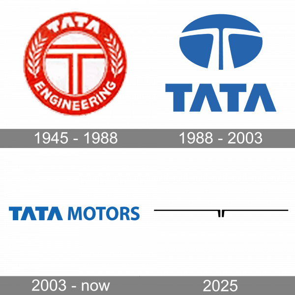
The logo, created for Tata Motors in 1945, has stayed with the automaker for more than forty years. It was a monochrome roundel, with the outlined uppercase “T” in the center, enclosed into a wide frame with the lettering and two spikes on it.
1988 – 2003
The redesign of 1988 introduced a modern and stable logo, composed of an emblem and uppercase lettering, drawn in dark blue against a white background. The emblem featured a thick white letter “T”, formed by two parts, stylized like a road. The emblem also resembles n a steering wheel. As for the logotype, it was set in a heavy geometric sans-serif typeface with the horizontal bars of both letters “A” removed.
2003 – now
In 2003 the Tata Motors logo gets more laconic and minimalistic, with the graphical emblem removed from the composition. Now the logo is formed by two wordmarks, written in different styles, but one light-blue color. The first, “Tata”, part is set in the same font as on the previous version, while the second, “Motors”, uses a more lightweight sans-serif for its capital letters.
2025 (tentative)
To celebrate the new area of the Tata automaking brand history, the designers have created a completely new and super stylish badge, which reflects the progress, sharpness and excellence. The whole concept is based on just one element — the capital letter “T”, but it is drawn in two mirrored elements, placed with a thin gap between each other. The geometric parts of the Tata “T” boast stable thick vertical bars, and thin distinctive horizontal ones, elongated to the sides.
Font
The “Tata Motors” logotype from the rim art badge of the Indian automaker, is set in a modern and clean sans-serif typeface, with the first part, emboldened and modernized, and the second — written traditionally. The closest fonts to the one, used for this insignia, are, probably, Myriad, or Rolphie Heavy.
Color
The light and calm shade of blue is the only color in the Tata Motors palette. It looks very tender and evokes a sense of reliability and security. Such a calm and pleasant shade is a pretty rear choice for the companies in this segment, hence this palette makes Tata Motors stand out on the list of its competitors.
Symbol
There are over 50 companies associated with Tata Group, each having a different logotype. Many of them are based on the same symbol representing a stylized letter “T.” This symbol is the most important part of the Tata Motors logo, too.
It was created in collaboration with one of the world’s most known branding agencies, Wolff Olins. The brand consultancy with offices in London, New York City, and San Francisco was created in 1965 and became a part of the Omnicom Group in 2001. The logo Wolff Olins developed for Tata embodies the innovative spirit of the group, as well as fluidity and adaptability. According to the official explanation, the emblem also symbolizes a fountain of knowledge or a tree of trust.
The letter “T” is formed by two lines making a 90-degree angle turn. In addition to the explanation mentioned above, they can also be regarded as stylized depictions of the road. One road is a mirror image of the other, and they turn in opposite directions. The first halves of the roads form the vertical part of the “T,” while the upper halves form something that can be interpreted as the horizontal bar of the “T.” The white road symbol is placed inside an oval shape with the dark blue filler.
The Tata Motors logo is in many respects similar to the emblem of its parent company. For instance, it is almost the same regarding the color palette and the typeface. However, the logos are far from being identical.
The automaker’s logotype is based on the wordmark. The first word, “Tata,” looks exactly as on the emblem of its parent company, with the distinctive letters “A,” where the horizontal bars have been removed. Next to it, the word “Motors” is also given in a sans serif all-cap type.
The first word is bold, while the second one is given in a regular type. All the letters have an identical height but differ in width due to the bold effect. For the same reason, the first word is more pronounced, which seems perfectly natural taking into consideration that this is the name of the whole conglomerate holding company, while “Motors” indicates just a smaller division inside the group.
Technologies emblem
Tata Technologies is one more Tata Group’s division dealing with the automotive industry. In fact, it is an 85%-owned subsidiary of Tata Motors, which specializes in developing cars and offering other services for carmakers.
The emblem of Tata Technologies is very close to that of the Tata Motors, but the word “Motors” is replaced by “Technologies.”
The 2017 logo
In 2017, the automaker adopted a new corporate brand identity. Basically, the logo itself remained the same but received a new visual interpretation. Now, the wordmark in white is given against the blue background covered with white dots. Below the wordmark, there is the following lettering: “Connecting Aspirations.” The shade of blue used in the Tata Motors logo is bright and saturated. Some of the concepts associated with the color include excellence, reliability, and strength.
The brand identity was created in collaboration with an external agency. The new brand promise, “Connecting Aspirations,” is supposed to imply that the company is a system of mobility solutions that are intelligent and perceptive.


