
![]()
| Founded | March 27, 1986 |
| Founder | Honda Motor Company |
| Headquarters | Minato, Tokyo, Japan |
| Owner | Honda |
| Slogan | “Precision Crafted Performance” |
| Official Site | www.acura.com |
| Official Facebook Page: | www.facebook.com/Acura |
Acura is the name of the Japanese automaking brand, which was established in 1986, with the idea of production of luxury cars for the international market. The brand is owned by Honda.
Meaning and History
![]()
Honda’s division Acura specializes in luxury vehicles. Among the Japanese automaker’s major competitors are Buick, Lexus and Infiniti.
Its cars have an impressive level of luxury, upscale image, features, and performance.
Acura history is relatively brief, but this company managed to achieve a lot in a short time.
![]()
Honda introduced Acura in North America in 1986. Although there were only two cars available (Legend and Integra), the new company was an instance success. Autos with Acura logo appeared in the lists of world’s most desirable cars. Prices are higher than for the parent company’s vehicles, but Acura has a lot of customers because it uses the latest in technology.
1986 – 1989
![]()
The original version of the Acura logo, introduced in 1986, and used by the company for the first three years, was based unjust the uppercase logotype, set in flat black letters, executed in a modern stylized sans-serif typeface. The wide stable letters of the Acura inscription looked unique and futuristic, with both “A”s and “R” having their horizontal bars shortened, and contours open.
1989 – now
![]()
With the redesign of 1989, the Acura logotype remained untouched but got accompanied by a sleek and sharp emblem, which still can be seen on the bonnets of the brand’s cars today. The Acura emblem is a geometric element, which can be read as both a stylized “H” (for the mother company) and the “A”. Another version of the logo meaning is a caliper.
Description
![]()
The logo is a stylised “A” that bears some resemblance with “H”. In this way the connection between Acura and its parent company Honda is emphasized. The lines also resemble a caliper, the tool that is a symbol of accuracy. Below the oval one can see the Acura word.
Symbol
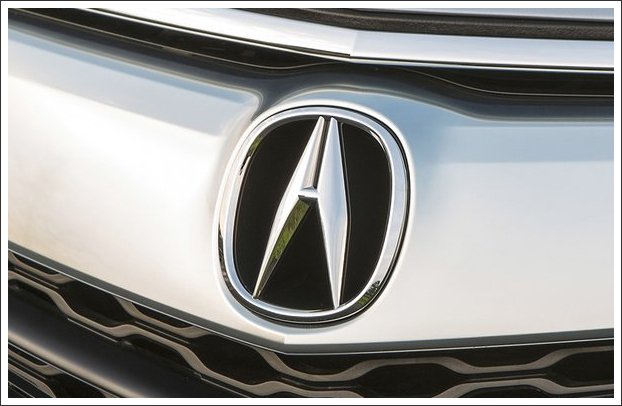
When the Acura symbol was unveiled in 1990, there was a bit of a scandal as the first version of the logo was introduced without Soichiro Honda’s approval. It had no small horizontal bar, so it lacked resemblance with the letter “H” which stood for “Honda”. Because of this Honda ordered to destroy all badges already produced.
Font
The bold and modern uppercase logotype from the primary logo of Acura is set in a custom sans-serif typeface, which looks pretty similar to such fonts as Aspire, but with some lines modified. The Acura “R” looks different, with its horizontal bar more square than triangular.
Emblem
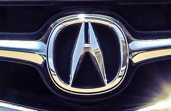
The very name of the company emphasizes the idea of meticulousness and perfection of engineering: the word “Acura” was created on the basis of the prefix “acu,” which can be translated as “sharp” or “precise”. No wonder the company’s designers prefers to interpret the Acura emblem as an upright pair of calipers, as far as this tool is intended for pinpointing exact, detailed measurements.
Color
![]()
The badge that can be seen on the Acura cars is all silver, so it doesn’t leave room for speculation about the symbolic meaning of the color. Yet, when it comes to graphic design, the choice of colors becomes meaningful. Most often the basic color of the Acura logo is white, which is supposed to symbolize integrity, purity, and perfection. In many cases, the logo is black, but the background is white.
Acura MDX logo
![]()
The mid-size three-row luxury crossover has been manufactured by Honda under the Acura brand since 2000. The wide italicized letters seem to belong to the same font as the TL logotype. The “M” and “X” have flattened vertices, while the “D” has rounded right corners.
Acura TL logo
![]()
The mid-size luxury car introduced in 1995 as a replacement for the Acura Vigor has a minimalistic script logo. The typeface is different than that of the regular Acura logo. The smooth shape of the italicized letters conveys the idea of speed, especially the “L”, which resembles a turn in the road.
Acura TLX logo
![]() The script logo of the mid-size sports sedan unveiled in 2014 reminds the badge of another Acura’s car, the TL. At least, the first two letters are identical. Similar to them, the “X” is wider than usual. It features sharp angles and flattened vertices.
The script logo of the mid-size sports sedan unveiled in 2014 reminds the badge of another Acura’s car, the TL. At least, the first two letters are identical. Similar to them, the “X” is wider than usual. It features sharp angles and flattened vertices.
![]()
![]()
![]()