| Successor | Chevrolet Buick GMC |
| Founded | 1926 |
| Headquarters | Detroit, Michigan, United States |
| Parent | General Motors |
| Official Site | www.pontiac.com |
Although Pontiac had at least two logotypes (the second one modified more than once), it always stayed true to the Native American theme. The theme reflected the fact that brand was named after the Native American Chief Pontiac, the leader of an unsuccessful uprising against the British.
Meaning and history
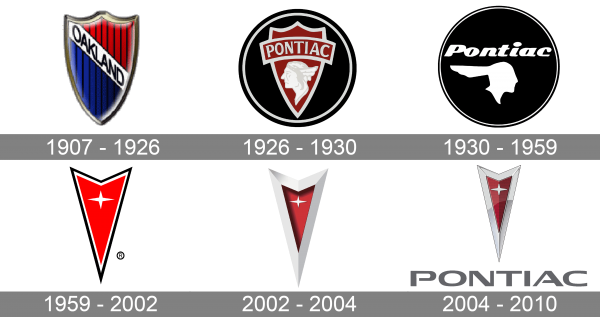
Pontiac was created on the base of the Oakland Motor Car Company, which had its roots in the 19 century. Oakland Motor Car logo was based on a shield shape.
The earliest Pontiac logo, which was adopted when the company had just started its way to success, depicted a side view of a Native American with a distinctive headdress. The red picture was placed in a circle frame of the same color, yet part of the headdress was left outside the frame.
The company used several versions of the logo depicting the Native American’s head, including the one based on a shield shape.
1907 – 1926
The original Pontiac badge was designed when the automaker was still called Oakland Motor Company. It was a glossy vertically stretched crest in a thick silver outline, with the body diagonally divided by a white banner with the black “Oakland” lettering into two parts — the striped red and black on top, and blue and black at the bottom.
1926 – 1930
The redesign of 1926 introduced a new badge for Pontiac. This time it was a depiction of the company’s name, honoring the Native American tribe. It was a triangular dark-red crest in a thick white outline, with the profile of a Native American man drawn in white on its bottom part, and a wide banner with the white uppercase logotype arched above the image.
1930 – 1959
In 1930 the Pontiac logo gets another redesign. The white image of a Native American man was now set in flat color, with the head turned to the right and placed on a solid black circle, accompanied by a bold italicized “Pontiac” lettering in a title case of an elegant yet stable sans-serif font. The roundel was enclosed into a thick double outline in black and white, which added some lightness to the badge.
1959 – 2002
The redesign of 1959 introduced a minimalistic geometric logo of the Pontiac company. It was a sharp triangular crest with straight lines, scarlet-red background, and a white-and-black outline. The only graphical element on the logo was a white four-pointed star, with its horizontal rays elongated. The star was placed over a Ted background in the upper part of the crest.
2002 – 2004
In 2002 the Pontiac logo became three-dimensional due to the addition of a massive gradient-silver frame to the red crest. The frame threw a shadow on the body of the logo, making it darker and deeper. As for the star, it was still there but drawn in a more laconic way, with the reduced size, to fit into a new framing, which was now the main element of the badge.
2004 – 2010
The last Pontiac logo was created in 2004 and stayed with the brand until its discontinuation. The frame of the logo got thinner and gained a glossier silver surface, with the body of the crest getting glossy too, but its bright red color was muted. As for the star, it was now set in silver. The Pontiac crest was accompanied by a bold uppercase lettering in gray, set beyond it.
Symbol
From 1959 to 2010, when the brand ceased to exist, it used an arrow-based logo. One of the reasons why Pontiac got rid of the previous badge was that the company wanted to address the younger audience.
Font
The bold and modern sans-serif logotype from the last Pontiac badge was executed in a custom font with stable letters and thick clean lines. Some of the contours were opened, which added air to the heavy inscription. The closest font to the one, used in this insignia is, probably, Vast XXXL Medium, but with some contours modified.
Color
The color palette of the Pontiac visual identity was composed of red and silver, and their gradient hues. The combination looked very elegant and timeless, evoking a sense of confidence and traditional approach and reflecting the values of the company and its desire to make its customers happy.
The red arrow facing down was nicknamed the “Dart.” The logo was officially introduced in 1959 on the split grille of the wide track model.
What does the emblem mean?
The company never gave an explicit explanation as to what meaning the star or the choice of color had behind. According to some sources, the reason was that both the star and the red color were often used in Native American art.
Pontiac Firebird Logo
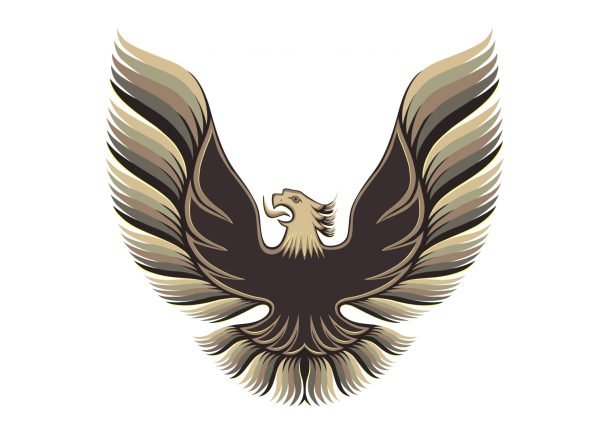
In 1967, Pontiac launched an automobile, which was designed as a competitor to the Ford Mustang. The vehicle, which was called Firebird, was developed as a pony car. Its logotype reflected the car’s name. It featured a stylized bird with its wings open wide. While the bird itself was black, the feathers were colored gold and brown to resemble fire flames and thus prove the word “Firebird.”


