| Founded | 1891 |
| Founder | Gustaf Erikson |
| Headquarters | Södertälje, Sweden |
| Parent | Volkswagen Group |
| Official Site | www.scania.com |
The iconic griffin on the logo of the Swedish brand Scania has been used for over 110 years. It hasn’t remained unchanged throughout this period, though – the Scania logo has been modified eight times.
Meaning and History
The corporate entity now known under the name of Scania AB was created in 1911 as the result of the merger of two smaller companies: Vabis (located in Södertälje) and Maskinfabriks-Aktiebolaget Scania (located in Malmö).
As the company explained in its press release, the first record of the Scania name and the griffin dates back to 1901. It was the earliest registered trademark of Maskinfabriks-Aktiebolaget Scania. This trademark could be seen on the bicycles made by this company. Later, it was used on the radiators of the first series-produced passenger cars sold under the Scåne brand. Scåne gradually evolved into a competitor truck company.
The full name of the second founding company of the AB Scania Vabis was Vagnfabriksaktiebolaget I Södertelge. The corporate entity created as the result of the merger was called Aktiebolaget Scania-Vabis.
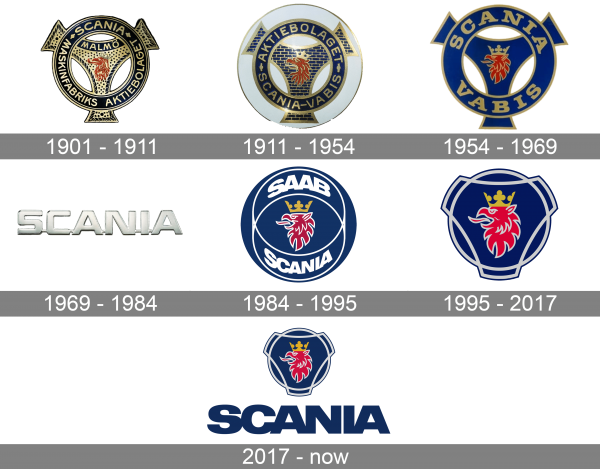
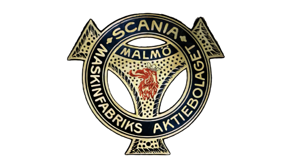
1901 – 1911
The griffin became its corporate symbol. All the versions of the logo featured the crowned head of the griffin in the center of a shape reminding a three-pointed star with its sharp points cut. Apparently, it had been inspired by the steering wheel. A ring with the company name was placed over the star. Each of the elements was modified more than once, but the overall shape remained rather consistent. The earliest logos were given in golden, black, and red, while the last version replaced black with saturated dark blue. Also, the earlier logos were more cluttered than the last version.
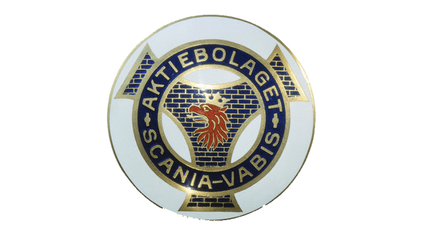
1911 – 1954
The logo, used by Scania for more than forty years, starting in 1911, was based on the previous version but had the pattern of the central element looking like a brick wall, drawn in thin golden lines over a solid blue background. The blue circular frame of the logo boasted a bold golden “Aktiebolaget. Scania — Vabis” lettering in the uppercase of a geometric sans-serif font.
1954 – 1969
The redesign of 1954 has simplified and strengthened the Scania badge, with all the small decorative elements removed from the badge. The ref griffin bow was set on a solid blue background, while the frame also featured a plain blue color. Both elements were outlined in gold. The lettering on the ring was simplified to just “Scania” arched along its top part, and “Vabis” — at the bottom. Both wordmarks were set in an extra-bold serif font with heavy stable characters.
1969 – 1984
In 1969, the company merged with Saab to form Saab-Scania. We should point out that the griffin wasn’t actually used on any Saab car.
1984 – 1995
It was only in 1984 that Saab-Scania adopted a corporate symbol featuring the griffin. The Scania logo was developed by the Swedish artist Carl Fredrik Reuterswärd. The mythological creature on the badge was placed in the central field created by two overlapping ellipses. The field on the top housed the word “SAAB,” while the word “Scania” was placed in the remaining field. This emblem was used in 1984-1995.
1995 – 2017
In 1995, Scania regained its status of an independent company, and an updated Scania logo was introduced. All the letters were removed, which gave a chance to bring the griffin in the limelight. The blue hues of the Saab-Scania logo were replaced by black.
2017 – now
The redesign of 2017 has placed the emblem of the company above the enlarged extra-bold Scania logotype in the uppercase of a modern sans-serif typeface, set in the same shade of blue, as the one used for the graphical part.
Font
The uppercase inscription from the primary version of the Scania logo is set in a heavy sans-serif typeface with the uppercase letters written in extra-thick lines with clean contours and straight cuts. The closest fonts to the one, used in this insignia, are, probably, Helvetica Neue 93 Ext Black, Rhode, and Reservoir Grunge.
Color
The color palette of the Scania visual identity is composed of calm and dark shades of blue, red, light-gray, and yellow, a classic combination with bright accents. Blue stands for confidence and professionalism, while a red represents passion. Yellow is a very energetic and friendly color, which is balanced by gray, calming, and harmonizing shade, evoking a sense of reliability and trustworthiness.
Company overview
Scania AB has a long-standing reputation of Sweden’s largest manufacturer of commercial vehicles. The brand is most known for its heavy trucks and buses. In addition to them, it also produces diesel engines.
Why is griffin used?
According to the company, the griffin (or, alternatively, the Gripen) on its logo symbolizes such values as “strength, speed, alertness, and courage”.
The griffin’s head was borrowed from the coats of arms of the Skåne and Östergotland counties in southern Sweden, where one of the two founding companies of the AB Scania-Vabis was based.

