| Native name | マツダ株式会社 |
| Founded | 1920 |
| Founder | Jujiro Matsuda |
| Headquarters | Fuchū, Aki, Hiroshima, Japan |
| Owner | Japan Trustee Services Bank (6.0%) The Master Trust Bank of Japan (5.4%) Sumitomo Mitsui Banking Corporation (2.2%) Ford Motor Company (2.1%) |
| Slogan | “Zoom-Zoom” |
| Official Site | www.mazda.com |
| Official Facebook Page | www.facebook.com/mazdacom |
Mazda is a Japanese automaking company, which has been on the market since 1920. The brand is known for manufacturing high-quality reliable sedans, SUVs, andengines. The cars of the Japanese company are being sold all over the globe through numerous Mazda subsidiaries on different continents.
Meaning and History
The birth of the Japanese company Mazda is prescribed to 1920. The company was set up in Hiroshima.
First, it bore the name “Toyo Cork Kogyo Co.” and manufactured phellem for requirements of The First World War. But soon, for the reason of the fervor of the First World War, it collapsed and closed. Later, in 1927, Jujiro Matsuda revived the company, and the production started again. In the beginning, the plant produced light three-wheel trucks and then launched the production of cars as well. After the Second World War, the company formally approved the name Mazda and already launched the production under its own logo. As the creators themselves said, the company name is taken from the name of great Zoroastrian God – Akhura Mazda.
The emblem of the company began to be changed in 1936 and acquired the form of the letter “M” absolutely identical to the emblem of the coat of arms of Hiroshima.
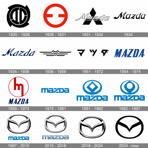
1920 – 1928
The very first Mazda badge, designed in 1920, featured an interesting abstract composition executed in dark blue on a plain white background. It was a roundel with a thin frame decorated by four elements, resembling shark fins, and creating a sense of a swirling motion. In the center of the circular badge, there were two half-circles sets vertically and turned to each other by their straight sides. As for the arched sides of the elements, they had open contours — the left one at the bottom, and the right one at the upper part.
1928 – 1931
The redesign of 1928 introduced a super minimalistic Mazda logo, which was executed in a powerful scarlet-red and white color palette. It was a bold circular frame with two straight and short lines coming out of it to the center horizontally, in the central axis of the circle. There were no lettering or other additional elements on the badge, just clean bold lines, and bright color. The badge only stayed active for three years.
1931 – 1934
In 1931 the Mazda logo was redrawn in a completely different style. It was bold contoured lettering in a fancy custom typeface with elongated and slightly curved lines, drawn over the solid blue iconic Mitsubishi diamond badge. The outline of the letters in the logotype featured the same shade of blue as the Diamond, and in the overlap sports, the blue lines had white accents for better readability.
1934
For a few months in 1934 Mazda has been using another logo — a black title case inscription in a custom typeface, resembling the one from the previous version of the badge. The new inscription was set in solid letters with flared lines and sharp ends of the characters. It looked very elegant and represented the geographical roots of the company, having that recognizable Asian influence in each detail.
1934 – 1936
The contours of the letters got refined at the end of 1934. The letters became narrower and taller, with the lines having some areas pretty thick and heavy, although still with smooth and elegant contours and sharp cuts of the lines. The color palette of the badge was changed from black to deep blue. This version hasn’t stayed for long either.
1936 – 1959
The logo, designed for Mazda in 1936, was set in a cool abstract style, with the composition formed by three parallel lines with three “M”s in the center of each. The lines featured different lengths, getting shorter from the top level to the bottom. The elongated horizontal tails of the “M”s made up an image, resembling two geometric wings speed to the sides and cut diagonally.
1951 – 1972
For the National market, the new logo for Mazda was created in 1951. It was a bold and sharp geometrically-styled lettering with three triangular hieroglyphs set in one horizontal line. Each triangle featured a different shape, but all of them were pointing down. The hieroglyphs were written in solid black lines with straight cuts.
1954 – 1974
The redesign of 1954 created a simple yet strong Mazda badge, based on the uppercase logotype in a calm but intense shade of blue. It was a bold italicized inscription in a custom narrowed sans-serif typeface. The horizontal bars of both “A”s were elongated to the right, adding sharpness and geometry to the tall solid characters.
1959 – 1975
In 1959, the logo was changed, there was still the Roman letter “M” in its base, but not in a horizontal, but in a vertical composition.
1991 – 1992
In 1991, the emblem, which is used now, but in strongly changed form, was developed. Based on the thought of creators, this emblem means the wings, the sun, and the circle of light.
1992 – 1997
From 1991 to 92, the logo was again subjected to change and was replaced by the circle, which symbolized the sun in the company’s understanding. “Circle of light,”- it was called by the Japanese.
1997 – 2015
In 1997, the work on change of the emblem continued. The designer Rei Yoshimara developed the new logo in the form of an owl. The company management liked the stylized letter “M,” and the new logo was accepted. The work of Yoshimara cannot be called bad because it has some triple sense in itself: the owl was assumed, the company sees the letter “M,” and the consumer saw a tulip… The work of the talented designer is defined by this.
2015 – 2018
The redesign of 2015 has made the silver gradients on the Mazda badge a bit lighter and more matte, but this was not the only change. The lowercase logotype, written under the emblem, was now also executed three-dimensionally, in gradient silver, with each massive letter outlined in blue. This made the inscription look like it has a neon light all around it.
2018 – 2024
The blue outline of the Mazda logotype was switched to the black one, and it added a sense of power and professionalism to the badge, and also made the emblem look darker and more confident. The logo, created for the brand in 2018 is a perfect representation of Mazda’s values and character.
2024 – Today
Symbol Description
So for today 2 versions exist:
- The symbol has triple meaning: the owl, which was assumed initially, the company makes out the letter “M” and consumers see a tulip… This the work of the talented designer
to create something complicated in a simple form. - The symbol is a stylized tulip, but along with that, it symbolizes stretched out wings, softness, and flexibility.
Color
The blue color of the logo features excellence and reliability of the Mazda vehicles. The silver color signifies their sophistication, creativity, and excellence.
Emblem
The Mazda emblem includes the SF Automaton typeface, which was created by the Omaha-based type designer, Derek Vogelpohl.
Font
The bold lowercase inscription from the primary Mazda badge is set in a massive futuristic sans-serif font with stable characters and thick strong lines. The closest font to the one, used in this insignia is, probably, Snasm Bold or Corporatus Regular, but with most contours modified.
What is there in the company’s plans for future?
The new off-road vehicle Mazda CX-9, which one can present as Mazda 6 having been enlarged in its proportions and having changed its role, will be produced in 2017. This is a product being created together with the Ford Company.
Also the rotor coupe Mazda RX-Vision is on its way to the launch. There is a stocky silhouette, a very long bonnet; a cab carried to a sexy stern. The rotary engine of the new generation, which received the name Skyactiv-R is located in the front; the drive is for the rear axle. There are composite materials used in the external trim package, including carbon fiber. The wheels, through which one can see six-piston calipers in the front and four pistons in the back are made out of it.
And the car Mazda Souga is a model for distant future. It is hard to find words to describe its external appearance. However, there is a standard set of functions for concepts of this type: an ecologically clean system of an alternative fuel engine; a flow chart with an improved control and safety system. Definitely, Mazda Souga has a bit of your fantasy.


