| Successor | British Motor Corporation |
| Founded | 1905 |
| Founder | Herbert Austin |
| Headquarters | Longbridge, England, United Kingdom |
| Products | Automobiles, Rover, Austin Rover, MG, Morris |
| Defunct | 1952 |
Meaning and history
Austin was founded in 1905 in England, by Herbert Austin. It merged with Morris Motors Limited in 1952. The Austin logo has changed many times over the company’s history.
The latest logo version features a front view of a wheel connected with a steering wheel, and a pair of wings. The marque was in use until 1987. Over the factory’s history, the logo changed a dozen of times.
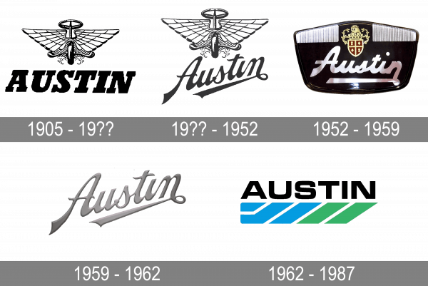
1905 – 19??
The bold, italicized “Austin” inscription was accompanied by a winged vehicle that had a motorcycle wheel and a steering wheel from an automobile. The outspread wings and smoke under the wheel gave the emblem a feeling of movement. One could even imagine that this vehicle is going to take off at any moment The emblem was quite detailed and had a three-dimensional appearance, which gave the logo a professional look.
19?? – 1952
The original emblem received rebranding by changing the style of the inscription. It was now elegant, cursive writing that gave the logo a touch of luxury and sophistication. The strokes had varying thicknesses and sharp, pointed ends. To add even more dynamics to the emblem and reflect the company’s progress, the designer placed the inscription on a diagonal.
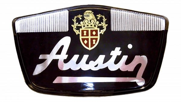
1952 – 1959
This emblem has a much bolder and richer appearance thanks to a black, shiny background. The name was straightened and featured thicker, more even strokes. The winged emblem was replaced by a luxurious shield with intricate decorations above it. This portion of the emblem was done in royal crimson and golden. The brand clearly positioned itself as an upper-class manufacturer.
1959 – 1962
This logo was created in the middle of the last century, but its minimalistic design looks stylish even today. It uses only the name, which is printed in the same style as in the second logo. The graceful, handwritten inscription placed on diagonal looks sleek in the new silver metallic color. It acquired some volume and reflected the advanced position of the brand while bringing back a classic feel.
1962 – 1987
A relatively simple and at the same time colorful emblem was created in 1962. The company introduced a new font for its name. It was bold and used clean strokes with straight cuts. The font resembled MicroSquare Bold Extended or Petualang font. Underneath the name, the logo had diagonal blue and green lines that not only created a feeling of movement but also created a look that was nothing like the brand had earlier. This represented the company’s ambition to grow and position itself as a reliable and trustworthy brand.


