| Founded | 1948 |
| Founder | Maurice Wilks |
| Headquarters | Whitley, Coventry, United Kingdom |
| Parent | Jaguar Land Rover |
| Owner | Rover Company (1948–1967) Leyland Motor Corporation (1967–1968 ) British Leyland Motor Corporation (1968–1986) Rover Group (1986–2000) Ford Motor Company (2000–2008) Tata Motors (2008-Present) |
| Official Site | www.landrover.com |
| Official Facebook Page | www.facebook.com/landrover |
Land Rover is the name of a British automating company, which was established in 1948. The brand specialized in the production of off-road vehicles in a high-price segment. Land Rover is a part of the Jaguar Land Rover Group, which is owned by Tata Motors, an Indian company.
Meaning and History
The history of the Land Rover logo creation began with a funny incident. The oval shape of the logo was caused by the simplest object – a can from under sardines.
The designer was somehow having dinner of canned food and left the can on his desktop, as a result of which traces in the form of oval outlines were left on it – thus, the company logo was born.
The Land Rover logo is not the most creative of all the corporative logos in the full sense of the word, but it works, it is recognized, and its simplicity says much about the product that it introduces.
On the first Land Rover, which brothers Spencer and Maurice Vilkom produced in 1948 for the British carmaker Rover, the car name loomed in a cast aluminum oval. There was a simple sans serif in italics, there were capitals – everything was executed simply, and the concrete idea was built in it: Land Rover is a utilitarian and understandable tool of a broad array of application and the lightweight, and corrosion-resistant alloy will play a significant role in the development of Land Rover for many years.
From the very beginning, the words “Land Rover” were separated by a dash in the form of a Z letter, crossing over both words. Since the moment of the launch until the starting of the Series III manufacturing in 1971, the aluminum plate with the make name also included words “SOLIHULL, WARWICKSHIRE” and “ENGLAND” in empty places of the oval. Depending on a model, an additional plate was installed on the logo; there was the inscription “Four Wheel Drive Station Wagon». Together with this, Land Rover designed the car, which would combine the external utility of Series and the luxury of furnishings of the passenger compartment in itself. Thus, Range Rover became a separate car in the line. Instead of the logo, the words RANGE ROVER were placed on the bonnet of a new car in heavy letters. The usual symbol of Land Rover appeared on Range Rover only 20 years later.
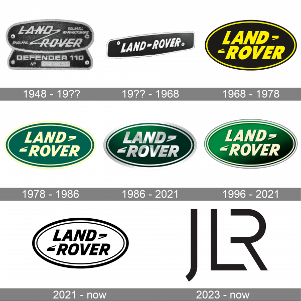
1948 – 19??
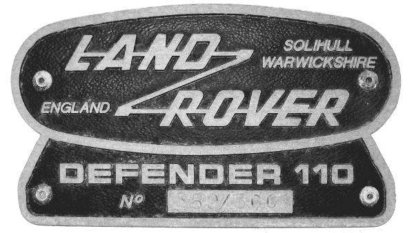
The original Land Rover logo, introduced in 1948, stayed with the British automaker for twenty years. It was a black badge with metallic details and framing, drawn in a shape of a horizontally oriented oval, set on a trapezoid pedestal. The main contours of the logo featured rounded angles, which were balanced by a strong and sharp inscription in an italicized geometric sans-serif.
19?? – 1968
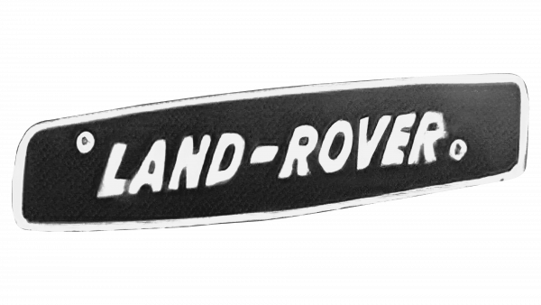
This logo started the era of simpler and minimalistic brand emblems. It has only the name printed in one line using white color and bold, sans-serif lettering. The inscription is placed on a black plate with light framing. This emblem does not have any elements that would make it stand out among many other such logos, but the brand name of a well-recognized company can make any emblem memorable and recognizable.
1968 – 1978
The redesign of 1968 has simplified the composite of the Land Rover badge, and made its color palette more interesting, adding a bright shade of yellow to a solid black background. The new badge was drawn as a clean black oval, with a double outline in yellow and black. The central part of the badge was taken by a bold two-leveed inscription in an italicized sans-serif font, with both lines accompanied by two commas — the top on the right, and the bottom on the left.
1978 – 1986
In 1978 the color palette of the Land Rover badge was refined again, with the plain black replaced by a light and smooth shade of green, and yellow getting muted. The composition of the logo remained untouched, but the font and the commas were modified, with the inscription getting a bit more delicate, and the commas — stronger and larger.
1986 – 2021
The addition of metallic silver, which replaced the light yellow seen in the previous logo, completely transformed the emblem. The green color was also made darker, so the new logo got a truly rich and sophisticated appearance. The green is a reflection of the safety and reliability of the vehicles as well as the stability of the company itself. Silver is often used to represent modern technology and add a touch of glamour.
1996 – 2021
The light shade of yellow was brought back to the visual identity of the British automaker in 1996. The frame became triple, and the lettering on a badge, which now featured a gradient green background, got shadowed, creating a better contrast between green and yellow.
The yellow on the Land Rover logo was replaced by gradient metallic silver, while the green on the background got brighter and darker. The inscription got its typeface switched to a more interesting one — with barely visible sharp serifs on the ends of the bold massive bars. The framing started looking wider due to the use of the new color.
2021 – now

This is a more modern and minimalistic version of the logos the company has been using since 1968. The logo is done in black and white, which not only reminds of the original emblem but also gives it a luxurious and contemporary feel. The emblem has only a few modifications, featuring a thicker outer line in the border as in the earlier versions along with flat black lettering.
2023 – now ( JLR Logo )
The visual identity of the Jaguar and Land Rover brands acquired a single emblem. It consists of a stylish, minimalist, yet powerful, and memorable monogram. The “JLR” initials are done in black, sans-serif letters with the “R” placed close to the “L” as it has no vertical leg. The letters feature straight cuts combined with diagonal, sharp cuts that create an impression of a company that follows modern trends and stays on top of technological advancements.
Symbol Description
With the production of Series III in 1971, the symbol turned more right-angled in its form, the words LAND-ROVER became more distinct, and they began to be separated by a clearer dash. It is strange, but nowhere in the corporate press, the words” Land Rover” were ever separated by a dash. For that period the font remained former.
In 1984, with the appearance of Defender as a replacement of Series models, the symbol became more similar to the initial one, but it was with an additional plate, as on old Station Wagon, with words ” Defender 90″ and “Defender 110”.
With the launch of the car Discovery in 1989, which became the link between an angular and utilitarian Defender and a deluxe Range Rover – Land Rover replaced an aluminum plate by the clear logo. The dash remained, but now the words “Land Rover” began to overlap it. Therefore, the dash became more like quotes. The new logo had to be associated with an ecological compatibility.
In 2010, the symbol update happened: its gold color was replaced by the silver one.
Color
While the green color in the Land Rover logo symbolizes the growth, freshness and environmental manufacturing of the company, the silver color signifies its excellence, purity, and charm.
Emblem
The Land Rover emblem uses the custom-made type style, which is heavily borrowed from Gill Sans font family.
In the future, the Land Rover Company plans to significantly expand its line of produced cars. Thus, for example, a modified version and, perhaps, a convertible, as well as 7-seat modification created on a stretched platform will be added to the available variants of the crossover Range Rover Evoque.
The more compact variant of the off-road vehicle Land Rover Freelander must appear, and the Defender family will undergo a change of generations. At the same time, a short, long and pickup versions of the line will remain.
The model of Discovery, which on the example of the new Range Rover 4, will make wide use of aluminum in the construction of its bodywork and chassis for cancellation of mass, will get a new generation as well. It is planned to realize the mentioned above goals by 2020. And China is called one of the key markets of the brand.
Font
The uppercase italicized inscription from the primary logo of Land Rover is set in a massive yet elegant typeface, with bold geometric shapes of the characters and small triangular serifs. The closest fonts to the one, used in this insignia are, probably, Cenzo Flare Condensed Bold Italic and Point Panther Oblique.


