| Founded | 1949 |
| Founder | Carlo Abarth |
| Headquarters | Turin, Italy |
| Parent | FCA Italy |
| Owner | Fiat Chrysler Automobiles |
| Official Site | www.abarth.it |
The Abarth brand is one of the most famous among the brands associated with car racing. The brand’s cars have been actively participating in car racing in Italy and other European countries for more than half a century.
Meaning and history
In 1949, the brand Abarth was registered in Turin, Italy. Its creator was Carlo Abarth, the former director of the racing team of the bankrupt automaker Cisitalia, and the investor Armando Scagliarini. They concentrated their attention specifically on specialized models, the main thing for which is to ensure a high speed and power of the car.
1949 – 1954
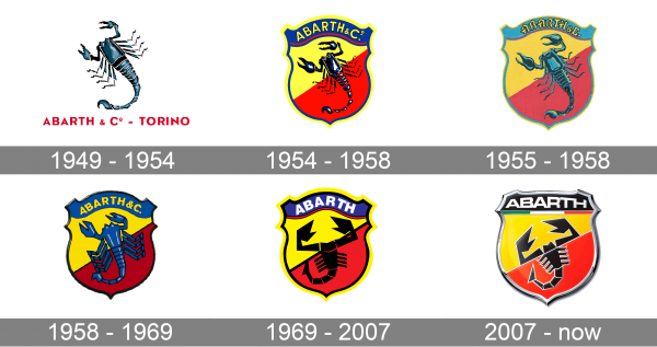
Since the creation of the very first Abarth logo in 1949, the scorpio has always been a star of the composition. The initial badge of the Italian automaking company was composed of a detailed image of the Scorpio in blue and black, set above the bold red “Abarth & Co — Torino” uppercase lettering in a modern sans-serif typeface. This version of the logo stayed with the company for the first five years of its existence.
1954 – 1958
With the redesign of 1954, the Scorpio was refined and placed on a bright yellow and red crest with the blue top part, where the yellow “Abarth & Co” inscription was set in all capitals. The Scorpio was redrawn more abstractly, with more black shades, but still, some blue gradients, which supported the blue outline of the crest and the top part with the inscription.
1955 – 1958
The color palette of the Abarth logo was lightened up in 1955. Blue became turquoise and red and yellow gained brighter hues. Another change of the year was made to the inscription, with the yellow “Abarth & Co” rewritten in a bold gothic-style typeface, having its letters slightly condensed and placed close to each other, which left a lot of space on the sides of the wordmark.
1958 – 1969
In 1958 the Abarth logo get changed again, with the crest becoming wider, the colors of the badge — more intense, and the scorpio in blue again. The yellow lettering was set in the bold and modern sans-serif typeface with solid and massive characters and enough space between the lines of the letters.
1969 – 2007
The predecessor of today’s Abarth badge was introduced by the company in 1969 and stayed untouched for almost forty years. The scorpion was drawn in an abstract geometric style, with all elements colored in plain black. The colors of the crest were adjusted, for creating a balanced composition with the bold and sharp lines of the logo’s main hero. As for the lettering, it was shortened to just “Abarth” and was now set in white massive capitals, executed in a bold sans-serif font.
2007 – now
With the redesign of 2007, the Abarth logo gets refined and gains not only the gloss on its surface but also a line, stylized as the Italian flag, which was separating the main part of the crest from the lettering, written along with the top black banner. All shades of blue were completely removed from the logo and replaced by black. The new logotype is set in a designer sans-serif font, in silver-metallic color, supporting the color of the thin lines on the badge and its sleek outline.
Emblem
Abarth’s emblem has changed several times over the course of its history, but the fundamental change – with the addition of a scorpion – was one thing. The primary simple logo quickly ceased to suit the creator, and Carlo Abarth was literally forced to make his logo more recognizable and, most importantly, more secure from possible fakes. After all, any brand that has won the trust of consumers sooner or later faces the need to protect its trademark and good name.
Symbol
The Abarth symbol is a symbolic image of a scorpion on a red-yellow background, located on a shield. Shield, in turn, being an element of heraldic, means authority (reputation).
As for the symbolism of the scorpion, this image reflects two meanings at once. The first concerns the horoscope: Carlo Abarth was born under the sign of Scorpio. The second is the special nature of this creature, which achieves its goal at all costs and does not hide its own danger for others.
Font
For the Abarth logo, the original font was developed. Initially, the text element was the central element of the logo, but later the stylized scorpion took its current place at the intersection of two color fields, and the font became more reserved and compact.
Color
The color solution of the Abarth logo is very symbolic. The image uses red, green and white colors, the colors of the national flag of Italy. In addition, red and yellow colors have a specific meaning in the automotive world, symbolizing the race at high speed. It is this combination of colors used as the background on which the scorpion is located.

