| Founded | 1906 |
| Founder | Vincenzo Lancia |
| Headquarters | Turin, Italy |
| Parent | FCA Italy |
| Owner | Fiat Chrysler Automobiles |
| Official Site | www.lancia.com |
| Official Facebook Page | www.facebook.com/Lancia |
Lancia is the name of one of the oldest Italian car manufacturers, which was established in 1906. The company, known for its affordable automobiles, works mainly for the European market, and today is a part of Stellantis, an international group, that owns several famous car marques.
Meaning and History
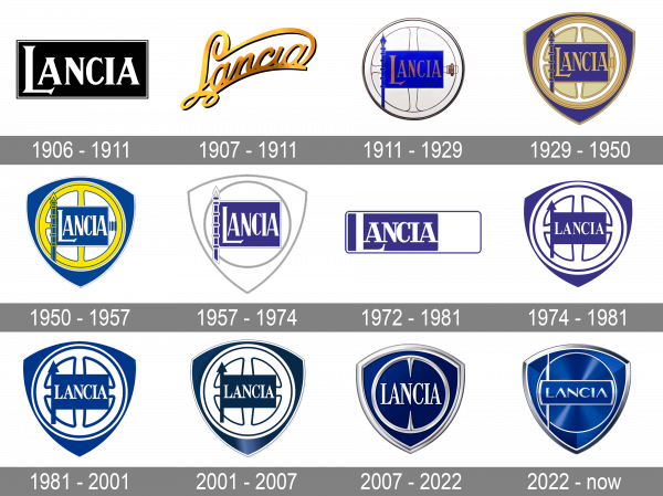
The Lancia logo boasts a rich history, which has witnessed six versions.
Even though Lancia is not the first Italian automaker in terms of international popularity, it is very well known in Europe, as has been on the market since the beginning of the 20th century. The brand was one of the European pioneers in the automobile industry.
Today Lancia is known for the production of passenger and commercial vehicles, and even military equipment. Since the middle of the 1950s, Lancia has been actively involved in motor racing.
1906 – 1911
The original Lancia badge, designed for the company in 1906, was composed of a solid black horizontally-stretched rectangular banner in a double white and black outline, and a heavy stylized “Lancia” inscription in the uppercase of a bold serif font, with the “L” Enlarged and its horizontal bar underlining the “A”.
1907 – 1911
The very first Lancia logo, introduced in 1906, has stayed with the company for five years. It was an elegant script lettering in gradient gold, with the diagonal orientation, elongated lines, and curved ends of the bars. This three-dimensional badge looked very tender and sophisticated, just right for its times.
1911 – 1929
The redesign of 1911 introduced a new concept of the visual identity design for the Italian car marque. That was white roundel with thin golden lines cresting an image of a string wheel on the background, and a bight blue flag with the golden uppercase logotype on it. The badge featured many traditional heraldic details and elements but looked bright and pretty modern.
1929 – 1950
The circular Lancia logo got placed on a triangular crest with the sides arched from the center, in 1929, and this was the date of the first introduction of the badge, which later becomes iconic and inseparable from the brand. The roundel was colored gold and white, and the crest was set in solid blue, with a thin gold outline, adding balance to the composition.
1950 – 1957
The color palette of the Lancia crest was refreshed in 1950, with the blue getting brighter, gold turning acid-yellow, and white being used more. Now the central roundel of the crest was colored white, as well as the lettering in a blue rectangle of the Lancia flag. This vivid and dynamic version of the badge was used by the Italian automaker for almost seven years.
1957 – 1974
The redesign of 1957 has brought back the bright blue and gold color palette, returning to the design from 1911, but this time placing the white and gold roundel on a solid bright-blue crest. All the golden details got gradient shades and glow on them, which worked well for creating a contrast with the background.
1972 – 1981
In 1972 the Lancia badge gets another redesign, with the crest and steering wheel completely removed from the composition. Now it was just a blue and white rectangle, placed horizontally and enclosed into a thin blue and white frame. The white lettering in the recognizable corporate serif font was set in the left part of the banner, over the solid blue background.
1974 – 1981
Another version of the Lancia logo was introduced in 1974. That was the iconic Lancia crest with a roundel inside, and a rectangular flag drawn on it, but this time the badge was set in a deep-blue and white color palette, with the lettering gaining a new serif font, and all the characters set in one size. This made the look of the badge more balanced.
1981 – 2001
The badge, used by Lancia from 1981 to 2001, was fully based on the previous version, but executed in a more sophisticated and sleek color palette, with a calm and deep shade of blue, a couple of hues lighter than the previous one. As for the overall concept and the elements of the badge, they were completely the same as on the crest from the 1970s.
2001 – 2007
The current logo features the steering wheel figure, which has been around since 1911, and the Reuleaux triangle, which has been the logo’s basic element since 1929.
2007 – 2022
Today, the logo is a chrome-frame triangle and the chrome steering wheel, which has been redesigned and now has two spikes. The wheel is placed on a blue background. This logo version was created and introduced at Geneva Motor Show in 2007.
2022 – now
The redesign of the Lancia logo, held in 2022, has introduced a badge, which graphically represents the growth and development of the company. It is still a crest shape, set in a blue and silver color palette with gradients and a glossy surface. You can still see a steering wheel, which is now drawn in a thin silver line, and a flag with a sharp long handle, but each of the details was rethought and minimized. As for the main change in the badge — it is the typeface of the logotype. For the first time in its history, Lancia started using the sans-serif font for its uppercase wordmark.
Font
The bold and elegant Lancia logotype from the official badge of the Italian automating company is set in a strong narrowed serif typeface, which looks quite close to such commercial fonts as Alter Headletter, Desire Basic, and Bridge Head Con Bold, but with some contours modified.
Color
The color palette of the Lancia visual identity is based on a combination of dark blue and silver, with glossy surfaces and some smooth gradients. This color scheme normally stands for professionalism, confidence, and excellence, and in Lancia’s case it’s all true.


