| Founded | 1895 |
| Founder | Václav Laurin Václav Klement |
| Headquarters | Mladá Boleslav, Czech Republic |
| Parent | Volkswagen Group |
| Slogan | “Simply Clever” |
| Official Site | www.skoda-auto.com |
| Official Facebook Page | www.facebook.com/skoda |
Škoda – The company whose logo has changed fundamentally several times. And if the very first logos are not taken into account, because they belonged to a company that was called differently at that time, then in the twentieth century, the vision of a single symbol of the brand changed very seriously four times.
The first logo of the Škoda brand was the head of an Indian with feathers on his head – this is perhaps the only logo in the world, the authorship of which is fundamentally hidden. Formally, it was thought that the commercial director of the company at the beginning of the 20th century, last name Maglich, came up with it. At the same time there was a version that this image has a much more complicated origin and is based on the profile of one of the American Indian leaders, found on a golden piece.
Meaning and History
Škoda has a very long and rich history as a company, and its visual identity evolution is a perfect reflection of all the brand’s milestones.
Škoda was founded in 1985 by two cyclists, Vaclav Layton and Vaclav Klement. In the first years, the company Salvia was manufacturing bicycles, then decided to add motors and in 1899 the company was renamed to Laurin & Klement and started producing motorbikes.
The company started trying itself in a car manufacturing and 1925 merged with Pizen Skodovka Co and became a Škoda company, producing vehicles, engines and agricultural machinery.
What is Škoda?
Škoda is the name of one of the oldest European automaking companies, and the most famous modern car manufacturers from the Czech Republic. The brand produced middle-class sedans and city cars, which make good competitors for German brands.
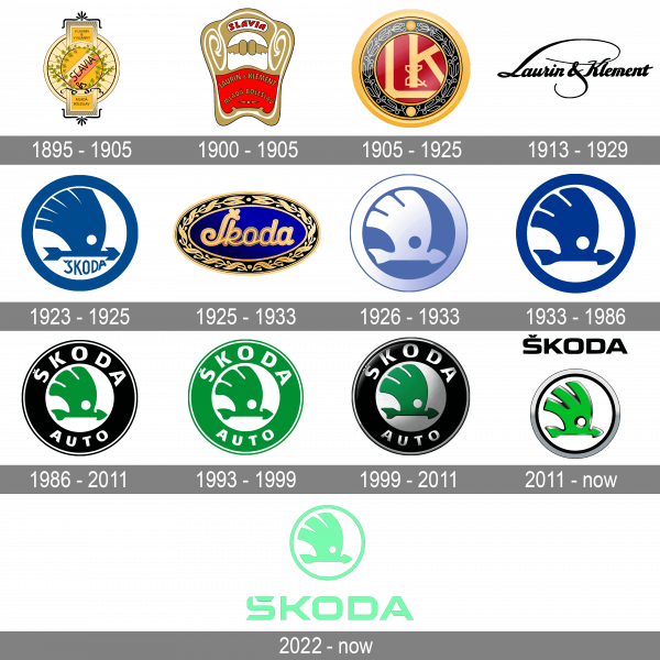
1895 – 1905
The round shape of the logo was chosen back in 1895, when the main symbol was a wheel decorated with linden leaves with diagonally placed font writing of the name of the company.
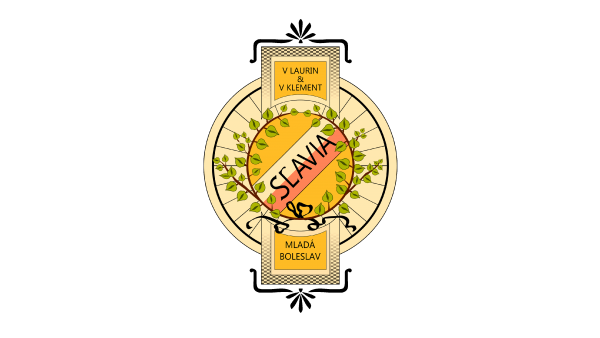
1900 – 1905
The badge, introduced by the company in 1900, featured an elegant trapezoid badge in gold, red and white, with the ornate upper part, which contained a small white banner with the bold red “Slavia” lettering, and the arched golden “Laurin&Klement” and “Mlada Boleslav” inscriptions set against a red background
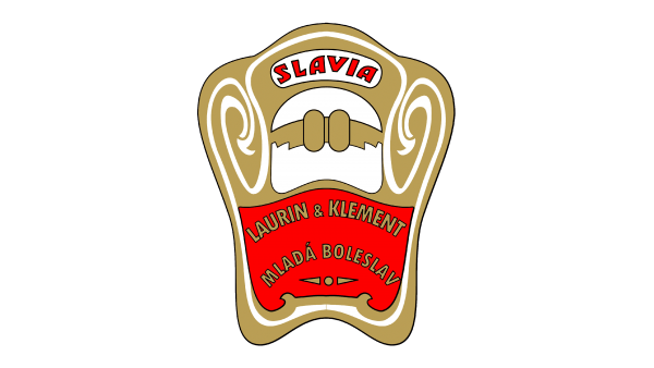
1905 – 1925
Later, the name Slavia disappeared from the logo, the names of the founders of the company (Laurin & Klement) disappeared, and the linden tree was replaced with laurel, and only in 1926 the new brand demanded a new name.
1913 – 1929
The logo, used by the company from 1913 to 1929, featured an elegant cursive “Laurin&Klement” lettering in a fancy custom cursive, with the elongated tail of the “L”, and the line of the ampersand, curved under the inscription and balancing the top part of the logo.
1923 – 1925
The first depiction of the iconic winged arrow was introduced by Skoda in 1923. It was drawn in solid blue against a white background, and enclosed into a thick blue circular frame, being accompanied by a stylized uppercase logotype in a handwritten sans-serif font, written under the straight line of the arrow.
1925 – 1933
Another badge, created for the automaker in the 1920s, featured a horizontally oriented oval in electric blue, with a wide golden frame, decorated by a leafy ornament. The logotype was written in a title case of a bold elegant cursive, also in gold.
1926 – 1933
The version of the Skoda logo, designed in 1926, introduced a modernized winded arrow, executed in a gradient white and blue color palette, with no lettering on the badge. The badge looked voluminous and sleek, making the brand stand out on the list of its competitors
1933 – 1986
The redesign of 1933 has made the Skoda logo flat and bright, drawing both the arrow and the framing in plain electric-blue, with the deep color perfectly contrasting with the white background. It looked bright and powerful and had no lettering on it either.
1986 – 2011
In 1986 the color palette of the Skoda logo was changed, with the winged arrow being redrawn in bright green, placed against a white background, and enclosed into a wide black frame with a white “Skoda Auto” logotype written around its perimeter in bold sans-serif capitals.
1993 – 1999
Although most of the elements of the Skoda emblem stayed unchanged, it looked very different. The company decided to remove the black color from its logo and replaced it with green. They used the same shade of green that is used in the emblem introduced in 1986. The new white and green color palette made the logo brighter, but it lost its sophisticated and rich appearance.
1999 – 2011
The Skoda badge became three-dimensional, with all white elements turning gradient silver in 1999. As for the composition, it remained untouched, but due to a new color palette, the logo became more elegant and sophisticated. This badge stayed in use by Skoda until 2011.
2011 – now
The redesign of 2011 has introduced a new cool badge, with the arrow redrawn in a bright, almost acid, shade of green, outlined in gradient silver, which made it voluminous, and placed against a white background, being enclosed into a double black and silver frame with no lettering on it.
2022 – Today
The redesign of 2022 has introduced a cool minimalistic version of the iconic Skoda badge in a modern color palette. The new Skoda green is much lighter than all the previous hues and looks very futuristic and innovative. As for the logo itself, it is composed of an arrow emblem in a fistulae frame, placed above an enlarged capitalized logotype, wi all the elements drawn in bold flat lines, in one color.
Symbol

The main symbol of the Škoda logo, since 1926, was a symbolic image of the “head of an Indian with feathers,” which later became a “winged arrow”. In both cases, this is a symbol of success in competition, credibility and, undoubtedly, speed.
Font
The first font on the logos of Škoda resembled classical calligraphy. Being placed in the center of the logo, it attracted special attention already thanks to its restraint and embodied dignity. And the letters connected with each other in a single calligraphic design testify to the integrity of the brand, its attentive attitude to the products created in all the details.
Later the font became more restrained and even, but better readable. In today’s logo, it is outside the image, and is no longer dependent on the graphic element, as it was, for example, in the 1999 version (the text was an element of the logo, being placed along the contour of the image).
Color
The basic background of the Škoda logo remained unchanged from 1926 – white or silver. But the color of the image itself – from blue to green – changed only in the 1990s. In the modern logo, unlike the version of the 1990s, the influence of black color decreased, – the black border on which the font writing of the brand was placed, was replaced with a thin line. But the black “shadow” appeared on the logo itself, making the “arrow” more distinct and noticeable.


