
![]()
| Native name | Ferrari N.V. |
| Founded | 1947 |
| Founder | Enzo Ferrari |
| Headquarters | Maranello, Italy |
| Official Site | www.ferrari.com |
| Official Facebook Page | www.facebook.com/Ferrari |
Ferrari is the name of an iconic Italian manufacturer of luxury cars. The company was established in 1939 and named after its founder, Enzo Ferrari. Today the cars of the brand are synonymous with the best vehicles in the world’s automobile industry.
Meaning and History
![]()
The history of the logo Ferrari with a horse standing rampant on the yellow background is not less interesting than the success story of all the company.
The Italian pilot Francesco Barakka, who is rightfully considered the ace in times of the First World War, was the author of Ferrari’s logo. The symbol of the rampant stallion appeared on his plane as reminders about the fact that the whole air squadron was put together from the cavalry unit. Also, the author of Ferrari’s logo Francesco Barakka himself was one of the best riders and a passionate horseman. The famous pilot won many air duels, but his aircraft was shot down in 1918 by Austrian troops by a gunfire from a fighting trench.
The first version of Ferrari’s logo was designed 13 years before the company was established. In 1916 Count Francesco Baracca painted a prancing stallion on the fuselage of his fighter plane. In this way, he celebrated his first victory against the Austrians. In two years the number of aerial fights he won equaled 34, and he was often called “The Cavalier of the Skies.”
The new border in the history of Ferrari’s logo began on the 23rd of May, 1923, when the mother of the Italian pilot Francesco Barakka presented the emblem of her son to the car racer Enzo Ferrari, who had a cap for Alfa Romeo’s team and it was rather successful. Enzo Ferrari promised the mother of the pilot that he would use the logo with the rampant stallion on his racing car in the hope that it would give him as many victories over enemies as her son had. In 1932, the management of the Alfa Romeo Company permitted the Italian racer to depict the black horse on the racing car. But Enzo Ferrari corrected the emblem a bit having added the yellow background, which symbolized the color of his hometown Modena.
That year the Alfa Romeo Company left the competition, and Enzo Ferrari established his team together with a plant Alfa Romeo team under the name of Scuderia Ferrari. Therefore, the story of Ferrari’s logo began from Alfa Romeo’s racing race cars. It is worth noting the best friend of pilot Francesco Barakka who for many years fought side by side with him in the same regiment used the rampant horse on Ducati motorcycles. However, after the glory of Enzo Ferrari began to rise he took a back seat. The symbols of SF (Scuderia Ferrari) on the Ferrari’s logo, in a translation from Italian, it means Ferrari stable. The logo Ferrari was attached to the first racing car of the Italian company in 1946.
The car Ferrari 250 GTO of the 1963 year of production is the most expensive car in the world. In this time 36 cars were let out from the conveyor, the price of each car was 18.000 dollars. In 1985, at the Sotheby auction, Ferrari 250 GTO was sold for over 10 thousand pounds. Three years later, an American businessman acquired a similar red car with the logo Ferrari for over 2 million dollars. In 1994, Ferrari 250 GTO of 1963 set a new record; it was sold for 13,3 million dollars. For the last time, when Ferrari 250 GTO 1963 was put up for bids, the organizers got 15,7 million pounds for it. The economists calculated that it is 30 times more profitable to invest money in these cars than to make investments in gold.
However, Ferrari’s logo can be met not only by race or sports cars. It is present on such items as a sport exercise equipment (Ferrari Unica), Ferrari’s silver 5-dollar coin, a collection of Scuderia Ferrari and Cavallino audio, a motorcycle, and wristwatch from Officine Panerai.
1923 – 1929
![]()
The prancing horse was the key element in the brand’s identity from the very start. The only difference is that it was facing a different direction than what everyone is used to seeing. The predominantly yellow and black color palette also appeared several years later. Initially, the company used a metallic silver color that created a sleek and refined image. The highlights and darker parts made it appear that the horse along with a shield base was not flat.
1929 – 1931
![]()
The very first Ferrari badge featured a shape of a traditional crest, with a sharp bottom line, and a triangular top part. The body of the logo was set in bright yellow, while the top part featured red, white, and black stripes, balanced by a thick black outline of the badge. The main hero of the logo was a black stallion, depicted vertically and facing to the left. Two elegant handwritten letters, “S” and “F”, were placed on the sides of the stallion, at the bottom of the emblem.
1932 – 1940
![]()
The redesign of 1932 has flattened the top part of the Ferrari logo and changed its color palette to the Italian flag tricolor. Now the stripes got a bit thicker and were colored in green, white, and red. As for other elements — they stayed in their places and their colors but got the contours slightly refined.
1940 – 1945
![]()
The stallion got wings and the crest turn into a circle in 1940. Now the creature was drawn in black-to-gray gradients, and was facing to the right, placed a bit diagonally and overlapping the circular background. As for the roundel itself, it has a gradient orange central part and a thick yellow framing, where the bold black “Auto-Avio Construzione” inscription in geometric serif font was written. On the sides of the frame, two Italian flags were placed, dividing the lettering into two parts.
1945 – 1947
![]()
The rectangular shape of the logo appeared during the postwar time. The company also kept a version with an arched top, but now it is clear which version won. The logo featured a bright yellow background with a black prancing horse as well as the banner at the top that used the colors of the Italian flag. The horse shape was slightly redrawn, but the overall look was preserved since the early years of the company’s existence. The brand also experimented with the name at the bottom of the emblem.
1947 – 1951
![]()
The first rectangular Ferrari badge saw the light I’m 1947. The composition fully repeated the first two emblems of the Italian automaker, but the stallion was redrawn in a more confident and modern manner. Also, instead of the SF initials, there was now a complete logotype, written in black bold lines under the horse. The top part of the vertically oriented rectangle was still decorated with green, white, and red stripes.
1951 – 1960
![]()
The redesign of 1951 slightly modified the contours of all the elements on the Ferrari badge, outlining everything in silver metallic, which added some volume to the composition and made the logo look more sophisticated and elegant.
1960 – 1981
![]()
The Ferrari brand continued to perfect its logo. Although it kept the name untouched, the horse was slightly redrawn. It is not obvious right away, but the tail now features thinner lines, while the mane has a more groomed appearance. The animal still has the same strength, determination, and grace about it. In addition, they made the green line in the banner at the top darker, which made the flag more balanced.
1981 – 2005
![]()
The stallion and the lettering were refined again in 1981, with the rectangular badge gaining a thick silver frame. As for the silver outlines of the elements, it became a bit thinner, so all the black details got brighter after this redesign.
2005 – 2010
![]()
The redesign of 2005 kept the iconic logo’s composition and color palette untouched, but all of the elements were strengthened and brightened up. The silver lines got replaced by thin black ones, which added more contrast and looked cleaner than on the previous versions of the Ferrari emblem.
2010 – now
![]()
In 2002 Ferrari badge gets one more redesign, with the yellow color of the background enhanced, and the black lines on the top part of the logo, with the Italian flag, removed. The badge started looking lighter and more elegant, representing the brand at its best.
Font
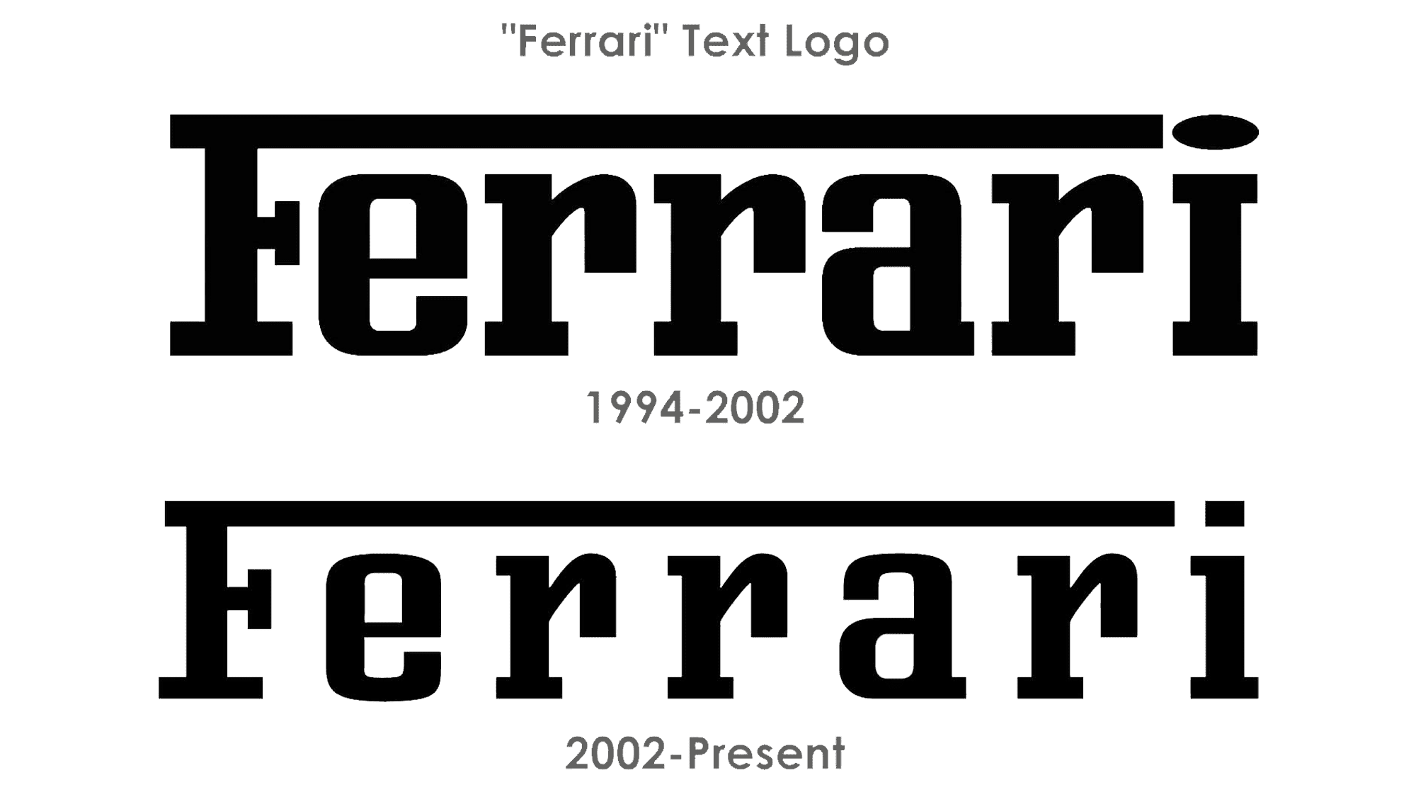
The iconic Ferrari lettering is, probably, the most recognizable auto logotype in the world. The elongated bar of the “F”, roofing all the lowercase letters, is recognized by people from all over the globe. As for the font, closest to the one used for the Ferrari visual identity, it is Kairos Pro Condensed Medium or Bourgeois Slab Bold Condensed, but with the contours and massive serif softened.
Symbol
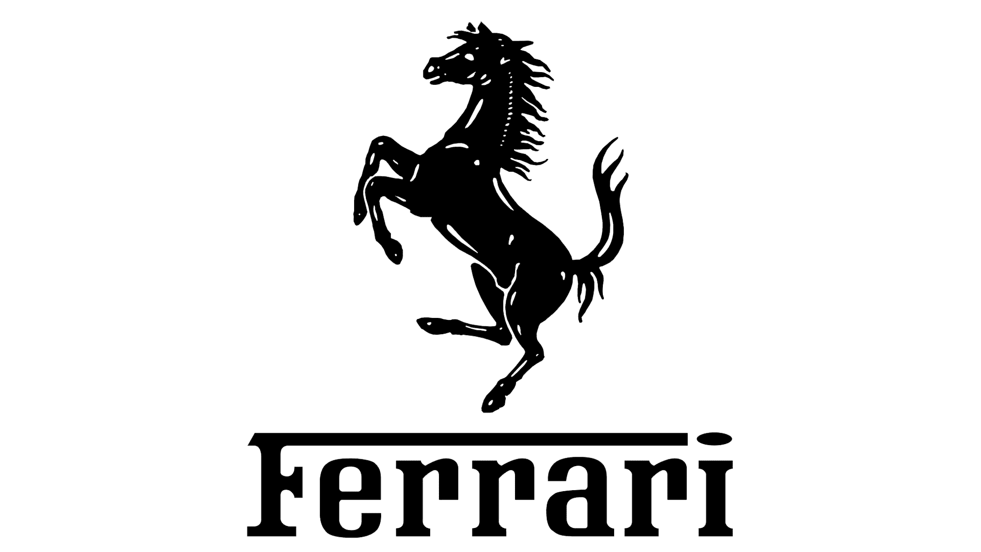
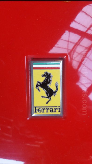
Ferrari’s logo consists of a symbol of rampant stallion on the yellow rear ground usually with SF letters. SF is denoting Ferrari Scuderia. The emblem of Ferrari is known and is well acknowledged by everyone and, especially, by admirers of car races.
The name Ferrari and its logo are associated with a feeling, which we experience at a great speed, and with sports cars.
Why does the Ferrari symbol have the same horse as Porsche?
The two rivaling automakers, Ferrari and Porsche, have so many similarities in their logos that it looks as if one stole the design from the other. Some experts assume that this was actually the case, and one of the companies decided to tease its rival. Yet, a mere coincidence is also very likely.
![]()
One more possible explanation is that the Ferrari symbol might have the same origin as the Porsche symbol. Porsche copied the coat of arms of its hometown, Stuttgart. Ferrari copied the emblem a German pilot Baracca used on his planes, which in its turn was inspired by the coat of arms of Stuttgart.
Emblem
Fabio Taglioni also used a prancing horse in his Ducati motorbikes. Ducati even had an explanation for this fact. The legend has it that Taglioni’s father was acquainted with the German pilot, whose emblem inspired the Ferrari emblem, and even fought with him in the 91st Air Squad. In the course of time, however, designers from Ducati decided to abandon the prancing horse logo.
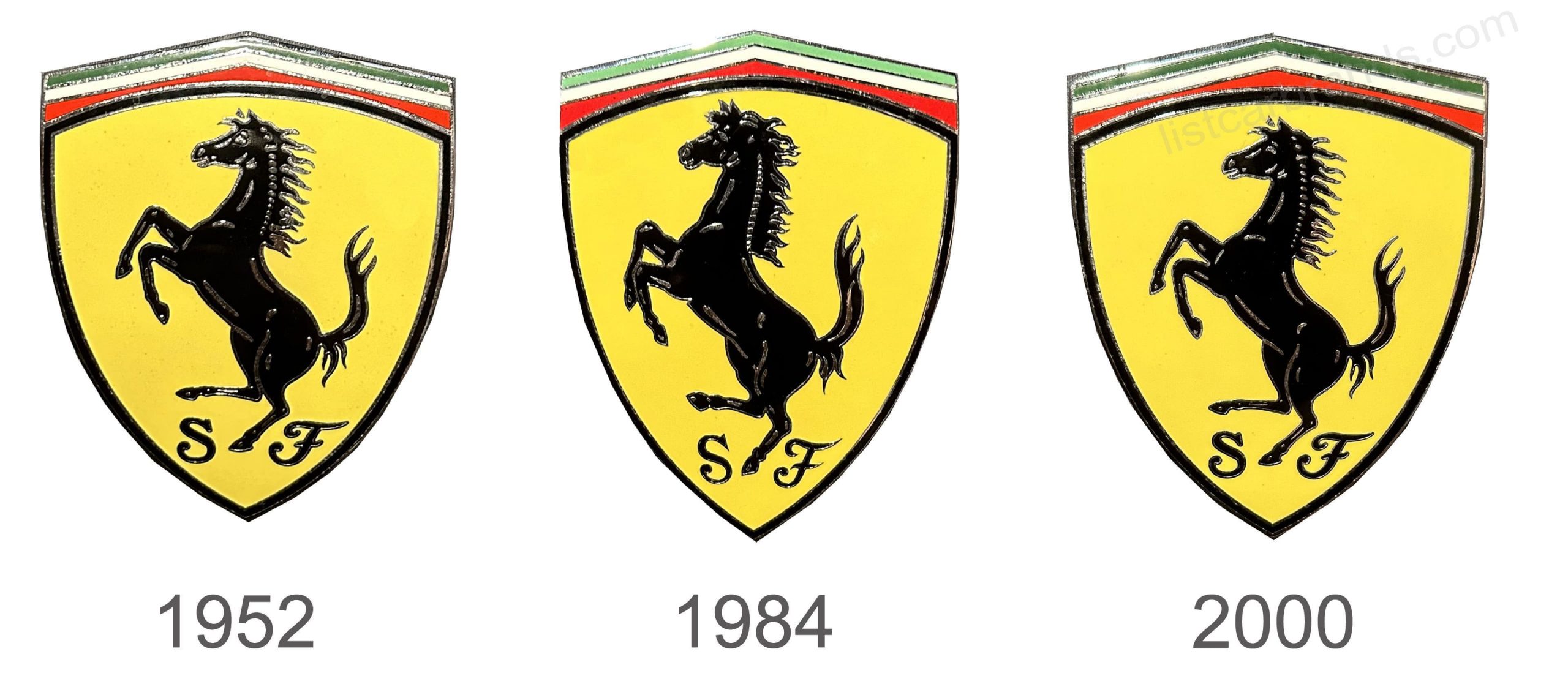
1952
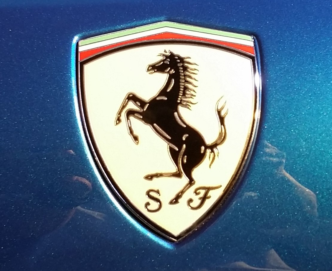
Founded by Ferrari around a century ago, the racing team and later a whole was named Scuderia Ferrari. The design of the shield, which was inspired by the coat of arms of Barakka, acquired the modern look familiar to us: a horse standing on its hind legs, with its tail raised up, against a golden background (the historical color of the founder’s hometown – Modena). Later, the national colors of Italy were added.
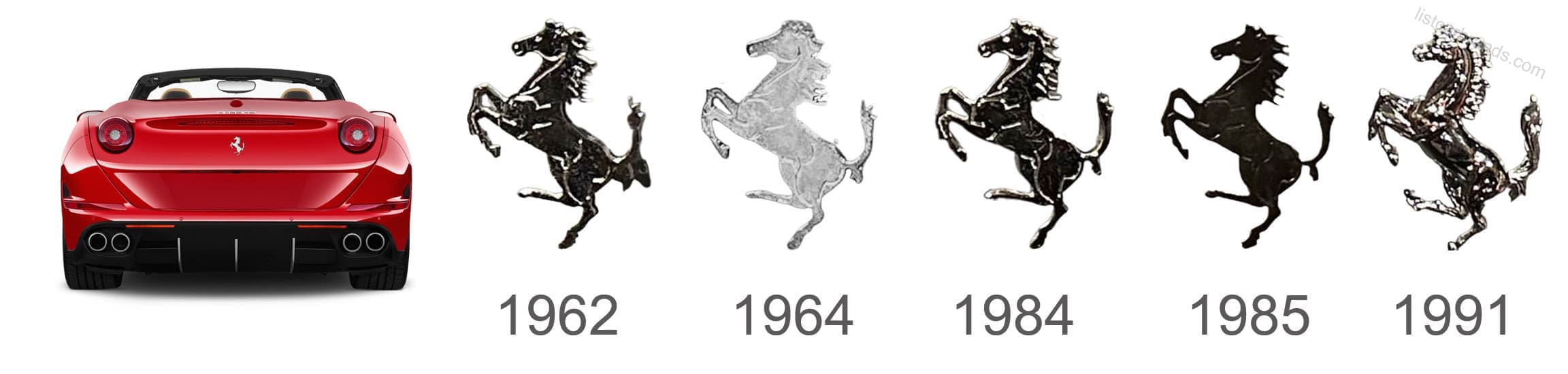
1984
A majestic, redrawn horse was featured on an updated logo. It looked splendid as the features were more defined and the horse appeared stronger. In addition, it was standing taller, so the shield was more elongated as well to create a balanced emblem.
2000
Although the previous logo was used by the brand for quite some time, it was decided to bring back an emblem that was even more familiar. The emblem created in 19952 was used again without making any noticeable modifications.
Colors
![]()
The Ferrari logo has the colors of Italian flag: green, white, red. Yellow and black colors are as additional ones. All these colors represent prestige, strength, dominance, and charm of the Ferrari brand.
The Ferrari logo uses a handwritten custom typeface.
The famous emblem, a stallion that reared up in a yellow background, is a true indicator of luxury. And exclusive things with Ferrari’s logo have high demand of all luxury red car fans.
![]()
![]()
![]()
![]()
![]()