| Founded | 1945 |
| Founder | Jamnalal Bajaj |
| Headquarters | Pune, India |
| Parent | Bajaj Group |
| Owner | Fiat Chrysler Automobiles |
| Official Site | www.bajajauto.com |
The automaker Bachraj Trading Corporation Private Limited began its work on November 29, 1945.
The primary goal of the young company was the supply to India of 2 and 3-wheeled wagons. Own company logo was not concerned with the company, limiting the use of blue for the name of the company.
History
The Bajaj brand was created only in 1972, to promote the company’s own motor vehicles to domestic and foreign markets – motorcycles, mopeds, scooters, cars. In 1959 the company received a license for the production of motor and automobile equipment, and began production, the main task of which was the creation of compact and critically cheap vehicles for the domestic market.
The first scooter, Bajaj Chetak, was released in 1972, and during this period, the acquisition of its own brand identity for the company was principled.
The Bajaj brand is considered the creator of the first ATV manufactured in India. That was Bajaj RE60. This is no longer a tricycle, but it is not a car, although it can be argued with the latter because it is difficult to find differences outwardly, for it resembles a small hatchback. Compact and sufficiently protected (there are seat belts), Bajaj RE60 can move both on gasoline and on liquefied gas. But most importantly – the cost of this baby is a record low and does not exceed 2.5 thousand dollars, which is especially important for the Indian, as well as for other emerging economies.
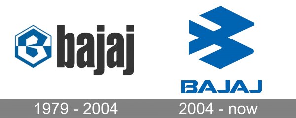
1979 – 2004
The first logo appeared in the company roughly in the early 1970s and was a stylized letter “B,” in blue and included in the circle. Subsequently, the circle gained volume, further harmonizing the logo.
The brand logo actually changed one day – in 2001, when besides manufacturing, the manufacturer intensified the export of its products. In the light of such changes, the need for the original brand logo became an urgent necessity, and the company’s management turned to professional designers.
2004 – now

With the redesign of 2004, the concept of the Bajaj logo was completely changed, and only the color palette of the emblem from the previous version of the badge was taken to the new image. The new concept features a bold uppercase logotype in a custom sans-serif typeface, placed under a large emblem in the same shade of blue. The emblem of the automaker features an interesting element, which looks like a geometric bird flying to the right, and also looks like a stylized letter “B”.
Symbol
The first logo of the company for almost three decades of existence has won an absolute trust of consumers. However, in 2001 it was time for a change, and the owners of the brand trusted the design studio Elephant Design. From the harmonious, enclosed in a circle or even the sphere of a symbol, designers created a dynamic and stylish, more than independent and recognizable sign with a deep content. In fact, it’s all the same as the first letter of the brand, but it’s already quite different. The dynamics of the image are fascinating and allows you to attach your story to the success stories of the company.
Font
Formally, the font logo was changed in principle only in 2001. From a fairly ordinary, quite symmetrical, but noticeably geometric, with protruding elements of letters, it turned into a steady-rhythmic one, each letter of which acquired completeness and seemed to be enclosed in an invisible square. The brand, thus, has found the missing solidity and self-confidence.
Color
The color solution of the logo in the history of the brand has not fundamentally changed. Generally, it is difficult to overestimate the sign of blue for the company and Indian culture. Its symbolism, poise, and depth, throughout the whole period of the brand’s existence, was aimed at forming a positive and trusting attitude towards the manufacturer.


