
![]()
| Founded | 1991 |
| Founder | John Hennessey |
| Headquarters | Houston, United States |
| Official Site | www.hennesseyperformance.com |
| Official Facebook Page | www.facebook.com/hennesseype |
In the history of automobile production, the brand Hennessey will remain as one of the most original and creative. And all because its founder – professional racer John Hennessy, paid special attention to several major factors – aerodynamics, as well as speed and stylish design.
Meaning and History
![]()
The brand was created in 1991, when John Hennessy registered his tuning studio, specializing in improving sports cars of Japanese brands Honda, Nissan, Toyota. At the same time, under the Hennessey brand, a network of service stations for “high-speed cars” was organized.
Subsequently, Hennessey became the official tuning studio of Ford, and was also involved in the development of a new generation of sports coupes Nissan.
Symbol
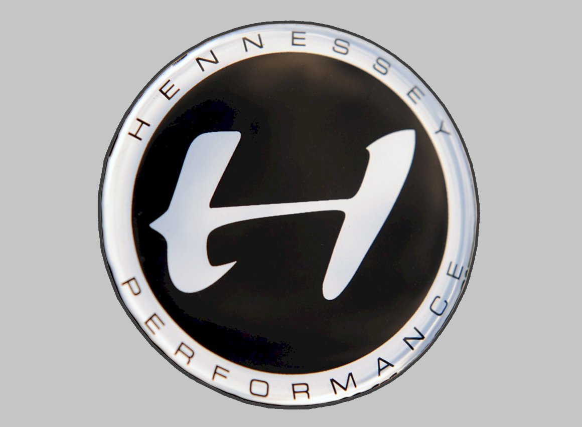
Speed was and remains the first and main symbol of the brand. However, since for the brand and also for the logo, something tangible is required, then as a symbol of speed, a special font was chosen, which depicted the brand name. Its location is at an angle, its sharpness is smeared, as if with a quick letter, thanks to which they managed to create a sense of dynamics and accelerated tempo is created.
However, subsequently the logo was changed in favor of a more standardized one, and only the first letter reminds of the first short stroke
Emblem
The Hennessey logo was the capital letter of the brand name, enclosed in an oval, and subsequently, with the improvement of the logo – it became a circle. It is placed on a black background in silver color to emphasize the contrast. In addition, silver in heraldry (and, as a consequence, in the later art of creating logos and emblems) is a symbol of nobility and aristocracy
Font
![]()
In the first version of the Hennessey logo, the font strongly resembled a handwriting, slightly careless one. This was done intentionally to emphasize the main mission of the brand – speed, but at the same time, a safe speed. Subsequently, the name moved to the outline of the emblem, and the font changed in terms of greater clarity and readability. However, even today the original font is sometimes used – if it is more appropriate to use only one brand name, but not a full logo.
Color
![]()
The background color of the logo is black. The color of the image – the logo itself – is silver. Consecutively, the silver color is used for the brand name, in case it is necessary.