| Founded | 1907 |
| Headquarters | Osaka, Japan |
| Parent | Toyota Group (100%) |
| Subsidiaries | Perodua (25%) |
| Slogan | “We Do Compact” “We Make It Compact” |
| Official Site | www.daihatsu.com |
Today, the Daihatsu brand belongs to Toyota, but its history has not always been associated with this auto giant. However, even while still independent, the manufacturer has successfully entered the international automobile markets, and, for example, the mini-vans of Daihatsu are in fact considered lawmakers of automotive fashion in Europe and Asia.
Meaning and History
The company was established in 1907 as a small company for the production of natural gas engines. The “green” theme was of fundamental importance for the founders of the company – professors of the University of Osaka Turumi and Yoshinki. The original name of the company is Hatsudoki Seizo Co., Ltd., and the first logos were focused on the innovative nature of production. The first logo shows a wheel with internal blades and a central Latin letter E (engine). However, in 1941, with the entry of Japan into World War II, the central element was changed to a hieroglyph – a unique phenomenon in international branding. After the defeat of Japan and its demilitarization, the previous logo, created in 1907, was returned.
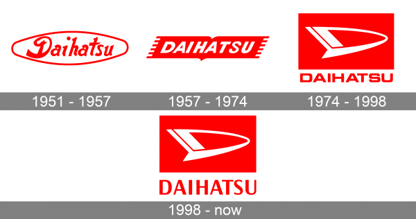
1951 – 1957
In 1951, the company was renamed to Daihatsu, which led to a drastic change in the logo. The main element was the textual writing of the brand, formed into an oval. The next change in the logo occurred in the mid-1960s, when the company entered the international market, and began working with Toyota. The main element was a strongly stylized liter D, stretched horizontally, as in the previous logo – an oval. Since that period, the graphic part of the logo has not changed.
1957 – 1974

The redesign of 1957 has made the Daihatsu logo stronger and tighter, although the color palette wasn’t changed. The new badge comprised a solid red horizontal banner with some stripes on the sides and small sharp detail in the center of the bottom line, which made the whole elements look like a stylized bird. The white uppercase logotype in the italicized sans-serif typeface was written along with the banner, taking all the place.
1974 – 1998

In 1974 the Daihatsu logo was redesigned again, still using the same red and white color palette, but completely changing the composition of the badge. It was now a solid red square with the styled white Letter “D” set on it slightly diagonally and accompanied by the bold red inscription in sans-serif, placed under the emblem. The logo looked stable and confident, representing the strong sides of the Japanese automaker.
1998 – now

The redesign of 1998 has kept the emblem and the color palette of the Daihatsu badge unchanged but switched the typeface of the lettering. The new inscription is set in the uppercase of a traditional bold sans-serif font with tall letters placed at a significant distance from each other. That added some air to the composition and made the logotype an equally-important part of the whole structure.
The Daihatsu logo, almost the only one in the Asian automotive industry, used the Japanese character instead of the ever-present Latin alphabet. True, the company itself does not like too much to remember this period – it was during the Second World War. After the unfavorable ending of the military conflict for Japan, the company returned to the original visual image based on the Latin alphabet.
Symbol
Formally, the Daihatsu logo lacks a symbolic image. However, in reality the special form of the capital letter itself is more than symbolic. With a clear focus, the logo is dynamic in itself – including, due to the “floating” thickness of the line in the logo, as well as sharp corners. At the same time, the images are fairly stable and easily “read”, which gives the structure a sense of stability and security.
Font
The font of the Daihatsu logo in the sample from 1951 strongly resembles a hieroglyphic Japanese letter. Subsequently, complex, individualized fonts for the company logo were no longer used. But in the 1960s, when a new logo appeared, it was the game with fonts and color that became the central theme of the changes. The font from “square” gradually becomes more “slender”, however uniformity, including uniform thickness of lines of a font is kept. Being placed under the graphic image, the font writing of the brand is a reliable basis for graphic design.
Color
The Daihatsu logo today often appears in a monochrome solution, using either classic black (a symbol of conservatism and confidence), or red (dynamics and development), or silver (speed and innovation).


