| Native name | トヨタ自動車株式会社 |
| Founded | 1937 |
| Founder | Kiichiro Toyoda |
| Headquarters | Toyota, Aichi, Japan |
| Divisions | Lexus Scion |
| Slogan | “Let’s Go Places” |
| Official Site | www.toyota.com |
| Official Facebook Page | www.facebook.com/toyota |
Toyota is one of the world’s largest automaking companies; which was established in Japan in 1937, and today has its sedans and SUVs distributed all over the globe, through dozens of its subsidiaries on different continents.
Meaning and History
Each big company is from time to time forced to harmonize its logo with time, philosophy of the brand, as well as with its own purposes.
Based on the main visual, image one can trace a history of the development of a company itself, as well as of world marketing and design. And sometimes this striving ahead is united with interesting or amusing stories.
Success and an easy to pronounce name played a significant role in Toyota to make a creation in 1936.
The story of the creation of the Toyota logo which begins since the end of the 19th century when a factory for the production of looms under the direction of Kiichiro Toyoda was created is very unusual. He produced the textile machines licenses, many of which (in particular, those for the manufacture of knitted cloths) were sold abroad. But Toyoda since his childhood dreamed of automating the weaving process but was forced to leave his own factory in 1909, because the shareholders deemed his inventions and ideas unprofitable for an enterprise.
In 1930, Kiichiro Toyoda had continued the father’s business and also focused on family innovation talent in the automobile industry, and already in 1936, the first Toyota A1 car left the conveyor.
Then Kiichiro Toyoda which became the founder of the carmaker announced the contest for the best logo for Toyoda. More than 20,000 requests were received, and the best got an emblem from the letters of the katakana in stylish design which transmits speed and perfection of the produced product.
Then the word Toyoda turned into Toyota, which was more attractive from the point of view of design. At such writing, the number of strokes necessary for reproduction of the emblem is equal to 8, and this number is considered fortunate, promising continued and ever-increasing prosperity.
Well to resume, Toyota became popular worldwide when the older son of the owner of the Toyoda Automatic Loom Works Company took up the production of cars. They decided for money from the sale of patent rights to spinning machines to release cars. The Model АА car and the Model G1 truck became the first cars of this make. This significant event occurred in 1936, just then these models were put into production. The first trucks were sent for sale to Northern China. And in 1937, people could admire a separate building of the Toyota Co. Ltd company occupying only with the production of cars of this known make.
But this story began before the war. And what happened to a company in postwar years? Of course, everyone understands everything went the right path. Thus this make actually won the title of the most popular car among car enthusiasts. In 1947, the Toyota Model SA was produced by the company. The financial crisis that occurred in 1950 did not strongly affect the development of the company. And after the business of the company developed successfully. In 1952, the creator of the company died, but it did not become the cause of a break-up of the company, on the contrary, precisely these years became the beginning of the progress.
In subsequent years, such cars as Toyota Corona (this vehicle got a great success in the US car market), Toyota Corolla (the most widespread car, widely used by Toyota lovers), Toyota Celica, Toyota Carina, Toyota Tercel were produced. The jubilee year 1972 went anniversary for history of the company, exactly this year 10 million cars of the Japan make were manufactured.
Toyota, although in the 80s was the known world brand in the consciousness of buyers remained a car manufacturer for a middle class. Simplicity and efficiency of the step made by Toyota to carve its way to the class of elite cars. Otherwise, this step can be called the tricky move!
The class of cars designed for a narrow audience of wealthy buyers was separated. Such people see the priority in the celebrity of the auto which they drive. And in 1986, Lexus unit oriented towards the manufacturing of such cars was opened. As it is known, Toyota’s tricky move paid off fully.
At present, Toyota is the largest producer of cars in the world, it is still faithful to the principle of kaizen, continuing to refine. The company managed for the first time in 76 years fire from the throne the leader of Americans from General Motors. But Toyota is opening for itself new horizons intending, in particular, to declare itself in the world of robotics.
It is also worth noting, interesting approaches in management appeared due to the Toyota Company. One can mention at least a system of «just-in-time» delivery and kaizen. So the name of the company is familiar to everybody. Besides, it became the main engine of all the economy of Japan in the previous century.
Today, more than 320 thousand people work for Toyota, the company’s turnover is more than 200 billion dollars, and the net profit is more than 2 billion. The Japanese giant takes the eighth place in the list of Fortune Global 500 – the biggest world companies. To such a success the company is obliged to the business principles which were pledged for it also by founders and to Japanese nation features as diligence, persistence, striving to learn.
Today, the Toyota Company engages not only in the production of cars. It is manufacturing diverse production, starting from robots and ending with the erection of elite cottages. But, of course, the chief one is the cars manufacturing.
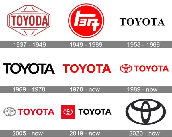
1937 – 1949
The very first Toyota logo was designed in 1937 and stayed unchanged for the first decade of the company‘s history. It was a red and white banner with the bold “Toyoda” lettering written across a thinly-contoured Diamond-like figure with small straight accents.
1949 – 1989
The redesign of 1949 introduced a Toyota badge; which has been used on the National market until the end of the 1980s, along with several international emblems, created during those years. It was a solid scarlet-red roundel in a white outline, with the stylized white inscription set on it.
1958 – 1969
The logo, designed in 1958, featured a simple yet elegant uppercase black inscription in a classy and elegant serif typeface with stable thick lines and elongated pointed serifs. The badge was used by the automaker in its international markets for more than ten years.
1969 – 1978
In 1969 the Toyota logo gets redesigned again, with the black logotype getting larger, and its serif typeface switched to a modern al medium-weight sans-serif one. The letters in the inscription were placed close to each other, which made the badge look a little imbalanced and amateurish.
1978 – now
The typeface of the logotype was changed again in 1978, with the letters getting a bit smaller, the lines — thicker, and more space between the characters. The color of the badge was changed from black to red, creating a powerful and bright image. This badge is still used by the company.
1989 – now
The first depiction of the iconic Toyota emblem appeared on the badge of the company in 1989. It was drawn in elegant red lines and placed on the left of the logotype, introduced in 1978. This badge is definitely the most famous of all Toyota insignias, created over the years.
2005 – now
The redesign of 2005 has made the iconic emblem three-dimensional, executing it in thick voluminous lines in gradient silver. The logotype remained untouched, set on the right from the graphical part in bold red capitals, adding a sense of vitality and motion to a cold elegant emblem.
2019 – now
Another version of a flat Toyota badge was created for the Japanese automaker in 2019. The emblem was now drawn in white lines over a solid red square, placed on the left of the bold sans-serif logotype, which was now written in black but kept its clean and modern typeface.
2020 – now
In 2020 the Toyota logo was simplified to just a flat black emblem, which was enlarged and placed against a plain white background. No lettering, no framing, no bright accents — the badge follows all the latest minimalistic trends in visual identity design.
Description
The Toyota concern is directly related to looms. Such a version that the Toyota logo is not anything other than a thread located into a needle is a trace of history- a spinning factory.
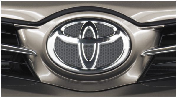
But the concern itself is interpreting its logo otherwise. As everyone knows the Japanese are lovers of the frenzy of signs. Visually, Toyota’s symbol is like a cowboy in a hat; there are 3 geometrical figures – ellipses. Across an intention of Japanese, the central ellipse (the small one) is that it is the «heart of a customer», agree, it is pleasant to realize yourselves in the spotlight… Good sports, excellent play in the direction of a customer. The horizontal ellipse is «the heart of offered goods». The largest element including a logo component, completing «the idea of the development of technology, great possibilities, and new prospects».
And, lastly, many manage to «see» the encoded brand name in this emblem. Some logos of known brands have hidden messages in themselves. Design of the Toyota logo also contains the car brand name. The T, O, Y, O, T, A letters are in the limits of the emblem of Toyota. The space serving as the background contains an idea of the global expansion of Toyota’s technology and its boundless potential in the future.
In 2004, the brand name was modernized and became three-dimensional. An expression of the main promise – a superior quality – became the development goal.
In 2005, after an appearance of a new emblem on Toyota AYGO cars the Toyota brand name underwent corresponding changes. Proportions of the emblem were slightly changed.
Symbol
The story of the Toyota symbol wouldn’t be complete without an explanation of the front mascots used on specific cars. Let’s begin with the one that appeared on the G1, which is the first vehicle in the company’s truck range. The symbol consists of two elements: the kanji mark “Toyoda” and the symbol of Nagoya, where Toyota was created.
Emblem
One more Toyota mascot was used on the model AA, the company’s first passenger car vehicle launched not long before the World War II. The Toyota emblem also consists of two parts. The first one is the wings, one of the most popular symbols of speed. The second element of the mascot is kanji “Toyoda.”
Font
The clean modern uppercase logotype from the primary Toyota badge is set in a modern sans-serif typeface with perfectly balanced shapes and spaces. The straight lines and cuts of the characters add professionalism and expertise to the company’s characteristics. The closest fonts to the one, used in this insignia, are, probably, Giga Sans Bold and Arazati Extranegra Condensada.
Color
Today the emblem is the three-dimensional image, made in color of silver metallic. The logo is made in color called “Toyota the Red” to emphasize this color’s belonging to the Toyota make. Since 2005, the color acquired a great depth.
Toyota Supra logo
The Toyota Supra logo was borrowed from the original Celica symbol. The only major change was the choice of color: the emblem was blue, not orange, like the original Celica. This version of the logo was in use until the beginning of 1986. With the launch of the A70 Supra, a new symbol was introduced. It featured orange writing on a red background, but the dragon was gone.
Toyota Tundra logo
The full-size pickup truck produced in the US proved to be rather successful. It was one of the nominees for the North American Truck of the Year award. Talking about the Toyota Tundra logo, we should definitely compare the symbols of the TRD and the TRD PRO. The TRD PRO emblem can be seen on the sides of the pickups bed, while TRD symbols have a different location (the shift knob, center console, and floor mats).
Toyota Camry logo
The Camry enjoyed an incredible commercial success; it is sold all over the world. Initially, it was a narrow-body model, but then the body grew wider, so the cars now fit the mid-size standards. The most recent change of the Toyota Camry logo occurred in 1991: from that time on the badge includes the new corporate logo (three ellipses).
Toyota Prius logo
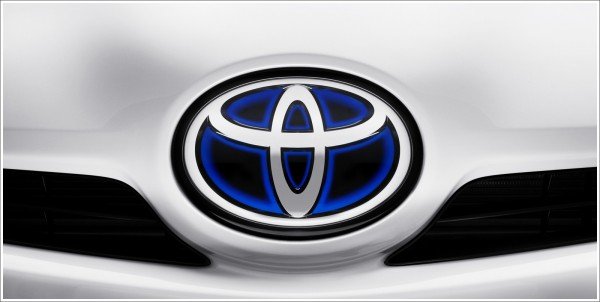
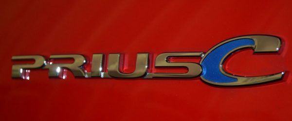
The first car sold under the Prius nameplate was a compact sedan, but today this name refers to a full hybrid electric mid-size hatchback. The 2016 “ECO’” version is considered the most fuel efficient of all the gasoline-powered cars sold in the United States (plug-in cars are not included in the ranking). Cars from this range are recognizable by the golden “Prius” lettering.


