| Founded | 1950 |
| Founder | Instituto Nacional de Industria |
| Headquarters | Martorell, Spain |
| Slogan | “Technology to Enjoy” |
| Parent | Volkswagen Group |
| Official Site | www.seat.com |
| Official Facebook Page | www.facebook.com/SEAT.Official |
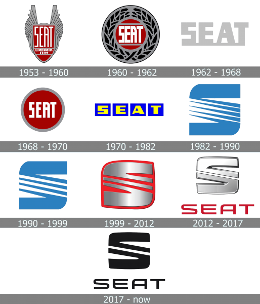
The official logo of the SEAT brand has changed at least 8 times for the last half-century. And the first five logos deserve special attention, in terms of the individuality of each.
Meaning and History
Seat is the largest Spanish automaker, which was established in 1950. The first Seat car was released only three years after the company’s foundation, in 1953. It was an automobile, which fully repeated the famous Fiat 1400, which had new nameplates. But it did not make any problem for Seat and its customers. Already in a year, about three thousand cars were produced. In all the following years the production of cars increased. In 1955, the company has already produced seven thousand cars, and in 1956, already ten thousand cars.
In 1957 the production of the new, Seat 600, model began. This car became extremely popular, and already in 1971, every fourth car in Spain was of this model. Production of this car ceased only in 1973.
Today Seat is still a leader in the National market, but it also has its car exported to many countries across Europe and other continents.
1953 – 1960
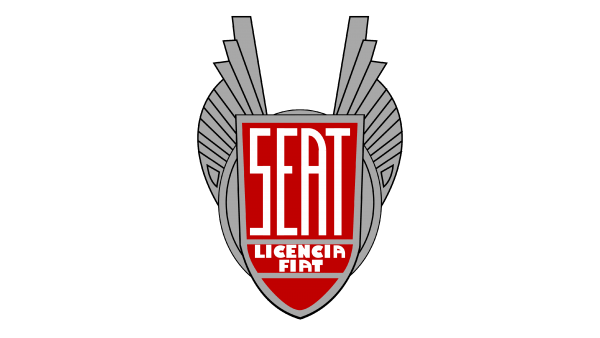
In 1953, the young automaker introduced the SEAT logo in the form of a winged coat of arms, on which the font name of the brand was placed. Fortunately, four letters could be placed in such a way that they could be read perfectly even in a limited space.
1960 – 1962
Following the Fiat way, Seat redesigns its logo in 1960, placing the bold stylized logotype in a custom sans-serif font over a red background in the center of a roundel with an extra-wide gray and black frame with an interesting geometric pattern. The logotype was enclosed between two gray horizontal lines.
1962 – 1968
However, already in the version from 1962, all the signs of conservatism – both the wings and the form of the emblem – disappeared completely, making room for a unified font logo that retained only a single basis for all letters.
1968 – 1970
The version from 1968 acquired a round form, in the center of which there still remained a font element, and surprisingly similar to the original one.
1970 – 1982
However, after two years the circle disappeared, and each letter acquired its own square background-base.
1982 – 1990
And only in 1982 appeared the prototype of the modern logo, the central element of which was the stylized letter S.
When in 1982 the brand radically changed its logo in favor of the stylized letter S with five diagonal lines instead of the central composite element, many experts and critics saw in this image an allusion to the international designation of the dollar sign. And although this analogy was at least weak, the company’s management rushed to dismiss this version.
1990 – 1999
The redesign of 1990 has emboldened the lined of the S-emblem, making it look more stable and balanced. The emblem got a bit narrow, with the upper and bottom elements of the letter becoming more confident. As for the diagonally-striped central part, the sharp ends of the lines got more square, and the lines themselves — thicker.
1999 – 2012
In 1999 the Seat logo got three-dimensional, being executed in gradient silver and placed over a solid scarlet-red background of a softened square, which repeated the contours of a sleek voluminous “S”. The number of the striped in the central part of the badge was reduced to three. The new badge stayed active for more than a decade.
2012 – 2017
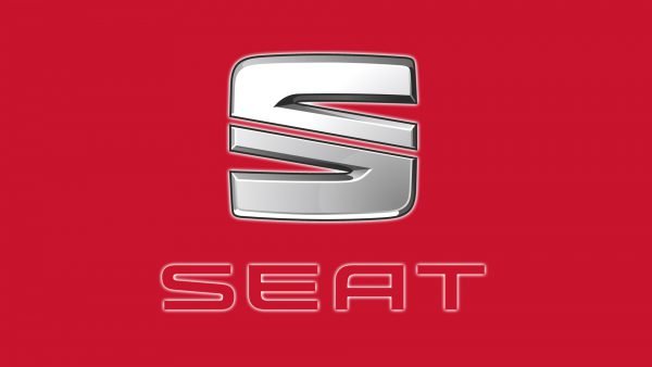
The redesign of 2012 has refined the Seat emblem, making it formed by two elements, separated from each other with just one diagonal line. The men were set in glossy gradient silver and placed against a white background, above the futuristic extended sans-serif logotype in bright red
2017 – now
In 2017 the Seat badge was redrawn in a flat minimalistic style, in plain black, with both elements set in clean solid lines over a white background. The uppercase logotype has kept its futuristic sans-serif typeface from the previous badge but got its lines a bit thinner.
Symbol
In the last four versions of the SEAT logo, the central place is occupied by the stylized letter S, essentially representing two horizontal features with numerous thinner diagonals in the middle. This design primarily symbolized speed, swiftness, dynamics and technical development. However, with each new version the number of diagonal elements decreased – from 5 to 4, then to 3 and finally to the current version, more reminiscent of the engine element, rather than the conventional graphic design
Font
The first SEAT logos were different for their vertical type. “Slender” letters were conveniently placed in the design of the logo, but already in 1970 the approach to the font changed. The letters became more impressive, and the ratio of their height and width aligned. The thickness of each line also increased. This was done simultaneously to improve the perception of the logo, and to create a more impressive form.
Background
Not burdening themselves with color delights, the creators of the logo until the last decade completely went for monochrome structures based on silver or gray. And only in the version from 2012 the brand name acquired a red color, while the main letter, consisting this time of two vertically symmetric designs, remained silvery and voluminous.


