| Founded | 6 November 1986 |
| Founder | Li Shufu |
| Headquarters | Binjiang District, Hangzhou, Zhejiang, China |
| Owner | Li Shufu |
| Official Site | zgh.com |
Geely, officially known as Zhejiang Geely Holding Group Co., Ltd., is a Chinese multinational automotive company headquartered in Hangzhou, Zhejiang. It was founded in 1986 by Li Shufu as a refrigerator maker, and it entered the automotive industry in 1997. Geely operates globally with numerous subsidiaries including the well-known Swedish luxury vehicle brand Volvo Cars, which it acquired in 2010. The company has expanded its footprint in the automotive industry, encompassing a wide range of vehicles from passenger cars to motorcycles.
Meaning and History
Geely was founded by Li Shufu in 1986 in Taizhou, Zhejiang, initially as a manufacturer of refrigerator parts. By 1997, under Li’s leadership, Geely had shifted focus towards the automotive industry, launching its first car, the Geely HQ. This was a significant pivot from its humble beginnings and marked the start of its journey in the automobile manufacturing sector.
Throughout the early 2000s, Geely expanded rapidly within China, developing a reputation for producing affordable vehicles. One of its notable achievements during this period was being the first Chinese car manufacturer to exhibit its models at the Frankfurt Motor Show in 2005. This move was part of a broader strategy to enter the European market and elevate the brand on an international stage.
In 2010, Geely made headlines worldwide when it acquired Volvo Cars from Ford Motor Company. This acquisition was a landmark deal that significantly boosted Geely’s credentials in the global automotive industry. Following this, Geely continued its expansion by acquiring a majority stake in the British sports car maker Lotus Cars in 2017, and a significant share in Mercedes-Benz Group AG’s parent company, Daimler AG, in 2018.
Today, Geely stands as a major player in the global automotive sector, boasting a diverse portfolio that includes a range of electric and hybrid vehicles. It has made substantial investments in new energy solutions and is committed to leading the transformation in the automotive industry towards a more sustainable future. With its strong position in China, expanding international presence, and strategic investments in cutting-edge automotive technology, Geely is poised to continue its trajectory of growth and innovation in the years to come. The company’s evolution from a local refrigerator parts manufacturer to a global automotive powerhouse exemplifies its dynamic approach to business and adaptability to changing market demands.
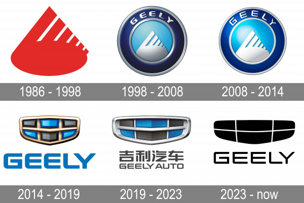
1986 – 1998
The first logo presents an abstract, stylized image that has a dynamic, forward-moving energy. Dominated by a vibrant red hue, the shape could be reminiscent of a flame or a drop of liquid in motion, signifying energy, passion, and drive. The element’s edges are composed of vertical lines that could symbolize speed, progression, and the rise of technology, pertinent themes in the automotive industry. This design is both simple and potent, utilizing color psychology to evoke a strong emotional connection. Red is often associated with excitement and action, which aligns with a company’s intent to make an impact in a competitive market.
1998 – 2008
The logo showcases a significant evolution in design, adopting a circular emblem that conveys completeness and unity. The emblem holds within it a white abstract form against a soothing blue background. This form is reminiscent of a pathway or road leading into the horizon, which could metaphorically represent the company’s journey toward the future. The color blue is traditionally linked with trust, dependability, and depth, reflecting the brand’s commitment to building a trustworthy reputation. The surrounding silver ring adds a touch of sophistication and modernity, indicating a premium quality associated with the brand.
2008 – 2014
This logo represents a further refined version of the second, with the circular emblem gaining a three-dimensional, metallic finish that imparts a sense of luxury and advancement. The central abstract form is more pronounced, giving a clear emphasis on the ‘pathway’ element, signifying progression and forward-thinking. The background blue is richer, creating a deeper visual impact and suggesting a matured brand confidence. The outer silver ring is sleeker, accentuating the emblem’s premium feel. The embossed look of the emblem’s durability and solidity are key attributes for an automotive company.
2014 – 2019
In the logo, we see a departure from the circular motif to a more shield-like emblem, which carries connotations of protection and strength. This emblem is composed of geometric shapes that come together to form a cohesive and bold design. The use of a golden color scheme imbues the logo with a sense of value, wealth, and high status. The blue shapes within the emblem are glossy and reflective, suggesting technological innovation and a futuristic outlook. The bold, capitalized “GEELY” lettering below the emblem is straightforward, ensuring brand recognizability and readability. This design iteration speaks to a brand that has established itself and is now focused on projecting an image of luxury and high quality in its offerings.
2019 – 2023
The 2019 iteration of the Geely logo showcases a continued evolution toward a more refined and futuristic brand image. This version simplifies the emblem to a sleek, silver outline that retains the shield-like shape, communicating safety and durability. The interior design features a bright, cobalt blue color, providing a vibrant contrast that captures attention and suggests innovation. The geometric pattern within, consisting of horizontal bars that taper towards a central point, conveys speed and technology. This minimalistic approach aligns with contemporary design trends and symbolizes a shift towards a more digital, connected era for the brand. The word ‘GEELY AUTO’ is displayed below in a modern, clear font that reinforces the brand’s commitment to the automotive industry while maintaining a connection to its heritage.
2023 – Today
In this new logo, Geely opts for an even more minimalist approach, removing the shield and bar elements entirely. The logo is rendered entirely in black, allowing for versatile use across various applications. The brand name ‘GEELY’ appears in a distinctive font with unique notching and angularity that hints at the innovative spirit of the brand. The elimination of graphical elements suggests confidence in the brand’s name recognition and an embrace of a sleek, modern aesthetic. This logo communicates a brand that is stripped back to its essence, focusing on delivering quality and performance without the need for embellishment. It signifies a mature brand that is comfortable with its place in the market and looks to the future with a clean and uncluttered vision.


