
| Founded | 1952 |
| Founder | Colin Chapman |
| Headquarters | Hethel, Norfolk, England, United Kingdom |
| Parent | Zhejiang Geely Holding Group |
| Owner | Geely (2017–present) Proton (1996–2017) R. Artioli/Bugatti (1993–1996) General Motors (1986–1993) |
| Official Site | www.lotuscars.com |
| Official Facebook Page | www.facebook.com/LotusCars |
Lotus is the name of an iconic British automaker, which was established in 1948. The company is engaged in the production of sports and racing cars, which are considered to be one of the best in this segment. Today the brand, founded by Colin Chapman, is owned by the Chinese Geely and Erika Automotive.
Meaning and History
![]()
The Colin Chapman Company was founded in 1953 and bore the name “Lotus Engineering Co.” Shortly, the famous “Lotus 7” was created, and in 1957 its batch production started.
The second racing auto “Lotus 8” appeared a year after the opening of the firm, and afterward, the reduced and shortened model “9” was created. Chapman liked racing autos most of all, even having someday participated in the competition, where the failure, unfortunately, befell him.
“Lotus 11” became the first car of the famous racer Graham Hill. One year later, the new model “Lotus Elite” was introduced. It was a fair shaped auto with heavy-duty qualities, such as the fiberglass bodywork, the 4th cylinder engine, and lightness. The engineer began the new series “Junior.”
A year later, “Lotus 12” – the first auto for participation in Formula -1 – appeared. But only three years later, the long-awaited glory arrived at Chapman and the legendary “Lotus 25″ brought it. It was distinguished by the fact that the driver was located lying as a plane pilot, holding the wheel arms extended. There was nothing like this. At that moment a two-seater “Elan” appeared too and “Lotus Elite S-2” – a little afterward.
Three years after that, Jim Clark won a competition on the “Lotus 38, ” and a year later, the model “Europa” appeared having a coupe bodywork and the central location of its engine. And the next model “49” (1967) was fitted with the FORD DVF engine.
A year later, the company produced “Lotus 56” – the all-wheel-drive auto with the gas turbine “Pratt and Whitney,” and its disc brakes were near the final drive.
On the 7th of April, 1968, Jim Clark died in the course, and after that, Formula 1 moved a bit away from the owner of the car maker. “Lotus” produced a new brand “Elite,” but after the introduction of new taxes, the license for the production of this brand was sold to the firm “Katerkhem car sales.” The production of racing cars was suspended, but nobody forgot about the series autos. Thus the new model Esprit was represented.
The constructors returned to racing cars only in 1978, having created “Lotus 79” with new development in aerodynamics, but even this triumph was darkened by a fatal tragedy of Ronnie Peterson.
After the Colin Chapman’s death in 1982, the Proton Corporation bought the company. They modernize existing models.
1948 – 1984
![]()
The original Lotus logo, created in 1948, differs from the badge we all can see today only in its color palette. The initial logo was set in glossy black, with all elements executed in silver. It was a black circular badge in a thin silver outline, with the outlined triangle with its corners softened, set inside. In the triangle, there was an uppercase “Lotus” inscription arched along the bottom side, and an elegant ACBC monogram, which was a celebration of the company’s founder, Anthony Colin Bruce Chapman.
1984 – 1986
![]()
The redesign of 1984 introduced a completely different style of the Lotus badge. It was a solid black horizontally stretched badge with rounded sides and a slightly sharpened top part. The logo was outlined in silver and had a bold uppercase logotype in an elegant serif font as its only decorative element. The letters of the world mar were slightly overlapping each other.
1986 – 1989
![]()
In 1986 the Lotus badge got its monogram badge. The elegant silver ACBC lettering was now placed above the stylized silver lettering, in the pointed triangular part of the glossy black badge. No other changes were made to the logo. The company kept this version as the primary one for almost six years.
1989 – 2010
![]()
The redesign of 1989 brought back the original design concept of the Lotus logo, but this time the circular medallion with a triangle in it was set in a green and yellow color palette. The solid yellow background of the circle was supported by smooth silver outlines and letters on the green triangle.
2010 – 2019
![]()
The green and yellow Lotus badge got its color palette darkened and intensified in 2010. The logo was now three-dimensional, with voluminous outlines and glossy gradients of all elements. The serif uppercase lettering got its contours cleaned and the lines — thinner, which made the whole logo look more elegant and chic.
2019 – now
![]()
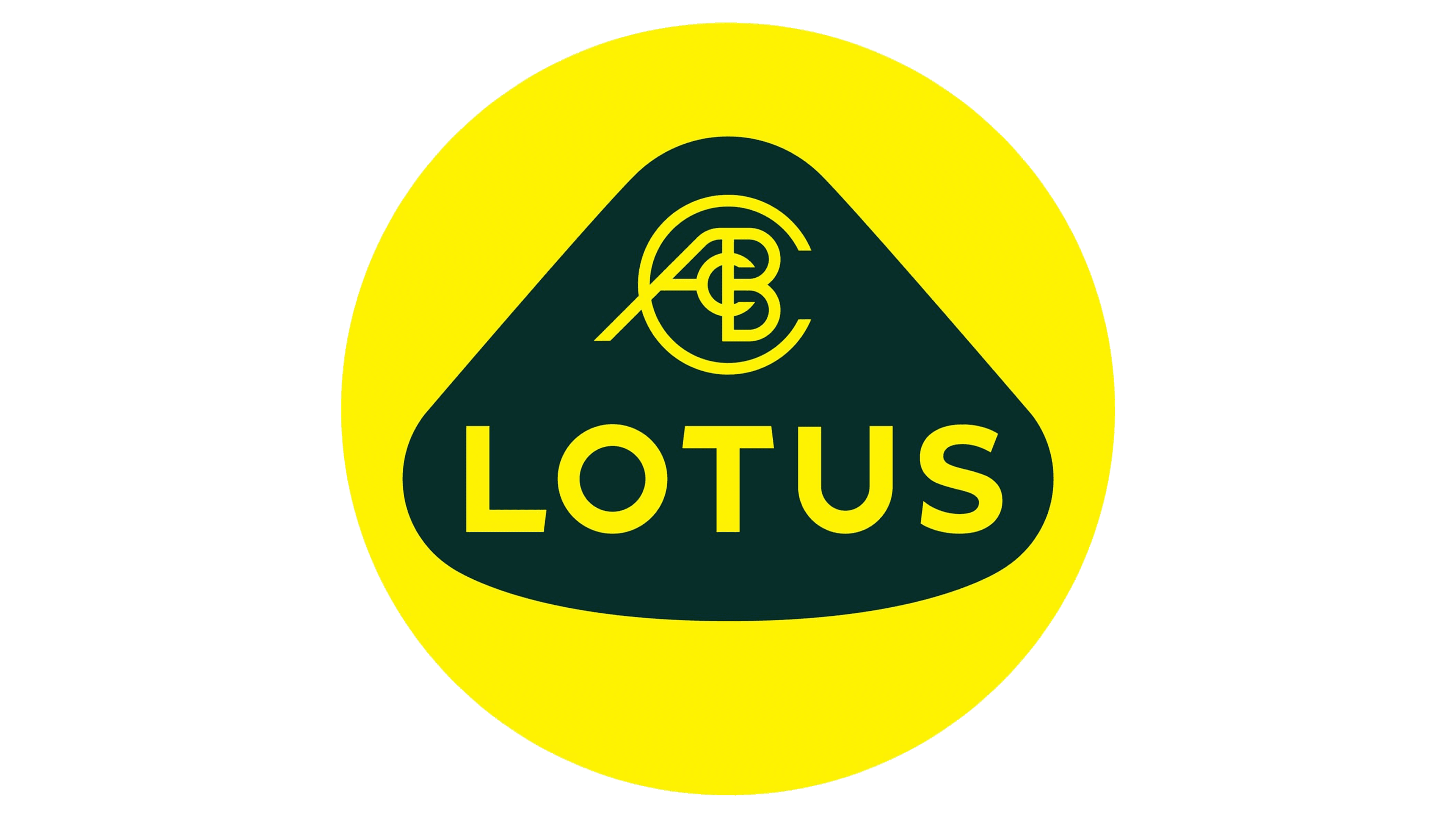
The redesign of 2019 has completely removed silver from the Lotus visual identity color palette. Now the white badge is executed in just two flat shades, green and yellow. The green triangle got its wide bottom line straightened, hence the inscription, which is now set in bold yellow capitals, is also set in a straight line. The letters both in the monogram and the logotype are executed in a sans-serif font, with the ACBC featuring thin and clean lines, and the “Lotus” — in bold stable shapes with the ends of the T-bar cut diagonally.
Description
![]()
A dark-green triangle is located in the yellow circle, which symbolizes the sun.
The triangle has letters in itself: A C B C and the name LOTUS. The A C B C letters are initials of Anthony Colin Bruce Chapman, the designer, engineer, and founder of the Lotus Company. Over time, other meanings of four letters on Lotus’s emblem appeared: “Lots of Trouble, Usually Serious” or “LOT UnSold.” However, it is not worth to take them seriously, although there is a share of a joke in each joke…
![]()
Colors
![]()
Four letters of the Lotus logo are located inside a green triangle. The triangle is over a yellow circle. The use of yellow color in the logo signifies sun, energy, and joy. The green color, which is also called “British racing green,” represents speed and passion so as it traditionally belongs to the national color of truly British racing cars.
Emblem
There is one more interesting episode connected with the history of the Lotus emblem. Although it is now well-known that the letters in the middle of the badge are the initials of the company’s founder Anthony Colin Bruce Chapman, his business partners Michael and Nigel Allen were sure that the “A” and “B” letters stood not for “Antony” and “Bruce”, but for “Allen Brothers”.
Symbol
If you compare the Lotus symbol with logos of other car manufacturers, you may notice that it stands out. For one, only rare car makes use as many letters in their logos as Lotus does. In comparison with minimalistic, yet recognizable badges like Hyundai or Mazda, the Lotus Emblem may seem too exuberant, even if we remove the initials and the colors.
![]()
Font
The massive uppercase lettering from the primary version of the Lotus logo is set in a modern geometric sans-serif typeface, which looks pretty close to such fonts as Conneqt Bold and Rexton Extra Bold, with the diagonal cuts of the horizontal bar of the letter “T” adding a unique touch to the style and recognizability to the whole composition.