| Founded | June 16, 1903 |
| Founder | Henry Ford |
| Headquarters | Dearborn, Michigan, United States |
| Slogan | “Go Further” “Built Ford Tough” |
| Subsidiaries | Lincoln Aston Martin (8%) Changan Ford Mazda (35%) Mazda (2.1%) Ford Performance Vehicles (Until 2014) Troller Jiangling Motors |
| Official Site | www.ford.com |
| Official Facebook Page | www.facebook.com/ford |
Meaning and History
Ford Motor Company is the car maker, the main plant of which is located in America. It produces not only autos (Mercury, Ford, Lincoln), but also trucks and diverse farm machinery.
Henry Ford founded the company in 1902. One of the first significant achievements of Henry Ford was a carriage for transporting of passengers. It got the name “Model A.” It operated at the expense of a gasoline engine.
The company of Henry Ford made the massive breakthrough in 1911. The automobile “Iron Lizzie” (Model T) produced by the talented constructor became available to a vast number of population.
Despite the fact, that automobile plants` logos undergo significant changes not so often; the Ford logo was not always the same.
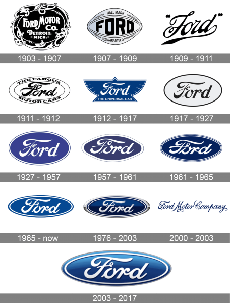
1903 – 1907
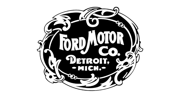
In the very beginning of its history, the logo was black-and-white, very ornate and even in trinkets. An assistant to the engineer at the plant developed it. This logo exists now but as a part of the historical collection. It is almost not used, and now, it is swapped a little, as trinkets were removed.
1907 – 1909
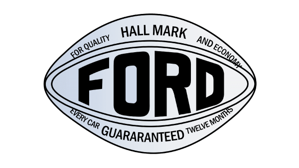
The oval shape logo design got simplified and now featured the motto of the company. At the top, it stated “Hallmark for quality and economy”, while the bottom had “Every Car * Guaranteed * Twelve Months” printed in the same style. The center portion also looked minimalistic and only had “Ford” printed in a bold, sans-serif font. A unique feature of this logo was the name that repeated the oval shape of the emblem. Even if you did not know the brand, this logo gave an impression of a reliable company.
1909 – 1911
This logo brought a start to a whole new era of Ford logos. The iconic “Ford” inscription was done using elegant, cursive writing and taken into quotation marks. The last letter curved down and underlined the name, giving it a more solid look. The designers used a trick that many companies like to use and placed the inscription on a diagonal, giving the logo dynamics and a feeling of progress.
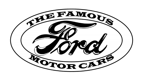
1911 – 1912
An improved version with an oval framing was presented in 1911. The framing had an inscription added at the top and bottom. It stated “ The Famous Motor Cars” using a bold font with sharp, pointed serifs. It added a very stylish and progressive look. The “Ford” portion was also modified and now had bolder strokes with white highlights. This made the logo look elevated.
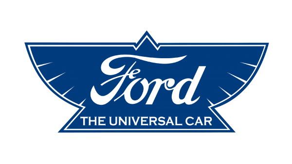
1912 – 1917
This logo introduced a blue and white color palette that was used by the company in future emblems. The designer used a triangle with outspread wings as the base. The inscription changed its look, but it was mainly the color, which was now white. “The Universal Car” declaration was added in a small font using a basic font with delicate serifs.
1917 – 1927
The company returned to a simpler emblem, leaving only an oval frame and the name. The “Ford” was printed using a font similar to the one used in several earlier versions. The emblem was done in two contrasting, classic colors.
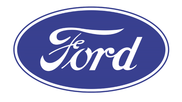
1927 – 1957
The traditional blue oval appeared in 1927, since 1976, the oval logo began to be fixed to all without an exception cars rolling off the Ford assembly line.
1957 – 1961
A slightly modified logo was created several years later. The oval base changed its shape and was made smaller. This made the name, which was not as tall anymore, stand out even more on the dark background.
1961 – 1965
The company preserved the elongated shape of the logo, making it look like a perfect oval. The designers worked on the frame, adding more thin, closely spaced lines. The blue now looked richer and created an image of a trustworthy, stable, company.
1965 – now
The color of the emblem was changed again and now it was much lighter, making the emblem look brighter. They also removed multiple border lines, replacing them with one, thicker blue line. The inscription was not italicized as much anymore.
1976 – 2003
This logo looks very modern and shows a company that uses advanced technologies. The white color was replaced by metallic silver. The border was changed and got thicker again. Moreover, the border now had a varying thickness, which created a dynamic and energetic look.
2000 – 2003
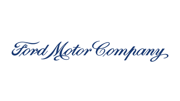
This logo looks nothing like the logos the company used earlier. However, the company used a dark blue color and a cursive font that was used by the company for its name. These elements gave the logo a recognizable appearance. The new logo now said “Ford Motor Company” in one line without any background elements or framing. The logo looked sophisticated and elegant with a classical touch.
2003 – 2017
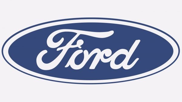
The company brought back a classic, recognizable emblem. The blue oval logo was slightly adjusted but otherwise looked a lot like the emblem created in 1965 but with the addition of a gradient. The name also acquired a shadow, which added a three-dimensional look to the emblem. The logo of the Ford company looks just as classy and stylish as it always did.
Symbol Description
The blue oval received more modern view by 2003. It was the year of the century jubilee of the Ford Motors Company. The modem symbol looks very elegant and stylish.
Colors
The blue color of the Ford logo signifies force, perfection, and grace of the company. The white color depicts nobility, elegance, and purity.
Emblem
The oval shape of the emblem was first introduced in 1912 to advertise the Ford brand as the “hallmark of reliability and economy.”
Good results of sales in the key markets (the first place in the United States and the second in Europe) indicate that the positive notion of the consumers about the make Ford has already emerged.
The Ford’s new concept implies the possibility to learn about the qualities of a car according to its appearance. For example, a drop like the silhouette of a car must tell about improved aerodynamics.
The key elements of the new concept in design are a dislocated above and overturned trapezoid of its radiator grille, narrow headlights of front light and a distinctive shape of its fog lamps.
In the future, hybrid cars of the Ford make will be able to determine ecological zones – areas available for traffic of cars with a defined level of the CO2 emission.
The company also develops intelligent Traffic Jam Assist. Technologies already applied on cars of this make as well as new will be used in it. Now, these systems are used in Ford’s cars: an aid for parking, an adaptive cruise control, the lane support system, as well as an automatic PowerShift transmission, maintaining the speed of a car in accordance with a flow speed. The help system operates while movement in traffic jams by use of data from a radar detection device and a camera. The intelligent driving system is intended to reduce a driver’s tiredness and improve automotive traffic control in a queuing traffic. The full implementation of the system is focused on medium-term future (2017- 2025).
Ford Raptor logo
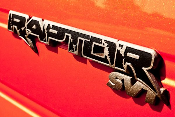
The Ford Raptor logo is not as minimalistic as badges of most contemporary car models. The script logotype looks rugged and even mud-stained, as if the vehicle has just returned from an off-road adventure. This choice seems natural, taking into consideration the type of vehicle Raptor is.
Ford F150 logo
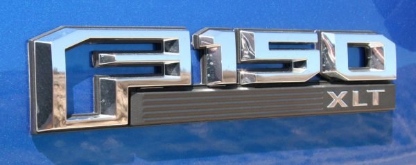
The Ford F150 logo features an unusual “F”, which does not look like the “F” from the regular Ford logo. The distinctive design element of the letter is the cutaway corner (top right). The same visual effect is applied to the figures “0” and “5”.
Ford Focus logo
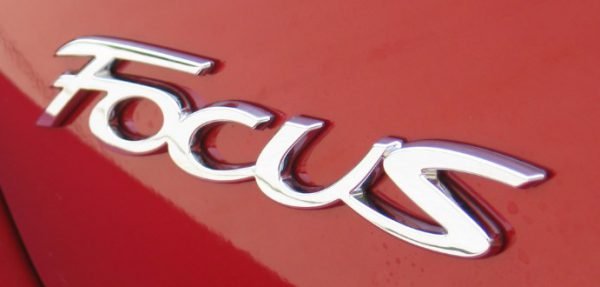
The model has had several logotypes. Probably the most popular Ford Focus logo features a beautiful scrip resembling handwriting. None of the letters stand apart, they are joined together very much like in a word written by hand. There is also a Focus logo with the unusual “f” and “u” and a badge featuring a pretty generic typeface.
Ford Mustang logo
 Arguably the most prominent design element of the Ford Mustang logo is the depiction of the horse. The running mustang horse is an excellent embodiment of the idea of speed and freedom, which is supposed to be the essence of the Ford Mustang cars. The horse has remained the same throughout the years, while the wordmark has been tweaked several times.

