| Founded | 1917 |
| Founder | Henry M. Leland |
| Headquarters | Dearborn, Michigan, United States |
| Parent | Ford Motor Company (1922–present) |
| Official Site | www.lincoln.com |
| Official Facebook Page | www.facebook.com/Lincoln |
Lincoln Motor Company is the name of an American luxury car brand, which was established in 1917, and was acquired by Ford in 1922. The brand is still a subsidiary of Ford. Lincoln is known for its luxury sedans, 4WD vehicles, and SUVs, which are distributed all over the globe.
Meaning and History
The company Lincoln was founded by an American businessman and expert on specific cars, Henry Liland, in 1917, in Detroit. The plant was called in honor of the famous American president Abraham Lincoln.
Two years later, it passed into the ownership of the Ford Company, to which it belongs now. The cars of the make Lincoln gained popularity throughout the world.
Starting from 1922, the company Lincoln offered different variants of its name writing. The first logo appeared in 1927. The greyhound dog was depicted on it. It symbolized speed, stamina, and grace.
It is interesting that, besides the official one, there is a logo under the name of Cobra Star. It is a Lincoln logo entwined by a snake from the logo of the Shelby Company. This is the logo of restyled cars from Lincoln Motorsport. By the way, the engine of Ford Mustang Cobra was set to the model Lincoln Mark VIII. It was V8 of 4.6 liters of volume.
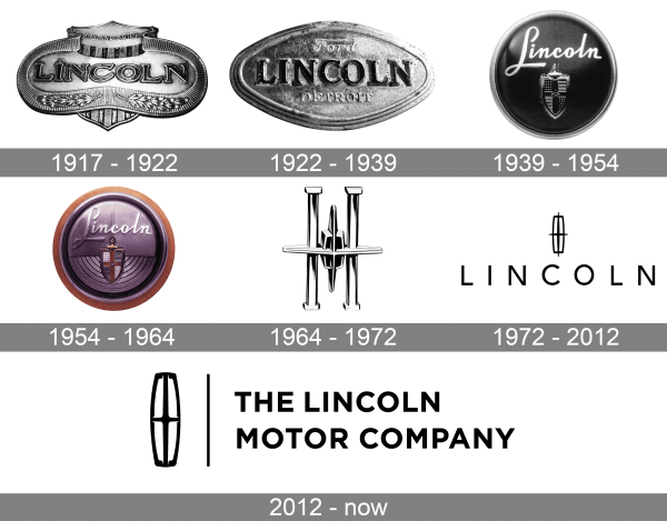
1917 – 1922
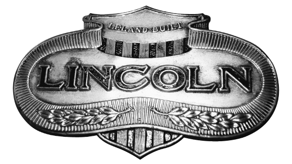
The very first badge was designed for Lincoln in 1917 and has been in use by the company until its acquisition by Ford in 1922. It was an elegant and ornate silver plate with smooth rounded contours and a sharp triangular crest at the bottom. The lettering in the uppercase of a massive serif font was written across the main part of the logo and enclosed into a thick silver frame with a floral pattern.
1922 – 1939
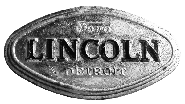
After Ford bought Lincoln, the new logo was created for the car marque in 1922. It was still a silver plate with the logotype as the central element, but now the badge featured a shape of a horizontally stretched rhombus in a minimalistic wide frame with several voluminous stripes on it. All floral motives were removed from the Lincoln logo.
1939 – 1954
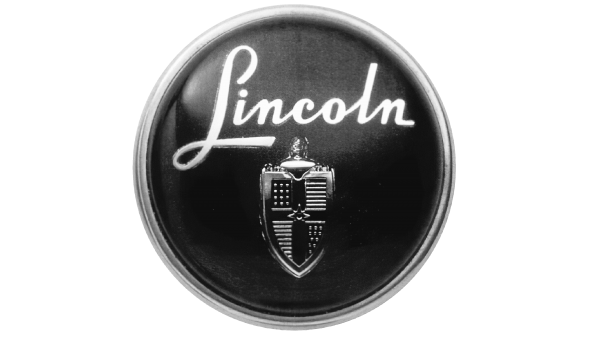
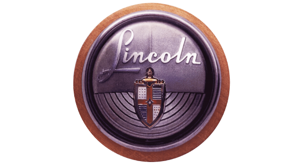
The redesign of 1939 changed the shape of the Lincoln logo into a circle and its color palette — to black and silver. The new composition featured a glossy black circular medallion in a thin silver outline, with the elegant cursive “Lincoln’ lettering written in silver above a vertically stretched heraldic coat of arms, drawn in the silver lies with some gradients.
1954 – 1964
In 1954 the Lincoln visual identity gained some vibrant colors. The new circular badge was executed in pink and purple gradients, while the frame featured a smooth peach shade. The lettering still featured the same cursive typeface and silver color, while the crest got colored and became a bit wider.
1964 – 1972
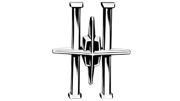
The traditional crest from the previous Lincoln badge was completely rethought in 1964. Now it became minimalistic and geometric, being executed in the three-dimensional silver square with rounded angles, and a wide straight cross with elongated bars, coming out of the small frame. The badge was supported by two vertical silver bars, placed on the sides.
1972 – 2012
The redesign of 1972 introduced a more minimalistic version of the Lincoln badge, with the graphical emblem set in flat and thin black lines, and placed above the uppercase sans-serif logotype in a clean modern font with lots of art in and between the characters. This logo was used by the luxury brand for forty years.
2012 – now
In 2012 the logo of the brand was redesigned again, with the emblem getting taller and bolder, moving to the left of the lettering. Now the inscription is composed of the full name of the automaker, The Lincoln Motor Company, and set in two lines, executed in a bold sans-serif typeface in black.
Symbol Description
It is not certain, what the current Lincoln symbol means. There is a range of opinions. Someone asserts this is the compass, the needles of which point to all the cardinal directions. Others assert the logo is called The Lincoln Star and symbolizes something bright and chic associating with luxury and prestige.
Color
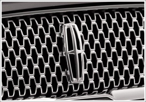
The Lincoln logo color is silver. The color belongs to the Lincoln Star. It signifies elegance, luxury and exquisite style, which can be seen in each vehicle manufactured by this world-renowned carmaker.
Emblem
According to one interesting version, the Lincoln Emblem does not have any significant meaning. The only purpose of its creation is to show that it is the Lincoln star that prefaces you.
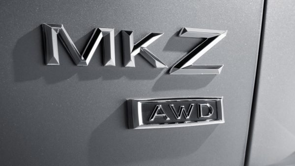
The new epoch of the auto with the Lincoln emblem began in 2006 with the crossover MKX. Further, all the models started to receive a three-letter designation except Navigator.
Also, the Lincoln subdivision is solidly retaining its positions in the market of deluxe models in the USA. Several families belong to the new production program: sedans LS, Continental and Town Car, as well as the first in the American automobile industry history off-road vehicle of the deluxe class, Navigator.
In 2015, Lincoln developed the new concept car Continental. The car has a new radiator grille, light emitting diode matrix headlights with laser cells, rear light emitting diode lights extending to all the width and classic proportions. The interior offers “the most sensual materials,” including seats and door panels upholstered in Venice leather, satin upholstering of the ceiling, and wool coating. There is a yellowish-pink dashboard frame and brightly chromed finish of the panel itself among its decorative parts. The 3,0-liter V6 EcoBoost engine is located under its hood. The auto’s production will be supposedly launched in 2016.
But the engineers of Lincoln hit at a remote prospect. For example, in 2012, an unusual concept car Lincoln MKF intended for the year 2025 was introduced. Outside the car reminds of a boat with a certain likeness of a keel, the abruptly chopped off rear part, and sidelines of the bodywork. The car is set in motion by the 6-cylinder V-similar “six” or a turbocharged hybrid power plant with 4 cylinders.
Font
The bold uppercase inscription from the primary logo of the Lincoln Motor Company is set in a modern et simple sans-serif typeface with solid and stable contours of the characters. The closest fonts to the one, used in this insignia are, probably, Conneqt Bold or Retrokia Caps Rough, but with come contours modified.


