| Founded | 1963 |
| Founder | Bruce McLaren |
| Headquarters | Woking, Surrey, United Kingdom |
| Products | Sports cars |
| Official Site | www.mclaren.com |
| Official Facebook Page | www.facebook.com/McLaren.Racing |
From the very inception McLaren Automotive of Great Britain focused on speed and high quality. In the 1960s, McLaren came up with what was the world’s fastest vehicle at the moment.
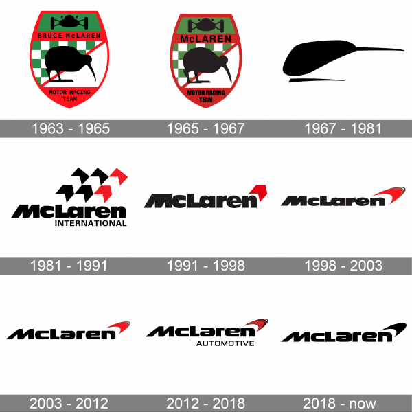
The McLaren logo has gone through a lengthy and vivid evolution. Its present-day version features a red speed-mark, which has been modified several times, and the word-mark, which comes in different colors depending on the background.
One of the most recognizable car emblems, McLaren logo has had a very successful racing history.
Meaning and history
The British manufacturer of sports cars McLarenwas founded by the New Zealand racer Bruce McLaren in 1963. And already in 1966 the first McLaren MB2, equipped with a 3-liter Ford power unit, saw the light. The car was designed to compete in Formula 1 races. Throughout the sixties, the brand developed slowly, but very few cars were produced.
McLaren Automobile has had its official history since 1989. Just three years after its formation, McLaren Automobile showed its first production model.It was a McLaren F1, designed as a coupe with the original, centered driver’s seat. Since then the company keeps creating new models and taking various rewards in racing competitions.
1963 – 1965
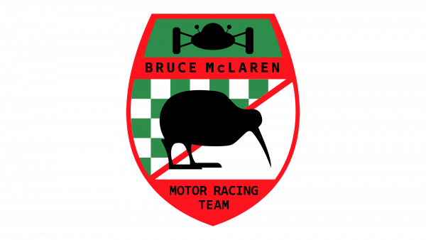
The original McLaren emblem was created in 1963 by Michael Turner, a UK illustrator who specializes in motoring and aviation paintings. It featured a Kiwi, which is the symbol of Bruce McLaren’s motherland, New Zealand. The emblem is done in a shape of a shield with a red border and red elements. The logo also featured a green color as a backdrop for the airplane silhouette and in the checker pattern behind the bird. The logo turned out quite symbolic, while its bright color palette caught the attention and reflected the power of the McLaren sports cars.
1965 – 1967
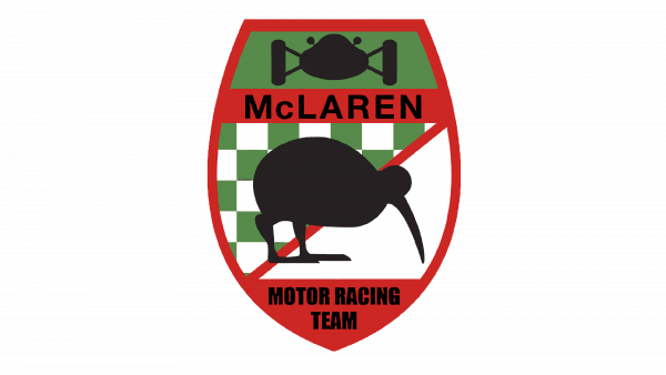
This logo looks like a dimmed version of the original. However, besides making the red and the green less bright, the designer made the shape of the emblem slimmer, the bird and airplane silhouettes shorter, and changed the inscriptions. At the top, it now had only an enlarged last name of the founder. The inscription at the bottom was simply made bolder to better stand out on the darker background.
1967 – 1981
Four years later Michael Turner developed a ‘Speedy Kiwi’ version. The shade it used is sometimes called ‘McLaren Orange’.
1981 – 1991
In 1981 Raymond Loewy designed yet another McLaren logo. The international emblem looks like a chequered flag. In the 1991 logo the three chevrons became one. In addition to this, the McLaren manufacturer decided to update the font, making it more refined.
1991 – 1998
The McLaren badge, designed in 1991, stayed with the luxury automaking company for a bit less than seven years.It was a simplified and shortened version of the previous badge, with just one red chevron in the upper right corner of the badge. The bold black lettering in a title case remained untouched.
1998 – 2003
In 1998 the symbol was heavily modified. The new version, which was introduced in 1998, comprised a streamlined speedmark. According to the company’s designers, its outline looks very much like the vortices created by the rear wing of McLaren cars. To make the image more energetic, the designers decided to use a white inscription on a black background.
2003 – 2012
In 2003 a revamped logo appeared. The iconic speedmark remained the center of the image.
2012 – 2018
The color palette of a sleek McLaren badge was strengthened in 2012, with the gray elements on its smooth three-dimensional emblem replaced by black. As for the lettering, with the refreshed emblem it started looking brighter and more powerful too. The logo got accompanied by an “Automotive” tagline, written in the uppercase of a modern geometric sans-serif typeface, in medium-thick black lines, under the “Laren” part of the main logotype.
2018 – now
McLaren has long been simply slightly modifying a logo it had designed back in 1981. This time, they made it look very modern and stylish. The red color, which has been in all the logos, except for one, has been removed along with the “Automotive” line. The logo featured the same font as the last three logos, which enhanced brand recognition and created an image of a reliable and trustworthy company.
Font
The extra-heavy black lettering from the primary version of the McLaren visual identity is set in a stable modern sans-serif font, which looks close to such fonts as Strelka Ultra and Vartek Semi Extended Bold, but with most contours modified, and the “M” completely different.
Color
The color palette of the McLaren visual identity is based on a powerful combination of black and red, which stands for strength, confidence, and passion. The color scheme brilliantly reflects the excellence and high quality of the brand’s cars and makes the massive and heavy badge look more elegant and timeless.


