| Native name | 本田技研工業株式会社 |
| Founded | 1948 |
| Founder | Soichiro Honda |
| Headquarters | Minato, Tokyo, Japan |
| Subsidiaries | Acura |
| Official Site | www.honda.com |
| Official Facebook Page | www.facebook.com/Honda |
Honda is the name of one of the largest Japanese companies, engaged in the production of vehicles. The company was established in 846 and named after its founder, Soichiro Honda. Today the cars of the brand are sold all over the globe, and the company has several subdivisions.
Meaning and History
Honda is a company founded in 1946 by a Japanese engineer, inventor, and car racer Soichiro Honda. The company in its present form with all its more than 50-year history exists thanks to his bold, ingenious and non-standard way of thinking and behavior.
The Honda logo means the capital H, but, naturally, in a distinctive design. H is the first letter in the name of the company founder, Soichiro Honda. “Dream power” is the Honda motto. This is the exact definition of the company’s activity.
In the time of its existence, the Honda Motor Company has turned into the largest producer of motorcycles in the world and become one of the leaders of the automobile industry. Having created a global network of 454 subsidiaries and the branches, the cooperation with which is being undertaken on the principle of equity, Honda develops, manufactures and sells in the market a broad range of products, starting from small universal motors and scooters up to specialized sports cars; everything taken together gave the company world renown and trust of customers all over the world.
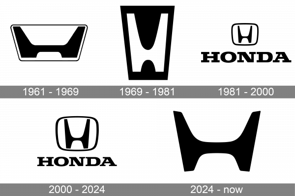
1961 – 1969

The Honda badge introduces in 1961 was very modern and stylish for its days. The logo featured a bold stylized letter “H”, enclosed into a trapezoidal frame, Iran in thin lines, with rounded angles. As for the letter itself, it featured the same contours as the frame but has its bars cut straight, and all corners sharp and distinctive.
1969 – 1981
The redesign of 1969 has changed the shape of the Honda logo, keeping the “H” as the main element of the visual identity. The letter became bolder, yet got its silhouette narrowed and contours softened. As for the shape of the frame, it also got narrowed and became taller, looking more elegant now. This badge stayed with the Japanese brand for a decade.
1982 – 2000

In 1982 the Honda logo was redrawn in a stronger and more contemporary way. The new emblem resembled the badge, designed for the marque in 1961, but was more balanced. Both the “H” and the framing became more square and got accompanied by the uppercase logotype, written under the graphical part in massive serif letters.
2000 – 2024
The redesign of 2000 only slightly refined the previous Honda badge, enlarging the emblem, but keeping all the elements’ contours almost unchanged. Now the massive serif logotype looked less aggressive, and the overall composition of the badge became looking more harmonious.
2024 – Today
The image depicts a logo that is simplistic yet instantly recognizable due to its iconic design. The logo consists of a bold, uppercase ‘H’ that has been stylized with distinctive features. The vertical bars of the ‘H’ are elongated, reaching above and below the crossbar, which is notably shorter in comparison, giving it a compact and modern look. The ends of the vertical bars are capped, suggesting a sense of completeness and precision. Each bar tapers slightly towards the center, adding a sense of dimension and depth to the design. The color of the logo is a solid black, which stands out with stark contrast against the white background, emphasizing its silhouette and making it highly visible. The font of the ‘H’ does not have any serifs and the lines are of uniform thickness, contributing to the logo’s clean and contemporary aesthetic.
In another interpretation, the logo can be seen as a symbol of strength and reliability, with the thick, bold lines of the ‘H’ conveying a sense of stability and endurance. The symmetry of the logo, with the vertical bars perfectly aligned and balanced by the shorter crossbar, could represent the harmony and precision that the brand stands for. Despite its simplicity, the logo has a dynamic quality; the slightly tapering lines give it a forward motion, hinting at the innovation and forward-thinking philosophy of the company it represents. The stark black color might also signify sophistication and elegance, traits that are often associated with the brand’s identity.
Moreover, the logo’s design is a testament to the power of minimalism in branding. It achieves a memorable presence without the need for intricate detail or embellishment. The ‘H’ stands not only for the initial of the company’s name but also as a hallmark of quality. The use of negative space around the letter ensures that it is easily discernible, even from a distance or when glimpsed briefly. This aspect of the design ensures that it can be effectively used across various mediums, from the small emblems on products to large-scale advertising. The logo is a visual encapsulation of the company’s ethos, which is likely to prioritize innovation, customer satisfaction, and a commitment to excellence in their field.
Font
The uppercase Honda inscription from the primary logo of the Japanese company is set in a massive font with enlarged square serifs. The closes typeface to the one, used in this insignia is, probably, Claredon No 1 Bold Expanded.
Symbol
The worldwide known Honda Company has a symbol not leaving any puzzles or doubts. The heart of any driver is freezing, enjoying the exquisite simplicity of this sign on the hood of Japanese autos. This is the capital H executed in the original style.
Colors
The Honda logo includes silver, red and black colors. All these tints symbolize elegance, passion, and exquisiteness of the Honda make.
Emblem
The Honda emblem uses a custom type of letters. Why did the creator choose this type of Honda emblem? Soichiro Honda considered that all his life, even his destination was concentrated in his creation. Therefore he gave his power and the particle of his life energy to the emblem. Based on the success, which always accompanies the brand progress, it is really so!
With an appearance of such new models as Honda HR-V and Honda Jazz, as well as of the sport car Civic Type R and the crossover CR-V, Honda can offer the buyers one of the most interesting new lines of cars in the market and is capable of meeting the requirements of a broad circle of consumers. The appearance of the supercar Honda NSX will contribute to the expansion of existing series. The tenth generation of Civic in Europe will be available at the beginning of 2017. Production of a five-door variant will be organized at the plant in Great Britain. For these purposes, 270 million euros were invested to provide the enterprise with necessary innovative capacities.
Also, the car-maker plans to focus on modernization of engines and transmissions, as well as on the reduction of their weight.
The Japanese car-maker will develop the hybrid technologies which, in its opinion, must occupy 80 percent of sales in Japan and 20 percent in the USA as well.
There is one more important point on the agenda: the achievement of 50-percent heat efficiency at the expense of turbocharging and technology of the diluted mixture ignition. This system is preparing for the 1,0-litre engines, which are expected in the market by 2020.


