| Founded | 1962 |
| Founder | Kurt Lotterschmid |
Lotec is the name of an automating company, which was established in Germany in 1962. The company is engaged in the manufacturing of sports cars and parts for them. Lotec started from the modification of Porsche vehicles and grew into a unique and stable brand.
Meaning and History
The car brand Lotec refers to obviously “young ones”. Its story is short, however, that does not mean the unknown. The cars of this brand, even if they are oriented towards a relatively small audience of connoisseurs or even car gourmets, and therefore few, are of great interest. First of all – thanks to the use of modern composites in car designs.
The logo itself can be called geometrically minimalistic, however this view will be more than superficial. Like the brand cars themselves, the logo is presented in a monochrome solution, but its geometry is not at all simple. Symmetry of the logo is underlined by the base – the central letter “T”, whose “weight” is the largest in the geometric design. Initially, the logo had a special form of the letter “O”, traditionally referring to the image of the steering wheel. However, subsequently the letter was practically divided into two constructive elements – semicircles, merging with other elements of the logo. Thus, the logo acquired a slightly different sound: the emphasis on manufacturability in the design symbol was strengthened by the “T” – “Technology” amplification.
1983 – 1998
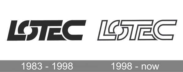
The Lotec badge, crested in 1983, boasted an uppercase logotype, executed in a custom designer typeface, with the bold letters overlapping each other, having their solid black bodies accented with the medium-thick white lines. This version of the badge stayed with the German manufacturer of sports cars for almost fifteen years.
1998 – now

The redesign of 1998 has kept the style and font of the Lotec badge, as well as its cool palette, but switched the shades, drawing the letters in white, and outlining them in black. In this execution the badge started looking more progressive and cool, it gained air and lightness, and now looks bright and confident on a background of any color.
Color
The Lotec visual identity is designed in a simple yet strong black-and-white color palette, with white as the main shade. The color scheme looks confident and professional, making the badge look actual, strong, and confident.
Font
The uppercase outlined Lotec logotype is set in a custom sans-serif typeface with massive lines and straight cuts of the bars. The clean contours balance the heavy shapes of the characters, making the inscription look confident and balanced.


