| Founded | 1954 |
| Headquarters | Seoul, South Korea |
| Parent | Mahindra & Mahindra Limited (70%) |
| Official Site | www.SsangYong.com |
| Official Facebook Page | www.facebook.com/ssangyongglobal |
The enterprise, which began as a small military assembly shop, only after a decade and a half they chose their first logo, and only 30 years later became independent in full.
Meaning and History
The company, now known as SsangYong, was founded in 1954. Its power was used for the needs of the military industry. However, in the late 1960s, when economic reforms began in South Korea, there was an urgent need to create a kind of visual image that could be used to identify products in domestic and international markets. The company SsangYong has chosen a classic symbol “yin-yang” for their first logo, and a combination of blue and red as their color solution.
The official name SsangYong (“Two Dragons”) and legal independence the company acquired only in 1986.
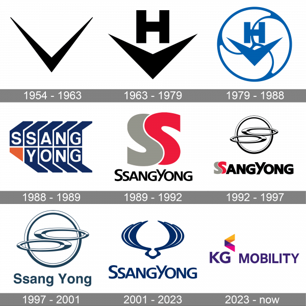
1954 – 1963
The logo, used by the automaker in the 1950s, was a simple bold hand-drawn V-shape tick, which was usually drawn in white on the dark bonnets of the SsangYong vehicles. It was a very simple and pretty amateurish concept.
1963 – 1979
The redesign of the 1963 has modernized the SsangYong logo, turning it into a professionally-executed geometric badge, drawn in solid black. The tick was now set in bold lines with sharp ends and accompanied by a heavy sans-serif letter “H”, placed above it, and also written in plain black lines.
1979 – 1988
In 1979 the emblem turns white and gets enclosed in a white circular frame. It was now placed on a solid blue square, set on the left from the bold black logotype in Korean. Apart from the tick with the “H”, the circle featured three smooth white lines coming from the center to the circular outline. The whole composition was enclosed into a horizontally stretched rectangular frame.
1988 – 1989
The redesign of 1988 replaced the graphical part of the automaker’s logo with a banner, composed of nine solid blue elements, with one of the “SsangYong” capital letters in white. The emblem was accompanied by a small golden triangle in the bottom left corner. As for the logotype, it was rewritten in Korean, according to the new name of the brand.
1989 – 1992
In 1989 the color palette of the SsangYong visual identity was changed, and now the emblem featured two bold letters “S” in gray and red, followed by black lettering in Korean. The badge looked pretty simple, yet stable and confident, evoking a sense of reliability and trustworthiness.
1992 – 1997
The redesign of 1992 introduced a new design concept for the SsangYong logo. It was now a composition of two horizontally stretched rings in blue and white, enclosed in a circular frame, drawn in the same palette. There was no additional lettering on the badge, and it looked modern and airy.
1997 – 2001
This logo reflects the company’s move towards a more simplistic, yet stylish brand visual identity. It now uses a monochrome color palette with grayish blue being the main color and white serving as an accent. The logo stayed instantly recognizable as the designers preserved the round emblem, changing only its color and updating only the font. It looks polished and powerful thanks to wide spacing and closely resembles Helvetica Bold.
2001 – 2023
At the beginning of the new millennium, the idea arose to abandon the Latin letters in the logo. In Korean written language, the inhabitants of the country are proud of the most harmonious of the existing sign systems in the world (the corresponding recognition from the UN was received in 2006). However, while the management of the company did not dare to replace the usual Latin font in the logo with the national alphabet or overload the logo by double-writing the brand name.
2023 – now
The “SsangYong” name that was used by the company for 35 years and its logo were replaced by a new name and corresponding logo in 2023. If you delve into the history of this automaker, it is actually a fourth name change. Along with the name, the new logo signals a new era for this company as it will now focus on modern technologies, including electric cars, AI, and self-driving tech. The logo features the KG Group logo – a purple wordmark “KG” printed using a sans-serif font with a multicolor arrow above it. Its new direction is denoted by the word “Mobility”, which is printed in a slightly smaller font of the same color to the right of the emblem.
Symbol
The first logotype and symbol of the company was the “yin-yang” sign, soon replaced by two dragons (in effect, having the same symbolism of a harmonious mix of opposites). Visual changes to the SsangYong logo were made later, but for Koreans the logo symbols remain unchanged. And the double rings, enclosed in a single logo, represent a variation, the symbolic content of which is similar to the original, and the present “flower” in all official descriptions appears as a symbolic image of two dragons. Symbol of the brand – two dragons, representing a unity of opposites, self-sufficiency and independence, harmony and infinity.
Font
The first versions of the logo did not contain font at all. However, already in the mid-1990s, it was impossible to go without the font designation. Therefore, the inscription in Latin letters SsangYong appeared under the emblem.
Color
The first version of the logo used a color combination / contrast of blue and red. When switching to animalistic images (images of animals), the color definition disappeared. At the beginning of the new millennium, from color diversity, SsangYong, like most other auto brands, switched to a laconic, chrome image.

