| Founded | 1994 |
| Founder | Nicolas Hayek |
| Headquarters | Böblingen, Germany |
| Owner | Daimler-Benz (1993-1998) Daimler Chrysler (1999-2007) Daimler AG (2007-present) |
| Official Site | www.smart.com |
| Official Facebook Page | www.facebook.com/smart |
The redesign of 2011 has introduced a new cool badge, with the arrow redrawn in a bright, almost acid, shade of green, outlined in gradient silver, which made it voluminous, and placed against a white background, being enclosed into a double black and silver frame with no lettering on it.
Meaning and History
Smart is a relatively young automobile manufacturer, as it has been around since the 1970s. The brand belongs to Daimler AG. The company specializes in microcars.
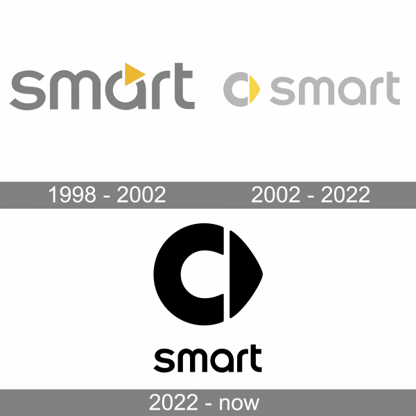
1998 – 2002
The Smart logo, designed in 1994, was based on the lowercase logotype in a playful sans-serif typeface, set in gray color. The letter “A” was decorated by a solid yellow triangular, pointing to the right, like a Play-button, and attached to the top border of the letter’s contour.
2002 – 2022
The emblem features a gray “C” and is complemented by a yellow arrow, which points to the right and symbolizes ‘forward thinking’. The “C” means ‘compact’ to emphasize the small size of vehicles.
2022 – Today
The redesign of 2022 has kept the recognizable Smart emblem and the font of its lettering, but slightly changed the composition of the badge and switched its color palette to plain black. The emblem got enlarged and moved from the left part of the logo to the top, with the lettering being set under the graphical part.
Font
The friendly and playful lowercase logotype from the primary Smart badge is set in a cool modern sans-serif typeface with rounded shapes of the letters and straight cuts of the lines. The closest fonts to the one, used in this insignia, are, probably, All Round Gothic Demi and Eastman Roman Alternate Demi Bold, but with some contours modified.
Color
The color palette of the Smart visual identity is composed of gray and yellow in their soft and light shades. Yellow adds a touch of energy and progressiveness, while gray stands for professionalism, reliability, and trustworthiness. The shades on the logo are perfectly balanced and create a sting and stable composition.


