| Founded | 1862 |
| Headquarters | Chongqing, China |
| Parent | China South Industries Group |
| Official Site | www.globalchangan.com |
Changan Automobile is a Chinese automobile manufacturer headquartered in Chongqing, China. Specializing in the production of passenger cars, microvans, commercial vans, and light trucks, Changan is one of China’s top four automobile groups and ranks among the top 20 global auto manufacturers. The company operates numerous manufacturing plants within China and has expanded its production and R&D facilities to countries including Russia, Iran, and Brazil.
Meaning and History
Changan Automobile, originally known as Changan Machinery Factory, was founded in 1862 by the Qing dynasty government as a military supply factory. Transitioning into an automotive manufacturer, Changan has a storied history that reflects China’s own industrial and economic evolution. Throughout the decades, Changan has not only contributed to the domestic automotive industry but has also positioned itself as a significant player on the international stage.
One of the landmark achievements in Changan’s history was its early cooperation with international car manufacturers. This strategy, initiated in the 1980s, allowed Changan to gain crucial technological expertise and management know-how, which was instrumental in enhancing its product quality and manufacturing processes. By forming joint ventures with leading automotive firms like Ford and Mazda, Changan significantly boosted its capabilities and market presence.
In recent years, Changan has made substantial advancements in electric vehicle technology and sustainability practices. The company has committed to phasing out the sale of gasoline vehicles, aiming to fully embrace electric and hybrid technologies. This shift is part of Changan’s broader strategy to align with global environmental trends and technological innovations.
Currently, Changan holds a significant position in the automotive industry, not just within China but globally. The company continues to expand its reach by investing in cutting-edge technologies and sustainable practices, striving to become a leader in the global green energy transition. With a strong emphasis on research and development, Changan is poised to make significant contributions to the future of mobility.
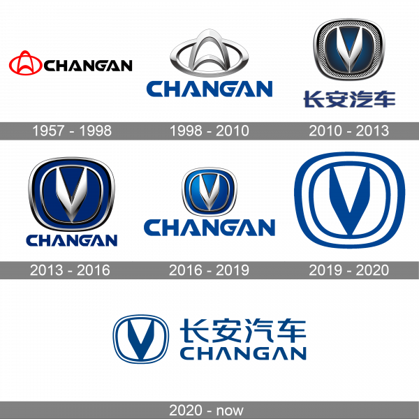
1957 – 1998
The 1957 Changan logo showcases a simple yet evocative design. The emblem consists of a singular geometric figure that reflects the essence of the automotive brand. It is encased within a thin circular outline, which traditionally symbolizes completeness and unity. The main feature, a stylized ‘A’, stands at the center of the emblem, with its peak reaching upwards, conveying a sense of aspiration and progress. This ‘A’ is enclosed within an overarching shape that may suggest protection and care. The logo’s red color is vibrant and energetic, embodying the spirit of innovation and passion that are key to the automotive industry.
1998 – 2010
By 1998, the Changan logo had evolved to reflect a more modern and sophisticated brand image. The new emblem retained the circular motif, a nod to the brand’s continuous commitment to wholeness and customer satisfaction. The letter ‘A’, now more abstract, rests at the center, its form resembling the peak of a mountain, which can symbolize stability and strength. This logo’s design, with its flowing lines, conveys motion and fluidity, echoing the elegance and dynamism of Changan’s automotive designs.
2010 – 2013
The 2010 iteration of the Changan logo marked a significant shift towards a contemporary aesthetic. The emblem, composed of a sleek ‘V’ merged with wings, creates a visual metaphor for freedom, agility, and the vehicle’s speed. The ‘V’ also stands as a tribute to victory, aligning with the brand’s ambitions of excellence and leadership in the market. The logo’s colors have shifted to a more profound and sophisticated palette of metallic and blue shades, representing innovation, trust, and reliability. The metallic sheen of the emblem suggests the brand’s investment in technology and modern engineering.
2013 – 2016
The 2013 Changan logo showcases a striking combination of modernity and elegance. The central motif features a stylized ‘V’ that also resembles an abstract bird in flight, symbolizing the company’s aspirations for innovation and its dynamic approach to the automotive industry. The emblem is framed by two concentric circles that add a sense of completeness and global perspective, suggesting Changan’s reach and influence in the worldwide market. The ‘V’ stands in a strong contrast against a lustrous blue background, a color often associated with depth, expertise, and stability. The metallic finish of the logo elements hints at sophistication and the high-tech orientation of the brand. Below the emblem, the company’s name ‘CHANGAN’ is written in bold, capitalized letters, ensuring brand recognizability and strong visual presence.
2016 – 2019
In 2016, the Changan logo retained its core elements but evolved to present a bolder and more streamlined look. The ‘V’ within the dual rings became sharper and more pronounced, reinforcing the brand’s focus on precision and forward-thinking design. The use of blue deepened, suggesting a blend of innovation with trustworthiness, a vital combination for consumers in the automotive sector. The silver-grey gradient and shadowing around the logo gave it a more three-dimensional and tactile feel, appealing to a consumer base looking for tangible quality and performance. The font of the ‘CHANGAN’ wordmark below also became sleeker, with a slight modification in typography to match the emblem’s refined look.
2019 – 2020
By 2019, the Changan logo had matured into an even more contemporary and assertive design. The ‘V’ now displayed increased depth, with the play of light and shadow giving it an almost sculptural quality. The emblem’s rings adopted a thinner and more elegant appearance, suggesting a refinement of the brand’s core values and a heightened focus on sleek design. The color shifted to a rich, darker blue, emphasizing the logo’s luxurious appeal and the company’s evolution towards upscale markets. The wordmark maintained its boldness but with a more modern cut, reflecting the evolution of the brand as it embraced the future of the automotive industry. This logo represents a blend of tradition and advancement as Changan continues to carve out a substantial presence in the industry.
2020 – Today
The current Changan logo is a refined iteration that blends traditional symbolism with contemporary design. The emblem is encapsulated within an oval shape, suggesting global reach and continuity. At its core, a sleek ‘V’ rises confidently, reflecting a soaring bird – an emblem of freedom and progress. The stylized ‘V’ also serves as a reminder of the brand’s commitment to innovation in the automotive sector. The emblem’s metallic sheen conveys a sense of modern sophistication and high-quality engineering.
The sharpness of the ‘V’ and the gentle curves of the enclosing oval create a harmonious balance between dynamic energy and refined elegance. Below the emblem, the Changan name is presented in bold, capitalized lettering with a modern sans-serif font. The blue color of the text mirrors the emblem, reinforcing the brand’s identity and ensuring instant recognition. This logo communicates Changan’s vision of blending heritage with forward-thinking in the global automotive marketplace.


