| Founded | 1937 |
| Founder | Saab AB |
| Headquarters | Trollhättan, Sweden |
| Parent | Saab AB (1945–1968) Saab-Scania (1968–1990) General Motors (1990–2010) Spyker N.V. (2010–2012) |
| Defunct | 2012 |
| Official Site | www.saabcars.com |
| Official Facebook Page | www.facebook.com/Saab |
The Saab make of cars, which ceased to exist in 2012, had gone through a series of logotypes ranging from minimalistic, clear wordmarks to comparatively complicated emblems.
Meaning and history
Although the Saab car brand was founded in 1948, its roots go back to the end of the 19th century, to the Vabis Company, which was established in Sweden in 1891. Several years later, Scania Trucks were founded. Having a look at the earliest Scania logo, you will definitely notice the same creature as on the Saab logo. So, in fact, the main element of the Saab emblem was first used several decades earlier than the brand itself was created.
The reason for this was that when General Motors took control of 50% of the Saab Company in 1989, it acquired the rights to use the griffin emblem only for two decades. When Nevs acquired the Saab assets in 2010, it did not actually buy the right to use the trademark. Scania, the former owner, was afraid that because of the Chinese interests behind Nev, the trademark might have been misused. As the result of the controversy, today only Scania can use the griffin.
1891 – 1900
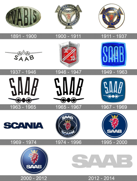
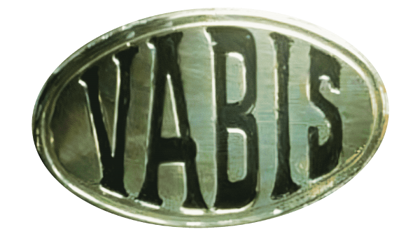
The very first badge, used by the Scandinavian automaker, was created in 1891 and stayed active for the first nine years of the company’s history. It was a metallic banner, in a shape of a horizontally-oriented oval, with the bold uppercase “Vabis” lettering in a fancy serif font, engraved on it.
1900 – 1911
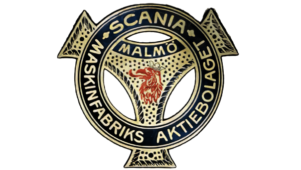
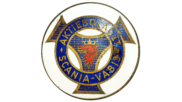
The redesign of 1900 introduced a more complicated and ornate logo. It was resembling a steering wheel, being composed of a geometric element with tree elongated tails and arched sides, overlapped by a wide ring. Both elements were set in dark blue and gold, with the red griffin drawn in the center of the composition. The circular frame of the logo featured bold sans-serif lettering with the complete name of the company.
1911 – 1937
In 1911 the Saab logo gets brighter, with the shade of blue replaced by an intense electric one, and the pattern of the central element being decorated by thin delicate bricks, outlined in gold. The red griffin shot bolder and more visible now. The lettering, written around the perimeter of the frame, was also enlarged and emboldened, being set in a rounded sans-serif font.
1937 – 1946
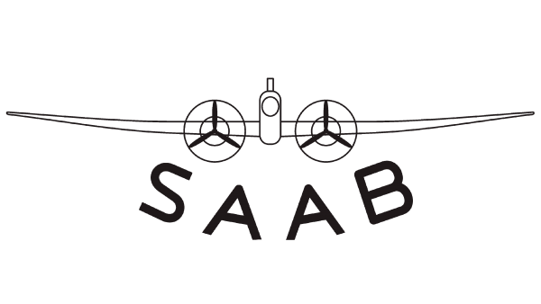
The redesign of 1937 created a light modern logo, with the uppercase “Saab” lettering in a modern sans-serif font, arched under the graphical emblem, depicting a plane with two enlarged propellers. The plain was drawn in thin black lines, with all the elements in white, which looked very airy and fresh.
1946 – 1947
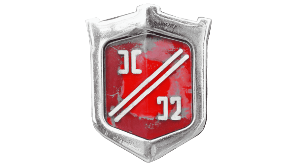
The badge, used for Saab in 1946, featured a flossy scarlet-red crest with a thick silver framing, having a wide stylized crown with three square peaks coming out of it, replacing its upper part. The body of the crest has two white diagonal lines, dividing it into two parts. There were two abstract geometric elements in each part.
1949 – 1963
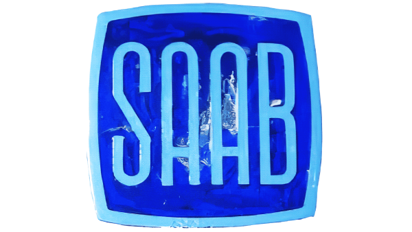
The redesign of 1949 has created a bright and vivid badge for Saab. It was a square blue badge in a thick light blue framing, with the sides slightly arched from the center. The bold uppercase logotype was written in the center of the logo, in the same shade and thickness as the frame of the logo.
1963 – 1965
The plane from the badge, designed for Saab in 1937, was redrawn and modernized in 1963. It got the wings shortened and the lines emboldened. The new image was placed under the cool and stylish Saab logotype, arched to the center, and executed in a narrowed geometric sans-serif typeface with clean contours and straight cuts of the lines.
1965 – 1967
The tiny white negative space lines on the wings of the Palme were colored black, and the Saab lettering changed its direction and was now arched from the center, which made the badge look more balanced and confident. This new version of the logo stayed untouched for two years.
1967 – 1969
With the redesign of 1967, the Saab logotype and emblem got redrawn in a soft and very light shade of sky-blue and white respectively and placed on a solid blue square banner in a voluminous silver outline. The badge had its angles softened and the sides slightly arched.
1969 – 1974
After the merger with Scania, Saab has been using its badge as a primary one for almost five years. It was a super heavy sans-serif logotype in the uppercase of a modern geometric font, set in dark blue against a white background, without any graphical additions.
1974 – 1996
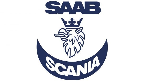
The red griffin from the historical logos of the brand came back to its badge with the redesign of 1974. It was now drawn on a solid blue roundel with a white outline; where the white “Saab” was written at the top part, and “Scania” — at the bottom. Both wordmarks were executed in an extra-bold sans-serif typeface.
1995 – 2000
The complicated outline was simplified to a simple gray ring in 1995. The “Scania” part of the lettering was completely removed w from the logo, and now there was only light-gray “Saab” written in the uppercase under an enlarged image of a red griffin, over a solid blue roundel. The outline of the griffin was also changed from white to light-gray.
2000 – 2012
The redesign has added gloss and gradients to the Saab badge, making it three-dimensional. All elements remained in their places but started looking kore elegant in a refreshed vivid color palette. The “Saab” logotype was now voluminous and boasted a gold glossy surface of its letters.
2012 – 2014
Starting with the Saab 9-4x production model released in 2012, the griffin logo disappeared from the hood. The new logo consisted of only the name of the brand given in light grey (silver). The typeface remained the same as on the previous wordmark. In addition to the lettering, the corporate logo comprised a depiction of the four seasons.
Emblem
Interestingly enough, Saab actually went through a succession of other logos until it borrowed the griffin from the emblem of its parent company.
The earliest emblem of the Saab auto brand was just a fictitious red heraldic symbol with a silver outline. It only appeared on the bonnet of the prototype called Ursaab. In 1949-1962, a blue wordmark was used. In 1963, it was replaced by a silver wordmark with a stylized plane below it. The logo used in 1969-1974 featured the same lettering and plane on a dark blue background.
The 1974 logo was the first one to feature the iconic typeface on which the company logotype was based ever since. In this version, the letters were black with a grey outline.
In 1984, the griffin from the Scania logo was made a part of the new Saab logo, which was developed by designer Carl Frederik Reuterswärd. The creature itself was red with a light grey outline, while the crown on its head was golden. The text above and below the picture was given in a light shade of grey, too. There were also two overlapping circles on the logo. The emblem was placed in a circle shape against a dark blue background.
The following version, which was adopted in 2000, got rid of the overlapping circles. The word “Scania” was removed, while the color palette was slightly modified. In 2002, the logotype went through a subtle upgrade.
Symbol
The strange “animal” seen on the emblem is called a griffin. It is a mythological creature combining the head of a bird and the body of a lion. Griffin is a symbol of vigilance. Another name for this creature is Gripen – this is how one of the Scania fighter planes was called. One more reason for adopting a griffin as a company emblem was that it was used on the coat of arms of the Count von Skane and later as the symbol of the province where Scania was established.
Font
The typeface featured on the Saab logo could possibly be a customized version of the Gill Sans Std Bold font. Also, it is not too far off the Bold Arial typeface (in case it is squished to 70% height). The distinctive feature of the wordmark is the way the letters overlap becoming a single unit instead of a set of four separate letters.

