| Founded | 1906 |
| Founder | Charles Rolls Henry Royce |
| Headquarters | Goodwood, England, United Kingdom |
| Parent | BMW |
| Official Site | www.rolls-roycemotorcars.com |
| Official Facebook Page | www.facebook.com/rollsroycemotorcars |
Rolls-Royce is an iconic company, engaged in the production of luxury vehicles since 1906. The brand, manufacturing one of the most desirable and expensive cars in the world, was established in Great Britain and named after its founders, Charles Rolls and Henry Royce.
Meaning and History
At first, the logo was red, but in 1930, it became black, because almost all logos in this time were black-and-white (and not in a sign of mourning after the death of Royce in 1933, as it was believed). But let’s return to the very beginning.
The creators of the most prestigious company in the world, Frederic Henry Royce, and Charles Stewart Rolls agreed about the name of the Rolls-Royce Group car in 1904. Already in 1906, the new car “Rolls-Royce 40/50” rolled out of the gate of the enterprise “Rolls-Royce Ltd.” created by partners in the Crew city. With the help of a three-speed gearbox, the car accelerated to 105 km/h. The cars had leaf suspension, and the bodyworks were made on an individual customer order by designers who were wagon wrights and became the first designers of autos.
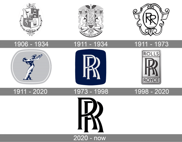
1906 – 1934
The logo of the company appeared in 1906. One story tells that Royce saw an RR emblem on a tablecloth in the restaurant and decided to buy this tablecloth.
1911 – 1934
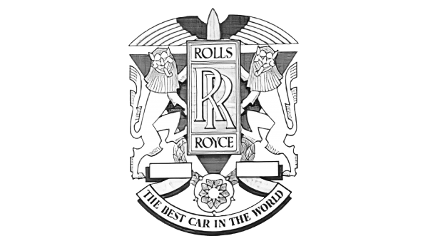
In 1911 the Rolls-Royce logo gets more ornate and chic, with the vertically-oriented rectangle with the monogram enlarged and placed between two stylized lions rampant, decorated by an abstract bird on top, with the wings arched from the center, and a clean white ribbon with “The Best Car In The World” lettering set in the uppercase of an elegant serif typeface.
1911 – 1973
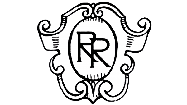
Another version of the Rolls-Royce badge, designed in 1911, was cleaner and simpler, and only featured a thin “RR” monogram in a custom serif font, written against a white background of a vertically oriented oval, which was enclosed into a wide ornate frame with curves and vignettes. This badge was used by the company for more than 60 years.
1911 – 2020
1909, Sir John Montague Lord Belyu acquired one of those Rolls Royces for private use. The Berker studio produced the bodywork for the lord’s car. It was a four-seat phaeton. To allocate his car from a total stream, the lord asked his friend, the modernist sculptor Charles Sykes to develop a mascot. The artist found a simple and elegant solution: he created the “Spirit of Rapture” – a figure, going ahead with flung backhands, in garments billowing in a wind, having descended as will of prediction on the car bonnet and frozen there to convey the spirit of the car– reasonable speed, grace, and beauty.
Few know that the personal secretary of Lord Belyu – Eleanor Thornton- became the prototype of the “Spirit of Rapture.” Sykes was hopelessly in love with her. The “Flying lady,” as the mascot was called soon, became the first metal figure on the bonnet of a car made in Britain. At first, it was made of babbitt metal, later- of bronze and chrome steel. There were several modifications of the figure; the “kneeling” one appeared in 1934. Even now, the “Flying lady” is a symbol of the “Rolls-Royce” firm.
1973 – 1998
The redesign of 1973 introduced a sleek minimalistic Rolls-Royce badge, with the white and gray monogram placed over a solid blue background of a rectangle with softened corners. The letters in the monogram were executed in a sophisticated custom typeface with flared bars decorated by small triangular serifs.
1998 – 2020
Since 1998, the company with this logo belongs to BMW, the license for the name and the emblem with double letter “R” cost 40 million pounds to the company.
2020 – now
In 2020 the Rolls-Royce badge gets super minimalistic, with the iconic “RR” monogram being drawn in flat black against a white background, with no additional colors or details. The contours of the letters now look very strong and elegant, making the whole badge timeless and powerful.
Symbol Description
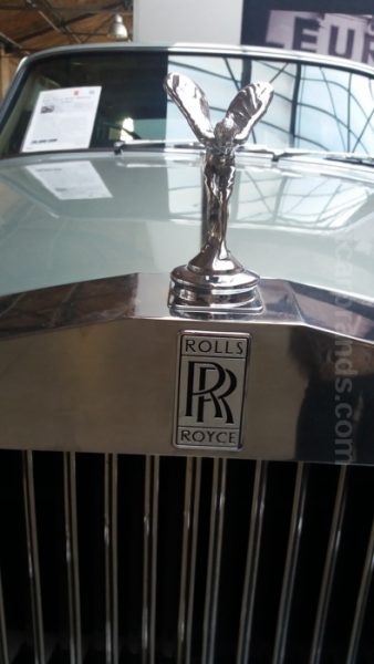
The symbol of the Rolls-Royce Group is a going ahead figure of a woman with flung backhands in garments billowing in the wind. Designed in the1911 by Charles Sykes, it was called the “Spirit of Rapture.” Afterwards, the figure received the name “Flying lady.” The “kneeling” modification was produced in 1934.
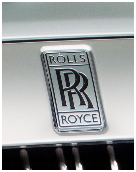
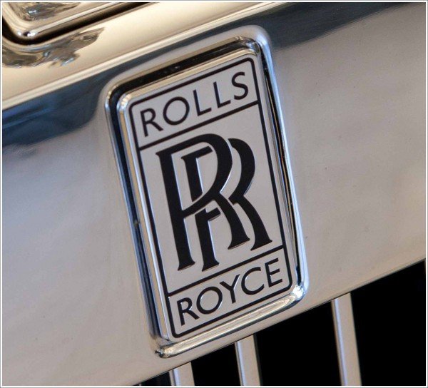
The graphical “Rolls- Royce” symbol is represented by two letters “R” applied on one another in a rectangle. In accordance with a legend, Royce saw this image on a tablecloth in the restaurant. Originally, the emblem was red, and since the middle of the 1930s, it became black-and-white.
Color
The use of the black color in the Rolls Royce logo signifies excellence, class, and grace of the company. The white color means nobility, elegance, and purity.
Emblem
Only the premium class cars are produced with the emblem of the British make with two letters “R” applied on each other, enclosed by a rectangle.
Font
The iconic “RR” monogram from the primary Rolls-Royce badge is executed in a custom serif typeface, designed exclusively for the brand. The small triangular serifs on the ends of the lines add some playfulness and elegance to the monogram and make the flared arched bars look unique and sophisticated.
What is going on with the make now? Just recently, the British deluxe brand has shown in Geneva new fashion performance of its models: the sedan Ghost and the coupe Wraith. The performance is called Black Badge and is addressed to the most promising part of the target audience of the make – bold and very rich young people. The attractive combination of new materials and a tint palette addresses to tastes of customers who are not used to retreat against plausible challenges. The changes affected, above all, the figurine “Spirit of Rapture,” not its material or a pose, but its color. It turned into a glossy-black lady- vamp, running around proudly in the darkness of the night.
The infinity sign, with which the firm unobtrusively labeled some parts of the passenger compartment, for example, the firm analog watch, also became the symbol of the Black Badge series. There are composite wheel disks as a special pride of developers, black color of an “unprecedented depth” of the bodywork, upholstering of the roof of the passenger compartment with light emitting diodes imitating the starry sky, decoration of the dash panel with composite where the carbon fiber and aluminum threads are interlaced among other interesting parts selecting cars of the Black Badge series against the background of traditional Rolls-Royce cars.


