| Founded | 1931 |
| Founder | Ferdinand Porsche |
| Headquarters | Stuttgart, Baden-Württemberg, Germany |
| Owner | Volkswagen |
| Official Site | www.porsche.com |
| Official Facebook Page | www.facebook.com/porsche |
Porsche is a German luxury car manufacturer, which was established in 1931, and by today has grown into a legendary company, with autos, being synonymous with luxury and quality. Porsche sports cars and SUVs are one of the most famous vehicles in the world, loved and desired by millions.
Meaning and History
Porsche has been building upscale luxury and sports cars for over 80 years. The company was founded in 1931 by an engineer Ferdinand Porsche.
First, it was an Austrian company, but shortly after it moved to Stuttgart (Germany), where it now has its headquarters. During its first years, Porsche did not make any autos under its own brand, but just developed motor vehicles for other companies (Volkswagen Beetle is one of such projects).
In 1945, the company’s founder was arrested, but his son Ferry steered the automaker through this difficult period. It was Ferry who developed a prototype for model 356 and the first sketch of Porsche logo that was to appear on that car.
We even know the exact date when this symbol was invented (April 25, 1952), as well as the place and circumstances. According to a corporate legend, Ferry was having luncheon in a restaurant in New York with his business partner Max Hoffman (he played an important part in Porsche history, as he was responsible for importing its cars into the US). Hoffman even took part in creating this sketch. One more peculiar fact: this draft was made on the spur of the moment, without any tools, and instead of paper Ferry just used a serviette from his table.
One more legend tells that Hoffman penned the logo himself. Other sources mention that there were several more drafts, one of them made by engineer Franz Xaver Reimspieb. Reportedly, Reimspieb refined Ferry’s sketch.
Porsche logo history has some dark places, but at least we know for sure, that unlike many other automakers that developed a distinctive emblem from the start, Porsche logo appeared more than 20 years after the company was registered.
1922 – 1938
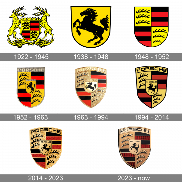
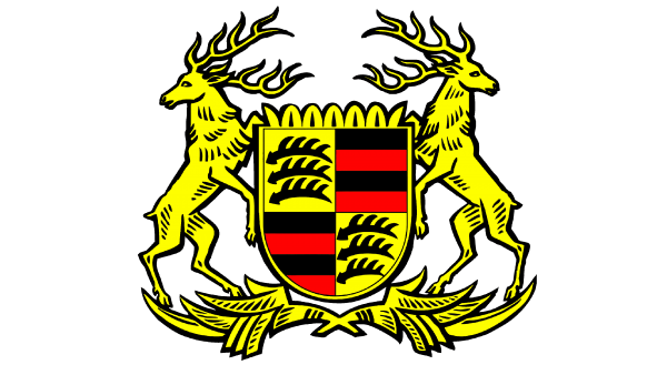
For the first years of its existence, the Porsche company has been using a classic heraldic symbol from the coat of arms of Stuttgart, the home city of the brand. It was a rounded crest in yellow, red, and black, enclosed between two standing deers, set in yellow with a black outline. The crest was accompanied by a shape horizontally oriented ornament at the bottom.
1938 – 1948
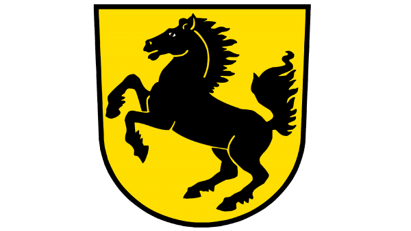
The first depiction of a black stallion appeared on the Porsche logo in 1938. The horse was drawn in profile, turned to the left, and placed on a solid dark-yellow background of a classic crest with a rounded bottom part, straight to one, and a medium-thick black outline. There was no lettering on this version of the logo.
1948 – 1952
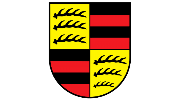
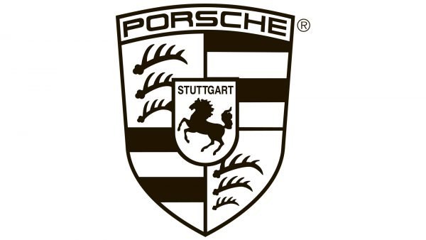
The badge, designed for the company in 1948 boasted a pattern from the very first logo, with the crest separated into four segments. The upper left and bottom right one were set in yellow and featured three black antlers in each, while the top right and the bottom left segments of the badge were set in black and red horizontal stripes.
1952 – 1963
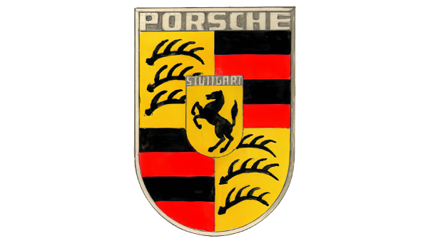
In 1952 the small yellow crest with a black stallion was placed in the center of the logo, designed in 1948. The yellow crest featured a golden banner with the “Stuttgart” lettering in the uppercase set on its top part. The main crest, divided into four fragments, also got a golden banner on top, with the capitalized “Porsche” wordmark written on it in a bold sans-serif typeface.
1963 – 1994
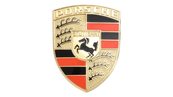
The redesign of 1963 has added volume and gloss to the primary Porsche logo, executing it in the shiny gold and red color palette with solid black elements, adding confidence and strength to the chic design of the crest. The shape of the logo was also switched to a triangular one, with all three sides of the shield slightly arched from the center. This version of the logo stayed with the iconic German automaker for more than thirty years.
1994 – 2014
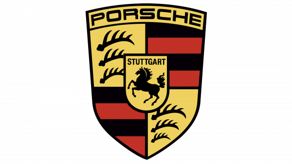
In 1994 the Porsche logo was redrawn in a more modern and minimalistic style, with all gradients and glossy shades replaced by plain and deep tones of red, yellow and black. The lettering on the top of the crest turned black, with the contours of the characters refined and cleaned up. All the central elements got a thick black outline, which made the whole badge look very masculine and precise.
2014 – 2023
The yellow shades on the Porsche logo were replaced by gold in 1963. The top part of the is o no crest got arched, making the badge look more sleep and elegant. The crest with the stallion in the center of the composition gained a double Gil’s and black outline, and the “Stuttgart” lettering was now set in black right above the head of the horse, with no additional framing or contrasting banner behind it.
2023 – now
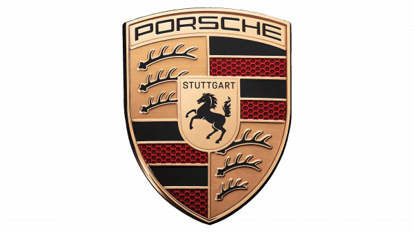
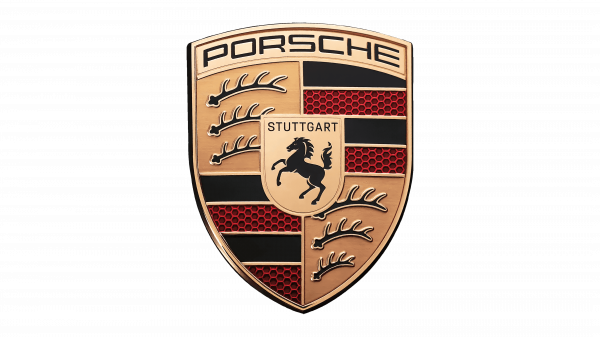
In 2023, the Porsche brand turned 75 years old. In honor of this event, the automaker has updated the logo that has been used on all its cars since 1952. The new logo differs from the old one only in a few changes. These include a black Stuttgart lettering, where the brand’s headquarters is located, and a modified image of a prancing horse. The entire logo is in a matte metallic style rather than shiny gold. It was also decided to get rid of all the texture details on the golden parts of the logo, while the red elements now featured a pattern that looked like a honeycomb with black lines.
For many years, the company was changing only small details in its well-recognized emblem. This time, the modifications were done to celebrate the anniversary and bring attention to the brand. They made the golden parts of the logo flat and matte, while the pattern on the red stripes was replaced by a new pattern. The red stripes now had a honeycomb pattern with a red outline and black center. These changes gave the logo an even more sophisticated look and reflected that the company is standing in line with all the modern trends. The loyal brand admirers will also notice that the shape of the horns and the horse silhouette were also redrawn.
Symbol
The first car to have Porsche symbol was 356 Pre-A. The badge appeared in the center of its steering wheel. It happened in late 1952 – only several months after the first draft had been created. In two years, it was installed into the front bonnet handle, and starting from 1958 owners of 356A could optionally add Porsche badge to their auto.
Font
The black uppercase Porsche logotype, which can often be seen under the iconic emblem of the German automaker, is set in an extended geometric sans-serif typeface in medium-thick lines. The closest fonts to the one, used in this insignia, are Design System D700 and Protrakt Variable Bold-Exp-Five, but with the contour of the “S” modified.
Color
The color palette of the Porsche visual identity is based on a combination of gold, black and red, which is a symbol of luxury and nobility. The scheme also stands for professionalism and passion if the company and makes its logo sophisticated, chic, and timeless.
You may be surprised by this timeline if you happened to see 356 №1. This car was released years before Porsche crest but still, bears this badge. In fact, it did not have an emblem: it is nothing but a later addition.
Description
There are three main elements:
- the black rampant horse was taken from the coat of arms of Stuttgart (the town where this company is based);
- antlers, as well as red and black bars taken from the coat of arms of Württemberg (region to which Stuttgart belongs);
- family name.
Basic colors are maroon (or claret) and black. These were the colors used for Porsche’s first driver’s handbooks and service manuals, so it is just logical that they were also chosen for its logo. Also, there are lots of golden colors.
Emblem
Although Porsche crest basically stayed the same, there were still some changes over time. Company’s logo for 356 and early 911 models have distinctive red/orange color. Word “Porsche” uses extended lettering, while letters in “Stuttgart” are raised and appear on a recessed background. Looking at the horse, you can notice a full tail and a distinct shoulder joint.
Emblem for 911 (1974–1994) uses bright translucent red and more gold color. Letters in “Stuttgart” are raised, the horse has a full tail. For the following four years logo for 911 was made with letters in black, while letters in “Stuttgart” were recessed. The horse looked slenderer.
Porsche 911 logo
The custom font used for the Porsche 911 logo emphasizes the idea of speed. The 2-door, 2+2 high-performance sports car range is one of the oldest and most popular Porsche’s lineups. According to the company, there are over 150 thousands of the 911 cars manufactured from 1964 to 1989 still on the road today. Interestingly enough, one of the models, the 911 Carrera Club Sport, had no rear lid “Carrera” logo, because Porsche designers wanted to get rid of as much weight as possible.
Porsche Cayenne logo
The mid-size luxury crossover SUV has a silvery badge consisting of the word “Cayenne” written in a custom font. Every letter looks smooth and well-rounded. The first car with the Porsche Cayenne logo was manufactured in 2002. In 2010, the second generation was launched. In spite of the fact that this vehicle has the same platform and body frame as the Volkswagen Touareg, it is very different because tuning, design, and production are done by Porsche.

