| Founded | 1896 |
| Founder | Armand Peugeot |
| Headquarters | Paris, France |
| Parent | Groupe PSA |
| Slogan | “Motion & Emotion” |
| Official Site | www.peugeot.com |
| Official Facebook Page | www.facebook.com/Peugeot |
Peugeot is a famous French automaker, which was established at the end of the 1890s. Before becoming a vehicle manufacturer, the company was engaged in the production of steel items. Today Peugeot is one of the most famous European companies in the segment, which has its cars exported all over the globe.
Meaning and History
The beginning of the Peugeot concern is the year 1812. For several decades the concern manufactured steel production, then the bicycles, the first car rolled off the production line in 1889.
The Peugeot logo originated from a heraldry sign and was developed for Peugeot by a jeweler and engraver Justin Blazer, on a foundation of the province flag, where originally the Peugeot plant had been located. In different periods, a lion was depicted on the logo; it was shown completely or just its head.
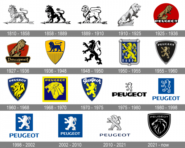
1810 – 1850
The very first Peugeot badge featured a very detailed contoured image of a lion; which was walking on an arrow to the left. The thin and elegant arrow was also poring to the left with its sharp arrowhead. There was no lettering on this badge, which stayed with the French company for forty years.
1850 – 1889
The redesign of 1850 has kept the style and composition of the Peugeot visual identity unchanged, but strengthened the lines of the logo, adding bolder black lines. The badge got darker, with the lion and the arrow almost fully black, and this added a sense of professionalism and confidence to an elegant traditional badge.
1889 – 1910
The Peugeot badge was redrawn again in 1889, and this time the composition wasn’t changed either. Although, the lion was redrawn in a less detailed way, and the arrow got more schematic, with its body drawn in just one black horizontal line. This new badge stayed with the automaker for almost twenty years.
1910 – 1927
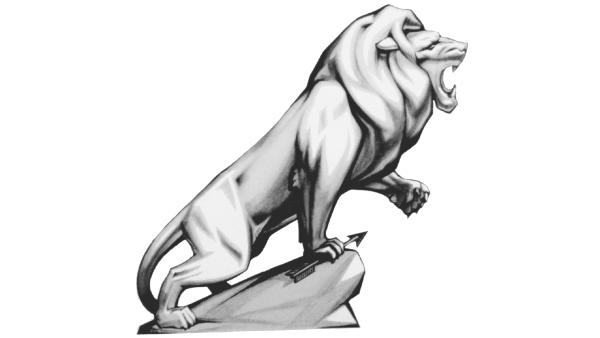
In 1910, the lion turned to the right, which meant a break with the norms of heraldry, and it acquired lines of a live lion figure, but not of the heraldry symbol. However, later the logo returned to the coat of arms style.
1925 – 1936
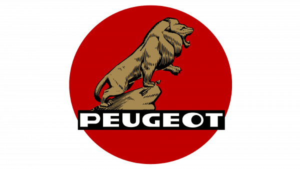
The red, round background behind the lion image not only added color and an illusion of a sun setting behind but also created a bold, powerful look. Although the lion shape was preserved, it was now done as a more abstract drawing with black lines and golden shading. For the first time in history, the brand name was added to the logo. It was done in uppercase, white letters with a black rectangular background that complimented the black in the image of the lion and allowed the inscription to stand out.
1927 – 1936
Although the previous version was still used by the company, they have presented a slightly different emblem. The round emblem was replaced by a red shield with a golden outline. The shield shape has been used by many companies and gives the logo a sophisticated and powerful appearance. The rectangular base behind the name was no longer a simple background that outlined the letters. It was a luxurious label with golden letters.
1936 – 1948
The original composition with the lion walking on the arrow to the left was brought back to the Peugeot visual identity in 1936. This time it was a solid blue image, placed over a yellow triangular crest. The lion was set at the plain part, at the top of the logo, while the bottom triangular part of the banner was decorated by thin blue vertical lines.
1948 – 1950
In 1948, the lion acquired obviously aggressive features – it reared up, the jaws opened. In this form, the logo remains now.
1950 – 1955
As the company has done earlier, it added a background for the lion image, which was updated a couple of years earlier. The lion was done in yellow and looked good against the blue and silver elegant background. White combs placed in a straight pattern added interest to the emblem, while a beautiful border enhanced the elegant look of the logo.
1955 – 1960
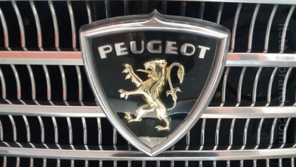
The heraldic lion rampant was redrawn in gold and made three-dimensional with the redesign of 1955. It was now set over a solid black triangular crest, which featured a thick silver frame, and had a bold silver “Peugeot” logotype in the uppercase; written across its top pry in a custom sans-serif typeface with modern heavy contours of the letters.
1960 – 1964
The logo, designed for Peugeot in 1960, looked very modern and chic due to its minimalistic style and pleasant blue and yellow color palette. The badge featured the same shape of a triangular crest, with the portrait of a lion, turned to the left. The head of the animal was decorated by a bold arched inscription in heavy white capitals, set above it. The badge featured a blue background and a distinctive white outline.
1968 – 1970
This year, the company presented a very striking and daring emblem. it was mainly due to the angular, geometric look of the lion head. It had a very empowering and fearsome look. The yellow color of the lion was supported by the yellow inscription above and the square border. Although the font was not changed, its straight lines and cut were a perfect complement to the impressive lion image.
1970 – 1975
This logo looks a lot like the emblem introduced ten years ago as it had a blue shield as the base with a white inscription at the top. When it comes to the name, it was printed using a different font that featured a graceful, cursive typeface. The full-standing lion that was seen in an emblem introduced in the 50s was redrawn and used again. Such preservation of the icon which the brand was identified with strengthens its good position in the market.
1975 – 1980
The new era of the Peugeot visual identity started in 1975. This is when the stylized lion rampant in thick strong lines was placed on the badge, above the enlarged stable logotype in an extra-bold sans-serif typeface. The first version of this badge was executed in a simple black-and-white color palette, which added even more power and elegance to the composition.
1980 – 1998
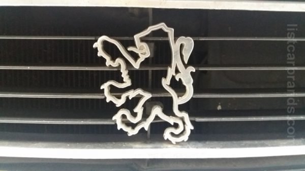
The company stayed true to its roots and used the lion figure in the logo once again. It was a simple outline with a white color used for the image and black for the outline. However, the accent this time was placed on the brand name. Although the company used the same typeface as in a few other logos. It somehow presented the brand from a completely different angle.
1998 – 2002
The redesign of 1998 has redrawn a lion in white and light-gray, making it a bit voluminous, and placed it on a solid blue square, above the blue uppercase logotype, which has changed its typeface. The new font featured lighter lines and narrower shapes of the characters, thus the whole badge started looking more elegant and balanced.
2002 – 2010
The composition of the Peugeot logo was slightly refined again in 2002, with the logotype becoming white, and moving to the bottom pry of the solid blue square. As for the graphical part, it got a bit smaller, in order to give some space to the uppercase inscription. The lines of the letters got a bit thinner.
2010 – 2021
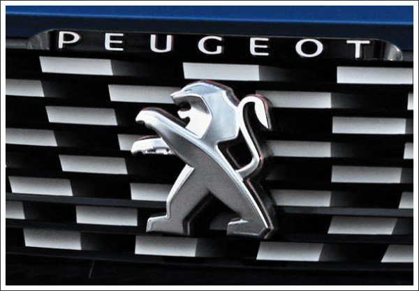
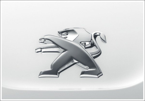
The redesign of 2010 has introduced a sleek three-dimensional version of the iconic Peugeot lion, executed in a matte silver, with smooth gradients. The emblem was placed above a modern and elegant dark-blue logotype in a medium-weight sans-serif typeface with softened contours of the letters and a lot of air inside and between the characters.
2021 – now
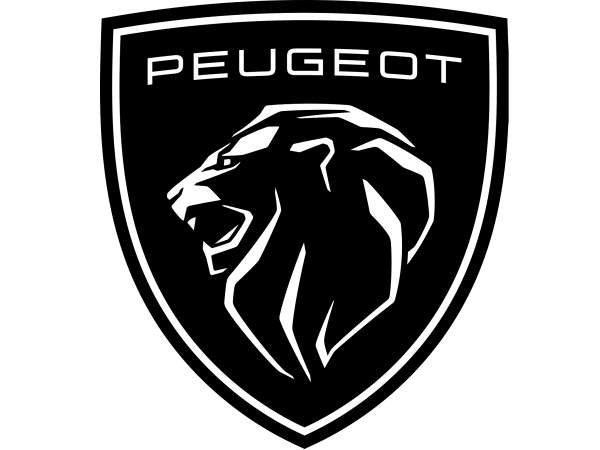
In 2021 Peugeot decided to come back to its sleek logo, designed in 1960 but made it stronger and more distinctive. The new badge is executed in a black and white color palette, with the aggressive lion drawn in white lines and enclosed into a double white and black frame. As for the lettering, it was rewritten in a thinner and more geometric sans-serif typeface, placed above the head of the animal, and set in white.
Symbol Description
The new brand Peugeot depiction– the three-dimensional renewed Lion without a protruding tongue – gives some dynamism to the symbol. First, it appeared on the bonnet of the model Peugeot RCZ in 2010.
Color
It is interesting that in the color solution Peugeot turned out imitative, this is a white and a blue one as in the case of Volkswagen, BMW, Ford, and Fiat. Apparently, this is the most popular combination of colors for car logos.
Font
The sleek and elegant uppercase Peugeot inscription from the redesigned crest, introduced in 2021, is set in a modern sans-serif typeface with extended letters and pretty thin lines. The closest fonts to the one, used by the French automaker are, probably, Technovier and FF QType Pro Extended.
Emblem
The current version of the Peugeot emblem has a custom typeface designed especially for the company by French type designer and graphic artist Christophe Badani.
At present, the PSA Peugeot Citroën Group concern is the most large-scale private enterprise in France and occupies the honorary second place in motor vehicle manufacturing in Europe.
The role of the make of an overall plan, which is aimed at quality and which is intended to fight in the armor and equally against Volkswagen is assigned to Peugeot. Of its 25 relevant models (cars not on the PSA platform and light commercial transport are excluded), only 13 will remain by 2022. Soon, the manager guillotine will “chop” off such now already morally obsolete cars as 107, 207 and 307, all coupe- cabriolets and big minivans. Each model that survives must be strong and very special. As many analysts believe, there is no place anymore for passing models, as a market’s serious challenge waits for each one.
The entirely new Peugeot cars will enter into production soon. New Peugeot models will be called Air Hybrid. This is a part of the program for the reduction of fuel consumption and bringing flow rate up to 2 liters of fuel for each 100 km of mileage. The task is to achieve this result by 2020 is set. However, not all new cars Peugeot will be fitted with engines of such fuel consumption at once.

