Founded: 1983
Founder: John Bloor
Headquarters: Hinckley, Leicestershire, UK
Official website: www.triumphmotorcycles.co.uk
Triumph is the name of one of the iconic motorcycle brands, which was established in 1885 in the United Kingdom, and turned into a modern brand in 1983 after John Bloor acquired the rights. The brand produces motorcycles in a wide variety of classes, ranging from sports to retro motorcycles, which are the symbol of the label.
Motorcycle History
The history of Triumph motorcycles lasts for more than a century. The company of the same name was founded in 1885 in Great Britain by Siegfried Bettman, who headed it until 1936.
The first motorcycle was produced by the company 17 years after its establishment, in 1902. It was a light model, based on a bicycle, where a Belgian engine of 239 CC and 2.25 horsepower was attached. Over the years, the Triumph bikes improved won races, and gained popularity.
Where are triumph motorcycles made?
The majority of all Triumph motorcycles are still made on the brand’s production facilities in the UK, though the company has five more plants in Thailand and Brazil, which allows them to cover distribution in Asian and Latin American markets.
In 1905 company recruited Charles Hatheway, a very talented engineer, who helped design a single-cylinder engine with a capacity of 3 hp and 363 CC. A motorcycle with this engine could reach 72 km/hour, which was a breakthrough. The company’s designers slowly but surely developed its mechanisms, thinking over every detail. This allowed Triumph to establish itself on the market as a manufacturer of reliable and dynamic motorcycles.
In 1907 Triumph motorcycles start taking leading positions in races, which increases their popularity and allows expansion to the international market. Only during World War I, the company produced more than 30 thousand motorcycles for the army. The most popular models then were the 4-horsepower Model H, also called the Trusty Triumph. They were equipped with a primary chain drive, a 550 CC motor, and a three-speed transmission.
After the war, an improved version of the Model H called Model 50 came out, in which the belt drive was replaced by a full chain drive complemented by a spring drive.
In 1923, the company sold the bicycle production and started producing cars in addition to motorcycles. Business was so good that in 1927 the brand produced a thousand motorcycles a week. The flagship was the Triumph TT with a 500 CC power unit, which had been designed with the Brooklands racer.
In 1936, production was taken over by Edward Turner, and in 1973 the company Norton-Villiers-Triumph was formed, producing motorcycles until 1990. In 1990, with the arrival of new owner John Bloor, the modern history of Triumph began, which three new models in the Triumph portfolio.
In September 1991, the company set up the production of three pairs of new models, the Trophy, Daytona, and Trident, introduced at the 1990 Cologne show. They were two motorcycles Trident, with 750 and 900 CC engines and no fairings, sports motorcycles Daytona, with 750 and 900 CC engines and full fairings, motorcycles for touring Trophy with fairings and the engine 900 and 1200 CC.
Who owns Triumph?
Since the early 1990s, the iconic British motorcycle manufacturer is owned by Bloor Holdings Limited, with John Bloor as its head.
At that time, the company produced very few motorcycles – no more than eight per week, but already in 1996 production had grown to 15 thousand bikes. Triumph launches the new line — enduro class motorcycles Tiger 900, Sprint, retro-model Thunderbird, and Adventurer.
Gradually there was a re-equipment of the produced models, competition with well-known motorcycle companies, Honda and Ducati, forced the Triumph designers to develop new motorcycles with technical characteristics ahead of their time.
As a result, the stunning T595 Daytona was launched in 1997, which allowed the Triumph brand to once again become an elite motorcycle manufacturer.
Brand Logo
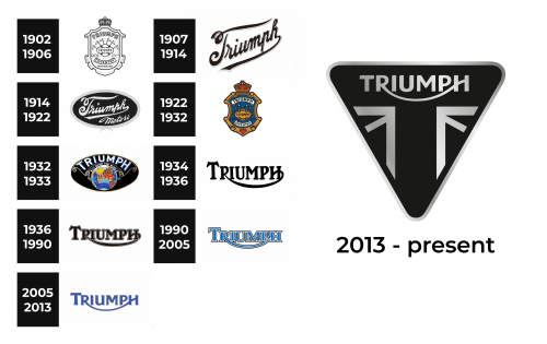
1902 – 1906
The earliest logo of the brand was presented as a heraldic shield with a crown at the top. It had multiple details that made it look sophisticated and added interest. The brand name curved across the top using all uppercase gray letters with a thin black outline.
1907 – 1914
A more minimalistic, but no less grand logo was created in 1907. It featured “Triumph” printed in an elegant cursive font. The horizontal bar of the “T” stretched across the top of the inscription, while the last letter curved and underlined it. The diagonal placement of the wordmark added dynamics to the logo while a light shadow made sure the logo did not look flat.
1914 – 1922
The previous emblem was placed on a black oval base with a light frame that had a mosaic pattern. It was now done in white and had some volume. Moreover, the angle at which the name was printed was made smaller, so it looked almost straight. At the same time, there was enough space in the lower right corner to add “Motors”, which was printed using the same writing style as in the main line. The logo looked more solid and appropriate for powerful and luxurious motorcycles.
1922 – 1932
This logo looks like a colored version of the original emblem. It is done in golden, red, and blue with black outlines and touches of white. Some of the details were modified to make the logo look cleaner and more polished.
1932 – 1933
This logo is quite busy and colorful and was used by the company for a very short period of time. A colorful globe, with an “All over the world” inscription curving above it, took the center position in this emblem. It was placed on a black oval base with a thin golden outline. The black color made all the other colors pop. The name was printed using a white basic font and all uppercase letters. The addition of a blue shadow not only added depth but also created a connection with the globe and gave the logo a futuristic touch. At the same time, there were fine, golden ornate lines that created a more sophisticated appearance.
1934 – 1936
It was this logo that set the trend for a more minimalistic design as it featured only the brand name. The name was printed using all uppercase letters with the first one being enlarged to imitate a capital letter. The company has already used beautiful swoosh lines and curves and this version was no exception. The “R” curved under the other characters and flowed right into the last letter, becoming a horizontal line in the “H”. Meanwhile, the rounded serifs added a classic touch to the logo, which was enhanced by the use of black color.
1936 – 1990
A few years after the introduction of a new logo, the company made a minor adjustment. It added a thin white outline around each character. To make it visible on the white background the white line was slightly indented inward, which created an illusion of a double border. The letters were no longer as tall, but the logo stayed the same otherwise.
1990 – 2005
This logo presents not only sharper, pointed serifs but also a new color palette. The blue color of the letter with a white and black outline looked fresh and full of life. The blue color made the brand look trustworthy and solidified its strong position.
2005 – 2013
The company presented a more modern spin on a familiar logo. The letters now featured flared serifs and a different shade of blue. In addition, there are no outlines around each character. The inscription looked smoother and friendlier. In addition, such smooth strokes gave the logo a feeling of movement and style.
2013 – now
The Triumph visual identity is elegant and sleek. Based on the logotype, created during the company’s early years, it still looks actual and sharp, representing the true style and timelessness of the iconic brand.
The Lee are two possible versions of the Triumph logo — a simple monochrome wordmark, which is used without any additional elements, or a triangular crest with the Union Jack patterns and the inscription placed along its top side.
Emblem and Symbol
The Triumph emblem featured a shape of a triangle pointing down, with its corners rounded, and a partial Union Jack motive in the middle. The lettering is placed above the flag fragment and executed in white, contrasting with the dark gray and black background of the crest. The emblem of the brand yells pride and value of its legacy, enough it looks modern and cool, it evokes a sense of traditional approach and fundamentalism.
Font and Color
The iconic Triumph logotype is executed in a custom typeface with the clean contours of the letters, smooth lines, and a tail of the “R” elongated, creating a “smile” under the wordmark. The closes font to the one from the Triumph logo is probably Arpona Bold or NS Mudolf Sans Serif, but with some elements modified.
As for the color palette, the British brand prefers using monochrome, a combination representing style, elegance, and power.
The Legends
The flagship of the company, the Triumph Rocket III mega cruiser, is at the head of the range. This motorcycle is equipped with an obscenely large engine with a volume of 2294 CC, installed longitudinally and developing up to 140 hp.
The torque of this bike is 200 Nm, which is more than many modern cars. Acceleration to 100 km/h is less than three seconds. The dry weight of the motorcycle is 320 kilograms and its length is 2,5 meters.

