| Native name | いすゞ自動車株式会社 |
| Founded | 1934 |
| Founder | Armand Isuzu |
| Headquarters | Tokyo, Japan |
| Slogan | Rajanya Diesel (The King of Diesel) |
| Official Site | www.isuzu.com |
Isuzu is the name of the Japanese company, which was established in 1934, and is engaged in the production of commercial vehicles and diesel engines. Until 2002 Isuzu has also been producing passenger cars, but this department has been closed.
Meaning and History
Isuzu is one of the world’s top manufacturers of cars and car engines. It produces heavy trucks and commercial vehicles. Isuzu engines are featured in Opel, Renault, and GM vehicles.
The Isuzu logo is a wordmark written in red caps with symmetrical ‘S” and “Z”. The earlier logo version featured two vertical pillars that symbolized excellence and were to emphasize the high quality of all Isuzu products.
The bright logo design has made Isuzu products recognizable around the world. The company’s signature font and color are reflective of its infinite thirst for perfection and integrity.
1949 – 1974

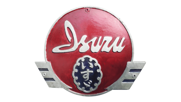
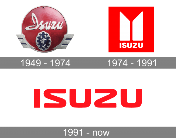
The Isuzu badge, used by the company during the first era of its history, featured a very elegant composition, with the silver cursive lettering in the title case written across the top part of the solid red roundel in a silver framing. The frame was decorated by two small geometric wings at the bottom. The wings were set in silver, with two blue horizontal stripes on each. The same shade of blue was used for the background of the small oval medallion with a silver hieroglyph and in a smooth ornate frame, set in the bottom of the red roundel.
1974 – 1991

The redesign of 1974 has introduced a super strong and modern badge of the Japanese automaker. It was a vertically oriented rectangle, colored in solid red, with the massive uppercase logotype in white written under a styled geometric emblem, also in white. The emblem was formed by two thick vertical lines, with the diagonal cuts of their upper parts, which formed a pointing-down triangle in the negative space.
1991 – now

In 1991 the Isuzu logo gets more laconic but doesn’t lose its power. The new design concept is based on the stylized uppercase logotype, set on a transparent background and written in a bright shade of red. The letters featured softened contours and straight types of the ends of the lines, and the “Z” in the inscription looks like a mirrored “S”.
Font</h2
The uppercase Isuzu logotype from the primary badge of the company is set in a custom sans-serif typeface with smooth and slightly extended contours of the “S” and the “Z”. The closest font to the one, used for the insignia of the Japanese commercial vehicle manufacturer is, probably, Eurostile Unicase Pro Regular, but with the contours f the consonants modified.
Color
As for the color palette of the Isuzu visual identity, the company has been using one bright and intense shade of red for its logo since the middle of the 1970s. This color stands for power and passion, and also shows the confidence and progressiveness of the Japanese company.


