
![]()
| Fate | Re-launched (2013) Discontinued (1986) |
| Founded | 2013 1931 |
| Headquarters | Tokyo, Japan |
| Parent | Nissan |
| Slogan | “Break Through” |
| Official Site | www.datsun.com |
Datsun is the name of one of Nissan’s car marques, which was established in 1931, and discontinued in 2022. The brand specialized in the production of automobiles and light trucks, which were mostly sold in the Asian region and Russia.
Meaning and History
![]()
The start to the history of the carmaker Datsun was made in 1911 with the creation of the Kwaishin-sha Company, the engineer Masujiro Hashimoto was its ideological center.
In 1914, the car DAT was produced by the Kwaishin-sha Company in Tokyo. The abbreviation of surnames of the company partners became the name of this new car: Den Kenjoro – D (田健), Aoyama Rokuro – A (青山禄), Takeuchi Meitaro – T (竹内明太郎).
So, Datsun is the subsidiary firm of the DAT Motorcar Company, which created mainly light trucks at the beginning of the XXth century. The make appeared in 1931 as Datson, which symbolized “a son of DAT.” However, three years later, the Nissan firm bought the DAT company, and the new owners decided to make a re-branding, having changed the name to Datsun. Thus, they used the flag of Japan, on which the rising sun is depicted.
Before 1960, auto models of the concern were produced only under the Datsun brand and Nissan itself manufactured mainly trucks. And, when in the 1960s, the Japanese decided to come out to the US market, the Datsun brand was selected out and away.
From the competitors, Datsun was distinguished by its low prices. There were mainly cheap sedans and hatchbacks, as Bluebird, Sunny, Stanza, and Violet. The model 240Z became the real success of the Datsun brand: an inexpensive sport coupe with a metal bodywork (1969).
Since 1983, in the States, in the framework of a concept of globalization, all “Datsuns” were renamed into “Nissan.” In some markets, the make Datsun existed a little longer, until 1986.
Datsun began to be revived on the 21st of March, 2012 in Russia, India, South Africa and Indonesia.
1931 – 1935
![]()
The very first Datsun logo, introduced in 1931 with the launch of the marque, was repeating the iconic Nissan badge, with the solid red circle horizontally crossed by the bright blue banner, where the white lettering was written in bold serif capitals.
1935 – 1976
![]()
The badge was refined in 1935, with its color palette being darkened up, and the typeface of the Datsun logotype modernized. The new inscription was set in the uppercase of a bold sans-serif typeface, with massive letters placed close to each other.
1951 – 1963
![]()
In 1951 there was one more badge designed for the Japanese automaker. The new concept was built around the stylized white logotype in a fancy sans-serif font, written on a horizontally stretched red banner with its thin bottom part in white.The banner had its corners rounded, which balanced the smooth contours of the futuristic lettering.
1963 – 1964
![]()
The redesign of 1963 has introduced a new Datsun logotype in a light shade of blue. That was a cursive inscription with the letters placed far from each other but connected by thin horizontal lines in the central part. This logo only stayed in use for several months.
1964 – 1965
![]()
The Datsun logo, created in 1964 has also stayed for just a few months. It was a bold white script wordmark, with each letter outlined in black, and set on a dark turquoise background, with the characters coming out of it to the top.
1965 – 1986
![]()
Another logo for Datsun was designed in 1965 and featured uppercase lettering in a bright shade of yellow. The inscription was set in a medium-weight sans-serif font, with the contours of the letters slightly extended. Clean lines and delightful colors made the badge look unusual and the brand — stand out in the list of its competitors.
1970
![]()
The logo, used by the Japanese car brand in 1970 was composed of a white script lettering in a thin turquoise outline. The bold lines and smooth shapes of the characters looked completely different from the second logo, used by the company until 1986.
1970 – 1972
![]()
Apart from the previous badge, there was one more emblem, designed for Datsun in 1970. It was a bold uppercase logotype in a strong and stable serif typeface, with the white characters in a contrasting black outline.
1972
![]()
The redesign of 1972 has brought one more badge to the Datsun visual identity experiments collection. That was a horizontally stretched black banner with rounded angles and a white uppercase lettering in a serif font. The characters in the inscription featured a thick gray outline and were placed far from each other.
1972 – 1976
![]()
One more logo, created for Datsun in 1972, boasted a massive black wordmark set on a transparent background. The uppercase logotype was executed in a custom font with thick lines and sharp triangular serifs.
1976 – 1986
![]()
In 1976 the company decides to come back to its logo from 1935, with the solid red circle cut by a blue rectangle with the white lettering on it. The only difference between the two versions was in the size and shape of the rectangle, which became longer and got its corners sharp, with the sides — completely straight.
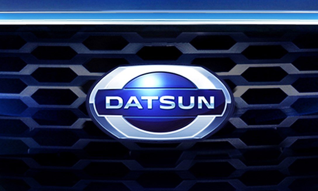
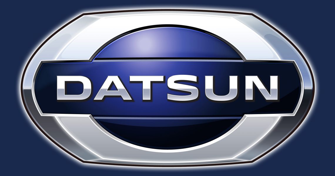
2012 – 2022
![]()
The last badge in the Datsun history was designed in 2012 and stayed with the automaking brand till its’ discontinuation in 2022. The new emblem was three-dimensional, with the thick silver frame around the voluminous blue circle, overlapped by the horizontally located banner with the lettering. The banner was drawn in the same shade of blue as the circle in the center of the badge, while the uppercase sans-serif inscription featured a light silver gradient.
Font
The lettering from the last Datsun badge was set in the uppercase of a modern sans-serif typeface, with stable letters in medium-weight lines. The closest font to the one used in that insignia is, probably, Syncopate Pro Bold.
Description
![]()
“DAT” is the initial letters of constructors K. Den, R. Aoyama, and A. Takeuchi. In 1934, the re-branding occurred: the owners changed the former name of Dutson (“a son of DAT”) to Dutsun, having based on the flag of Japan, on which the rising sun is depicted. Also, one of the first logos represented the red circle (symbol of the sun) and the name on a blue bar over this circle.
![]()
The new logo represents the blue ellipse in a silver hexagonal frame, in the background of which the make name is located. The new hexagonal form of the logo demonstrates modernity of the revived Datsun.
How is the new Datsun symbol different
The old Datsun symbol bears a much more noticeable resemblance to the Flag of Japan: you can see the picture of the red rising sun in the background of the logo. In the new version, the idea of the rising sun is hardly present. The red color was replaced by blue, and the very shape of the “sun” changed: now it’s not a circle, but an ellipse. Designers added a silver frame and chose a more modern font.
![]()
On what cars the Datsun emblem can be seen?
Since March 2012, when Nissan announced that it was going to revive its Datsun brand, several models have been introduced. In 2013 the Datsun Go and the Datsun Go+ cars were launched. The next year the Datsun on-Do (based on Lada Granta) and the Datsun mi-Do followed. One more long-expected model, the Redi-Go concept, was unveiled the same year.
Colors
![]()
On the former logo, the location of the blue frame over the red circle, which symbolized the sun, reflected the fundamental principle to the company – “sincerity leads to success.”
On the new logo, the blue color is a part of the heritage of the brand; it symbolizes honesty and reliability.