
![]()
| Manufacturer | Chevrolet |
| Production | 1953–Present |
| Model years | C1: 1953–1962 C2: 1963–1967 C3: 1968–1982 C4: 1984–1996 C5: 1997–2004 C6: 2005–2013 C7: 2014–present |
| Owner | General Motors |
| Official Site | www.chevrolet.com/corvette-sports-cars.html |
| Official Facebook Page | www.facebook.com/corvette |
Corvette is the iconic model of a sports car, produced by the American Chevrolet. The first Corvette saw the light in 1953, and since then ten models of the legendary car have been released.
Meaning and history
![]()
The Chevrolet Corvette is a sports car produced by Chevrolet, a division of the American company General Motors. Over the years, the car has been constantly improved and currently, there are seven generations of the car. The first generation was shown by GM in 1953 as a concept car. The name describes the car as small, maneuverable, like a warship – a corvette.
The Chevrolet Corvette is rightly called the most iconic American car and the most popular sports model in the world – more than 1.5 million cars were produced.
The second generation is remembered for the release of the famous Corvette C2 Sting Ray in 1963. According to many, this generation is the best in the history of the model.
In the name of the third generation, the word Stingray (rocket) began to be spelled together. The third Corvette, released in 1968, was based on the 1965 Mako Shark II concept.
The fourth-generation Corvette, which began production in 1983, was not as revolutionary in appearance as the previous generation, but it had outstanding aerodynamics and was very clever technically.
Since 1997, the Corvette has been as most people know it. The C5 was designed by engineer Dave Hill and designer John Kaffaro.
The sixth generation of the legendary car was introduced by the Corvette C6 with coupe and convertible bodies in 2005. The new model was Built on the updated platform of the C5 model, it has the same suspension, but a new, more powerful engine.
The seventh-generation Chevrolet Corvette was officially unveiled on January 11, 2013, at the North American International Auto Show, formerly the Detroit Auto Show, USA.
The 2020 Chevrolet Corvette is the brightest and most coveted new car and arguably the biggest Corvette in decades. Not only that, this American sports car has been given a mid-engine location – the engine is now located right behind the front seats.
1953 – 1955
![]()
Robert Bartholomew created the first version of the Corvette logo shortly before the car itself was introduced in 1953. The Corvette symbol consisted of two crossing poles, with two flags (a checkered flag and the US flag).
Yet, less than a week before the car appeared at the GM Motorama auto show; it was actually changed as the company’s management found out that it was against the law to use the US flag.
1955 – 1962
![]()
he restyled badge featured a fleur-de-lis, the white racing flag, and the company’s signature bow tie.
However, this was nothing but a temporary solution, and shortly before the car went into mass production, a new logo Corvette was introduced.
1963 – 1967
![]()
The Corvette logo, introduced in 1963, was designed specifically for the new Sting Ray model. The black circular frame was enclosing the emblem and the lettering of the new badge, which were set on a plain white background. The emblem still featured an image with two crossed flags, just like on the previous version. As for the lettering, it was set in two lines, with the black cursive “Corvette” set above the white sans-serif “Sting Ray” written on a black horizontally-oriented rectangle, and underlined by a thick black line.
1968 – 1982
![]()
The version introduced in 1968 had no circle frame, while the flags spread apart even further.
1982 – 1996
![]()
In 1984 the circle was brought back, but the poles and the fleur-de-lis disappeared.
1997 – 2005
![]()
In 1997, however, these two elements returned, while the circle transformed into an oval.
2005 – 2014
![]()
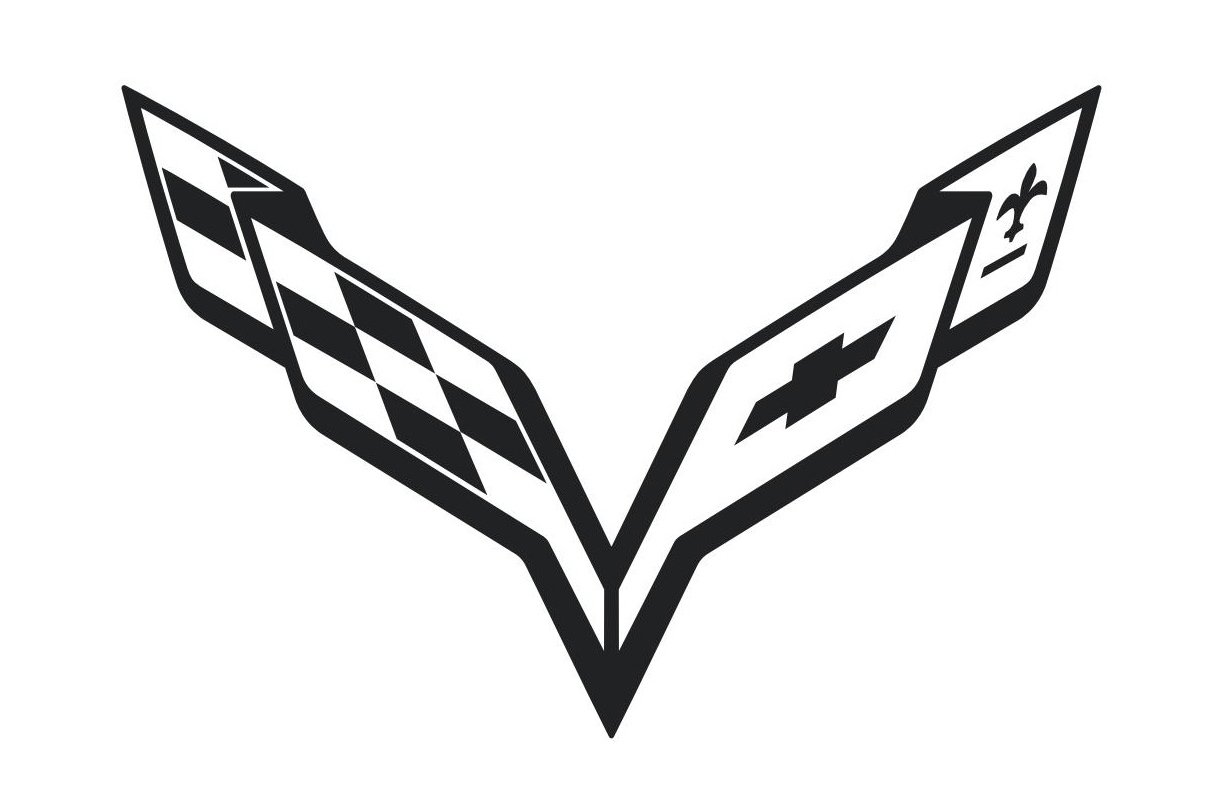
The redesign of 2005 has refined the iconic Corvette logo, making the flags’ contours smoother, and adding the lettering to the composition. The new flag emblem looks like a letter “V” with the bars spread to the sides, like two wings. As for the logotype, it is executed in a modern and easy sans-serif typeface with black capital letters slightly slanted to the right, evoking a sense of speed and motion.
2014 – 2019
![]()
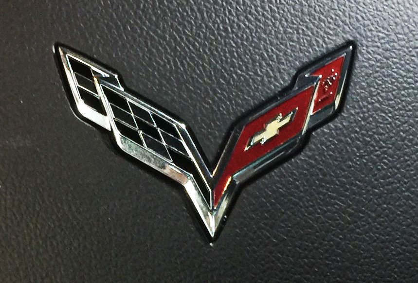
In 2014 the Corvette logo got another redesign, with the flag-V getting sharper, and all the elements executed three-dimensional, with black lines replaced by the glossy silver ones. The lettering was also set in silver, with the typeface almost fully repeating the one from the previous badge.
2019 – now
![]()
The redesign of 2019 has made the Corvette V narrower, yet it started looking more confident and brutal. As for the inscription part of the badge, it changed the typeface to a more traditional sans-serif one, with all of its italicized capital letters set separately from each other. The silver elements got more cold gray hues, compared to the previous version, and the framing of the emblem became more matte than before.
2020 – Today
![]()
New Corvette logo is designed for the C8 Corvette and features the same two crossed flags, composing the letter “V” but in stronger and sharper lines. It looks powerful and energetic. The fleur-de-lis symbol is also slightly modernized.
Font
The strong uppercase Corvette logotype is a perfect representation of the speed and power of the iconic cars. The lettering is set in a custom italicized sans-serif font, which has some of the contours based on such fonts as Munrolane Bold Solid Italic and Chronosphere Expanded Italic.
Color
As for the color palette of the Corvette badge, it hasn’t changed much throughout the years, as the main element of the brand’s logo is composed of two traditional flags, one in black and white, and the other one — in red. This tricolor is accompanied by glossy silver and gold elements, which elevate the logo, and makes it look even more sleek and luxurious.
The sixth-generation symbol
One more version of the Corvette logo appeared in 2005, with the sixth generation of the car. The poles of the iconic flags were colored in the same colors as the flags themselves. The circular frame was removed once more.
The seventh-generation emblems
The C7, which was introduced at the beginning of 2013, underwent so many changes that the company claimed there were actually only two things taken from the previous version: the cabin air filter and the top latch. The Corvette emblems were also revised.
![]()
The new version looks more angular and swept. In this way the logo Corvette designers created reflects the changes introduced into the seventh-generation Corvette itself. One more reason for the change in proportions is that they also help to convey the idea of speed.
![]()
![]()