| Native name | 三菱自動車工業株式会社 |
| Founded | April 22, 1970 |
| Founder | Mitsubishi Heavy Industries |
| Headquarters | Minato, Tokyo, Japan |
| Owner | Nissan (34%) Mitsubishi (20%) |
| Slogan | New Motoring Wave Creating Together Heart-Beat Motors Drive@earth |
| Official Site | www.mitsubishi-motors.com |
| Official Facebook Page | facebook.com/Mitsubishi |
Meaning and History
Mitsubishi emblem is often called “Three diamonds” – that is exactly what the name of this company means in translation from the Japanese.
The word “Mitsubishi” is a combination of two Japanese words: “mitsu” and “hishi”:
- “mitsu” is a numeral meaning “three.”
- the common meaning of “hishi” is “water chestnut.” However, this word also has a less common meaning “a rhombus of a diamond shape.” It appeared due to the resemblance of a chestnut leaf to a rhombus.
Now when you have another look at Mitsubishi logo, you will immediately see how closely its shape is related to the name of the company.
The name of the company was settled on more than 40 years later. In 1964 Mitsubishi chose its first slogan, which was written in Japanese only. Four years later Mitsubishi adopted a new one, “Advanced and ever-advancing,” which was used worldwide.
You might be wondering why there is “b” instead of “h” in the word “Mitsubishi.” Rules of the Japanese language require that when “h” occurs between two vowels, it is replaced by “b.”
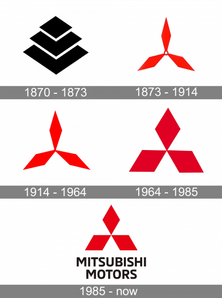
1870 – 1873
The Mitsubishi logo owes its existence to the founder, Yataro Iwasaki. When he established his organization back in 1870, he chose this emblem resembling his family crest (three stacked rhombuses). It also bore a resemblance to the three-leaf emblem of his first employer, the Yamanouchi family from the Tosa Clan. Who would have imagined that this minimalistic symbol was to last for more than 130 years and earn the trust of people worldwide!
1873 – 1914
The three elements of the previous logo were transformed into another shape that is well recognizable nowadays. Each plate was transformed into a rhombus shape. The diamonds were positioned around a small ring. The red color of the diamonds and the ring contrasted perfectly against the white background, while the three elements in the logo reflected the values and roots of the company.
1914 – 1964
The ring in the center of the logo was gone. Otherwise, the logo was kept unchanged. It reflected a closer connection between the two crests that the emblem was based on as well as the integrity of its key values.
1964 – 1985
The new emblem is a modified version of the previous logo. The darker and richer color gave the logo a more sophisticated and powerful impression. This was further enhanced by the wider shape of the rhombs. It was a perfect update to a logo that existed for almost a century.
1985 – now
A brighter shade of red was brought back. However, this was not the only update. The full company name was printed using thick, clean strokes and straight cuts. The typeface is very similar to a customized version of ED Northridge Sans Extra Bold and New Sans Std Bold fonts. The black color of the characters gives the brand a stable and strong impression with a touch of sophistication.
Emblem font
The very first corporate typeface was devised back in 1955: that was a number of Japanese hieroglyphs. The font even had a name (Mitarashi-ryu). However, this typeface did not last long and was replaced in 1963.
Why hasn’t Mitsubishi ever changed its symbol?
In contrast to many other companies that introduce a new logo every one or two decades, Mitsubishi has not changed its logo for more than 100 years, ever since it was registered in 1914.
There are two reasons behind this noteworthy decision. In the first place, it can be explained by company’s loyalty to its roots and history. Also, this image is so simple and yet impressive that it does not look dated even now.
Meaning
The “Blue Mitsubishi” emblem was designed in 1985 for use inside of Japan only. It was complemented by a new corporate slogan.
Mitsubishi Evo logo
The high-performance sports sedan Mitsubishi Lancer Evo uses the same emblem as all other Mitsubishi cars, with a different inscription. Special edition Evolution VI, launched in 1999, was named after Finnish rally driver T. Mäkinen and features his logo.


