| Founded | 1922 |
| Founder | William Lyons William Walmsley |
| Headquarters | Whitley, Coventry, United Kingdom |
| Parent | Jaguar Land Rover (since 2013) |
| Owner | Tata Motors |
| Slogan | “How Alive Are You?” |
| Official Site | www.jaguar.com |
Jaguar is the name of a luxury automaking brand, which was established in the United Kingdom in the 1920s, and today is a part of the Jaguar Land Rover Group. The brand is known all over the globe for its chic sedans and SUVs.
Meaning and History
Jaguar traces its origin from “Swallow Sidecar Company” created in Blackpool by William Lions in its 21st birthday on the 4th of September, 1922.
Lions intended to manufacture motorcycles, inter alia, sidecar motorcycles. Originally the emblem depicted a martin in flight, perhaps because the word “swallow” denotes precisely this bird in English.
During five years, the company was manufacturing bodyworks for the “Austin Seven,” “Swift,” “Standard,” and “Wolseley” firms. In 1931, the “Swallow Sidecar and Coach-building Company” produced its first car “SS” – these two letters were depicted on the hexagon emblem.
While the company originally had two co-founders, in 1934, William Walmsley decided to sell-out. So, his partner, Lyons, created a new company called S.S. Cars Limited. The new company was supposed to buy the existing business. As Lyons didn’t have enough funds for the deal, he decided to issue shares to the public.
In 1935, the decision to give the new name to the firm was taken and of 500 proposals, “Jaguar” was selected, regarding the fact that the animal itself is an embodiment of speed, power, and beauty.
In September of the same year, the model “SS Jaguar” appeared, and an emblem with wings loomed on its radiator. Sometime later, the emblem with a jaguar’s head appeared. After the war, the company ceased to use initials “SS,” because they referred to Himmler’s Schutzstaffel (security troops) and accepted the name “Jaguar Cars Ltd.”
While the cars were a success, and lots of people wanted to buy them, the following decade was rather difficult for the company because of shortage of materials, especially still. For years, government limited the amount of steel plants could get. To boost production, Jaguar had to sell one of its major assets, the Motor Panels company, which was bought in the late 1930s, to Rubery Owen, steel and components manufacturer. At the same time, Jaguar purchased the production facility where Standard Motor Company produced Jaguar’s six-cylinder engines. Starting from that period, Jaguar didn’t manufacture bodies for its cars but bought them from external suppliers.
Jaguar became increasingly popular as a manufacturer of impressive, flashy sports cars providing enviable driver’s experience. Moreover, models designed by the company’s engineers proved to be very successful in international motorsport.
1922 – 1935
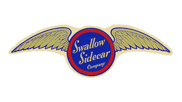
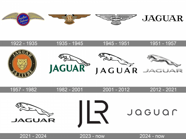
The very first Jaguar logo, designed in the 1920s, had nothing in common with the badge the whole world knows today, as the company was established under another name, Swallow Sidecar Company, getting the new identity only in 1945. The initial badge of the bran was composed of a solid blue roundel in a bold red frame with two elegant gold wings coming out of it to the sides. The name of the company was written in a fancy cursive diagonally over the blue background, with all the letters set in gold.
1935 – 1945
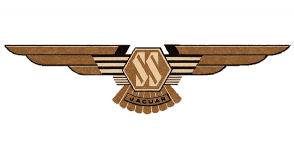
The most provocative badge of the Swallow Sidecar brand was created in 1935, and stayed with the British automaker until the end of the World War II. The beige SS monogram in a triangular designer font was placed on a light-brown hexagon between two geometric elongated wings. The bottom part of the badge was decorated by a transparent ribbon, arched from the center and boasting a black uppercase “Jaguar” lettering in a modern Sans-serif font.
1945 – 1951
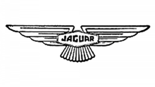
The redesign of 1945 has removed all the elements, resembling of Nazi, and introduced a new badge, executed in black and white, with the horizontally-stretched hexagon placed between two wings. The central part of the badge was now taken by the bold uppercase “Jaguar” inscription in black, set in a custom sans-serif font.
1951 – 1957
In 1951 the Jaguar badge was only composed of an uppercase serif inscription, set in plain black against a white background. The bold and stable capital letters looked very elegant, yet at the same time powerful and strong, with clean contours and sharp thin serifs. It was a timeless classy logo, which stayed with the automaker until 1957.
1957 – 1982
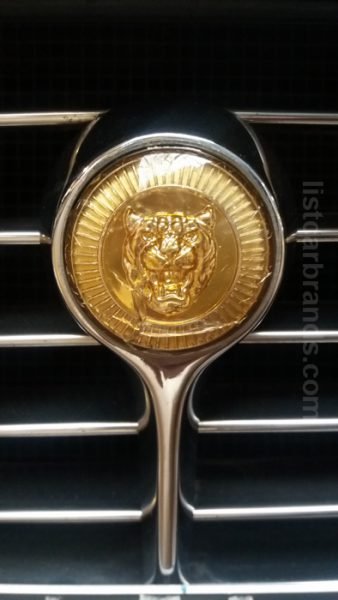
The badge, used by the Jaguar brand from the end of the 1950s to the beginning of the 1980s, featured a circular shape. The main part of the badge was executed in orange, with some gradients, creating a geometric pattern, a thick black frame, a golden image of the jaguar’s head in the center, and a sophisticated uppercase lettering around the perimeter.
1982 – 2001
The Jaguar name was officially adopted but the British automaker in 1945, and the logo has been changed accordingly. It was a bold uppercase logotype in a forest shade of green, set under the graphical emblem, depicting a wild cat leaping to the left. The jaguar was contoured in black and looked very modern and sleek. This badge stayed in use by the brand for almost five decades without any changes.
2001 – 2012

The redesign of 2001 has introduced a refined version of the iconic logo, executed in a black-and-white color palette, with the contours of the leaping cat refined and elongated, and the typeface of the uppercase logotype switched to a more elegant one. The composition remained the same — the contoured jaguar was placed above the inscription, but the wordmark got more air between the characters, so everything looked lighter and more sophisticated.
2012 – 2021
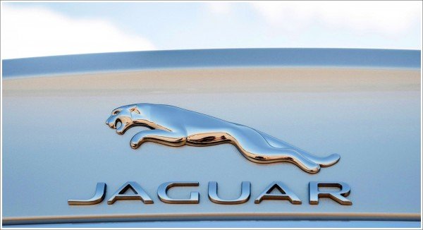
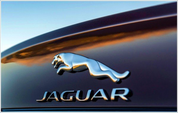
In 2012 Jaguar has introduced a three-dimensional version of its iconic logo, with the leaping wild cat executed in gradient matte shades of silver, with the uppercase lettering rewritten in a bolder and more confident sans-serif font, the letters horizontally extended and the gradient hues forming a dark horizontal line crossing the inscription.
2021 – 2024
The badge, created for the brand in 2021 is a mix of two previous versions. The flat black contouring resembles the logo from 2001. While the typeface of the inscription was taken from the 2012’s emblem. The new badge of the brand looks confident and powerful. Executed in a black-and-white color palette, the logo looks strong, brutal, and chic.
2023 – now ( JLR Logo )
When the Jaguar and Land Rover got the same logo, it had more qualities of the Jaguar brand while pulling in the more simplistic look of the Land Rover brand. At the same time, the fact that the “R” does not have a vertical line and uses the “L” next to it to create a complete letter, as well as the minimalistic, clean, and sharp look of all the strokes, give the logo a hi-tech feel. This logo will look amazing for many years to come on any automobile of these brands.
2024 – Today
Another version of the Jaguar logo was introduced in 2024, and it significantly differs from all the previous emblems of the legendary automobile marque. Today the logo of the luxury brand is composed of just a stylized dark-gray lettering with upper- and lowercase characters featuring the same size and interesting rounded shapes with distinctive contours and straight cuts of the lines. The main geometric idea here is built around circles, while the first and last characters look similar, creating somewhat similar framing.
Symbol
The first figure on a bonnet – a standing jaguar from chrome brass – did not have popularity. In 1938, a jumping jaguar, offered by Rankin E.B., the manager of the firm’s public relations department, changed it. The figure was additionally provided at two guineas. The jaguar’s head was represented on the radiator grille from 1950 to 1956, but then the jaguar in a jump occupied its place. The bonnet figure was removed in the middle of the 1960s mainly by virtue of safety rules generally accepted in North America.
So the modern Jaguar logo is a jumping jaguar. The figure of the jaguar is 7 feet long (=17, 8 centimeters). Jaguar logo symbolizes speed, power, elegance, grace, and beauty.
Colors
The colors used in the Jaguar logo are silver, metallic gray and black. The black color features elegance, integrity and high performance, the metallic gray and silver colors are a perfect depiction of sophistication, modernity, and perfection of the brand.
Emblem
The Jaguar emblem has a custom typeface. The last update of the Jaguar emblem happened in 2012. From this time, the figure of the animal became more tridimensional.
The make Jaguar does not refer to obsolescent car brands. For example, Jaguar XJ belongs to the highest class category of cars. In 2015, the new generation of the sedan XF on the new aluminum platform appeared. And in 2017 and 2018, the new generation of the sedan XJ and a completely new coupe XJ will see the light.

