| Founded | 1857 |
| Founder | Alexander Wilson |
| Headquarters | Bedfordshire, England, United Kingdom |
| Parent | Opel |
| Owner | General Motors |
| Official Site | www.vauxhall.co.uk |
The logo of the British car brand Vauxhall has been modified around ten times since the 1920s. And yet, it has always stayed consistent in its visual core.
Meaning and History
Vauxhall is a subsidiary of General Motors Corporation, which sells Opel cars in the UK under its brand name. The company was established in 1857, and since the beginning of the 20th century, has been engaged in the production of passenger cars, mainly for the British and Australian markets.
Vauxhall, previously active in the production of ship engines, switched to car production at the turn of the century.The company produced its first car in 1903.
1857 – 1983
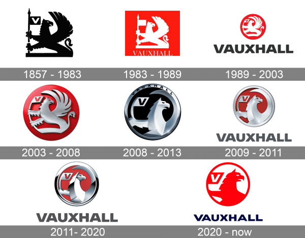
If you take a look at the old Vauxhall logo, you’ll discover it has much in common with the current one. The griffin with a prominent wing and a flag in its paw is still there. Even the letter “V” can be seen on the flag. The original badge is by far more cluttered, though. The griffin has scales around his neck and on his wings, and there’re many other details.
1983 – 1989
The 1980s brought about an even more minimalistic white emblem on the bright red background. The word “Vauxhall” can be seen under the griffin.
1989 – 2003
In the 1990s, the emblem went from square to round – it was necessary to make the badge fit in the recess designed for the circular Opel logo. The flag pole adopted a curve to fit the roundel shape, and so did the wing.
2003 – 2008
In 2003, the badge got more depth due to the gradient texture, while its overall shape remained unchanged.
2008 – 2013
In 2008, the Vauxhall logo went through a complete overhaul. Almost half of the griffin moved beyond the logo, and as a result, the badge grew more minimalistic and less cluttered, while the griffin became more prominent.
2009 – 2011
The redesign of 2009 has removed the lettering from the sleek Vauxhall emblem, making all silver elements lighter and cleaner. The new badge looked very sharp and minimalistic, showing the company as a sting and progressive one. The emblem was now accompanied by a heavy gray logotype under it. This version of the logo stayed in use for just a couple of years.
2011 – 2020
In 2011 the Vauxhall badge gets another minor redesign, with the silver elements gaining darker gradients. The graphical part now looked cold and edgy, being balanced by solid gray lettering in flat bold sans-serif capitals. The framing on this badge was a hit thicker than on the previous one, with more gloss and shine.
2020 – now
The redesign of 2020 has introduced a flat bright version of the Vauxhall visual identity, with the graphical emblem drawn in plain red against a white background, and a geometric sans-serif lettering set in dark blue, looking powerful and stable. The new logo makes the company look strong and confident.
Font
The bold blue uppercase logotype from the primary Vauxhall badge is set in a heavy geometric sans-serif typeface with the letters slightly extended. The closest fonts to the one, used in this insignia, are, probably, Nakara Rough and Radiate Adan’s Bold Expanded.
Color
The color palette of the Vauxhall visual identity is based on a combination of scarlet-red and dark blue, the colors of passion, professionalism, and confidence. The red here is for energy and motion, while dark blue is about reliability and trustworthiness.
Company overview
The history of the company started in 1857 in the Vauxhall district of London. While the company was founded under another name and originally produced pump and marine engines, it was later renamed Vauxhall Iron Works and started making cars in 1903.
Why the griffin?
The Vauxhall logo was inspired by the coat of arms of Falkes de Breauté, a nobleman who lived in the area where the Vauxhall company was located in the thirteenth century. As a mercenary soldier, de Breauté received the Manor of Luton from King John. Through his wife, he also had the rights to an area near London later called Vauxhall. Here, the nobleman built a house, which was called Fulk’s Hall.
In the course of time, the name was transformed into Vauxhall and in this form was adopted by the company Vauxhall Iron Works, together with the griffin coat of arms. Interestingly, when in 1905 the company relocated to Luton, it coincidentally found itself in the vicinity of the other Falkes de Breauté’s house.
That said, the griffin would have been a pretty impactful symbol in itself, even without such an interesting history. You can see it on many commercial logos, including several carmakers (Saab, Scania, Gumpert, Iso, to name just a few). That’s because it represents the noble character, power, heritage, as well as speed and freedom, which are symbolized by the wings.

