| Founded | 1899 |
| Founder | Louis Renault Marcel Renault Fernand Renault |
| Headquarters | Boulogne-Billancourt, France |
| Slogans | Drive the change (corporate) Passion for life (Renault marque) |
| Official Site | www.renault.com |
| Official Facebook Page | www.facebook.com/renault |
Renault is a French automobile manufacturing company, which was established in 1899. Today the company operates worldwide, distributing its passenger cars and vans across the globe. Renault has grown into a huge company, owning several auto marques in different price segments.
Meaning and History
Renault was founded at the end of the 90s of the XIXth century. One interesting story was a preliminary to that.
The future creator of the company, the Frenchman named Louie Renault argued with companions that he would drive through the Rue Lepik Street of the Montmartre (which, by the way, has the slope of 13 degrees) on his patent car. It was a reworked De Dion-Boton of three wheels, which got the fourth wheel from Renault together with one more curious technology: a direct gear.
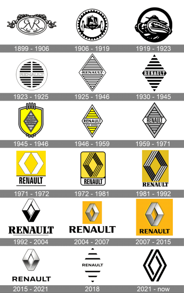
1899 – 1906
The first Renault logo, on which the initials of three brothers Renault (Louie, Ferdinand, and Marcel) were depicted appeared in 1899.
1906 – 1919
In 1906, the logo completely changed into front view of the car.
1919 – 1923
During the First World War, Renault emphasized the production of light tanks (Renault FT-17), at that period, a tank influenced the logo depiction.
1923 – 1946
Although the most different emblems and symbols were depicted on the company catalogs and repair operation manuals, there were no emblems on the cars themselves until 1923, when a circle with a Renault inscription placed inside it on a grill between two horizontal lines appeared. The sign was put on klaxons, and the grill allowed a sound to come out without obstruction.
1925 – 1946
In 1925, it was decided to make the rhombic grill, the shape of the emblem changed accordingly. There is also an opinion that this is by no means a rhombus, but a trace from tank tracks.
1930 – 1945
In 1930 the Renault Diamond was refined and drawn in a stronger and more modern style. The framing was gone; and the rhombus was now formed by thick flat black lines, set against a white background. The central part of the badge was taken by a bold white logotype, written in the title case of a narrowed serif typeface.
1945 – 1946
The redesign of 1945 has made the Renault badge more complicated, drawing the rhombus in flat gray and placing it over a bright yellow background of a smooth crest with a thick gray outline, decorated by four vertical lines at the top part, and four short diagonals at the bottom.
1946 – 1959
In 1946 the Diamond gets placed against a white background without any additional banners of framings. It was set in yellow and white, with medium-thick black lines for stripes and outlines. The inscription in this version was written in black sans-serif capitals over a white banner in the center of the logo, and accompanied by a “Regie Nationale” lettering in small caps, placed under it.
1959 – 1971
Yellow was replaced by gray with the redesign of 1959. The lines got thicker and the frame of the rhombus — wider. As for the lettering, it was now composed of the brand’s name, which was written in a bold narrowed sans-serif typeface, in black, over a wide white banner with sharp triangular sides, set in the center of the Diamond.
1971 – 1972
The redesign of 1971 introduced a new version of the Renault Diamond, which was formed by two thick white elements, resembling arrowheads, and cresting a clean yellow rhombus in the negative space. The yellow rectangular banner with the emblem was accompanied by a bold black logotype in a narrowed sans-serif font, written under it and enclosed between two black horizontal lines.
1972 – 1981
The emblem chosen in 1972 had yellow, black and white colors. The emblem of the French company Renault, which has recently created the Renault- Nissan alliance, was created by the founder of the op art Viktor Vasarely. The diamond image on a yellow background was exposed to optimism and prosperity. On the emblem of Renault, each side of the rhombus was located over the other; this pattern cannot exist in reality. Thus, Renault promised its owners to implement something impossible.
1981 – 1992
The rounded vertically oriented badge gets its outline removed and corners made straight in 1981. The yellow banner now was set directly above the bold black serif logotype, written against a white background with no outlines. As for the emblem, it gained light gray accents between the black lines of the Diamond, which created a brighter contrast and made the badge look more elegant.
1992 – 2004
The diagonal stripes were erased from the surface of the Renault Diamond in 1992, with the color palette being changed to black-and-white. The refined sleek and smooth emblem was set against a white background, with the enlarged uppercase logotype in a bold serif font written under it, and complemented by a thin horizontal line, which was underlining it from the middle of the “R” till the end of the “L”.
2004 – 2007
The logo got three-dimensional in 2004, with the Diamond being executed in gradient silver with light shades, and placed on a flat yellow rectangle. As for the lettering, it was still set in black, but the typeface of the uppercase logotype was changed to a more modern and elegant one, with small triangular serifs, softly coming out of the vertical bars to the left.
2007 – 2015
The lettering was rewritten in a smaller size and placed on a yellow banner, tight under the voluminous metallic emblem of Renault. The typeface remained the same, but in a new size the inscription looked more delicate and sophisticated, and it changed the moos and style of the whole badge.
2015 – 2021
The yellow banner was removed from the Renault visual identity in 2015. The gradient silver emblem gained cold blue and gray gradients and was now placed directly on a white background, above the bold black uppercase logotype. The typeface of the inscription has been changed to a more modern and geometric one, with the letters slightly extended, compared to the previous versions.
2018
The badge, introduced by Renault in 2018, looked very minimalistic and stylish, although stayed in use by the brand for just a few months. It was a black uppercase logotype, accompanied by three black horizontal lines above it, and three — beyond. The lines formed a shape of a rhombus and were placed at a large distance from each other.
2021 – now
The redesign of 2021 has created a stylish laconic badge for the French automaker. The Diamond here is drawn in thick straight black lines. The emblem is formed by two elements, which leave the contour of the final image open, letting air into it from both inside and outside. The primary version of the Renault logo has no lettering on it.
Symbol Description
The modern emblem with the smooth surface was accepted in 1992 to emphasize radicalization of changes in the company that occurred not long ago.
Color
The yellow color of the Renault logo featured prosperity, energy, joy, and optimism. The silver color signifies perfection, sophistication, and creativity.
Emblem
The actual edition of the Renault emblem has the custom-made typeface named “Renault Identité,” which was invented in 2004 by French type designer Jean-François Porchez.
The modern line of Renault includes the following models: Renault-Logan, Sandero, Duster, Fluence, Latitude, and Koleos, as well as Megan, Scenic, Laguna, and Kangoo.
DeZir is the name of the concept car created by Renault to show us, in what direction Renault’s designer thought will evolve in the next several years. It is a big red coupe. The exterior of the new concept is original and very attractive. Doors are the key feature of the new concept. Here, the doors of a guillotine type are being opened in different directions! On top of that, DeZir does not at all have the rear glass, in an opinion of designers, in the future, video cameras will provide the vision in motion. The car is fitted with an electric motor small in power, which should get 110 kilowatts to sets rear wheels in motion (there are lithium-ion accumulators). In accordance with Renault’s data, the maximum speed of this big coupe is just 180 km/h. As for its appearance, it is worth looking at. The fact that many models of the French company will be made in a similar style, including “a people’s” car Logan, is not excluded.
The nearest plans of Renault: to prepare an update of Duster. The French crossover will receive the CMF platform, on which several models of the Renault-Nissan alliance are based just now: Qashqai, Kadjar, and the others. Due to use of the new basis, Renault Duster will seriously grow in its gauges. Its length is assumed to increase to 4500 mm. Duster will undergo serious changes of its exterior and interior design, where a lot of expensive options will appear.


