| Headquarters | Gothenburg, Sweden |
| Parent | Volvo Cars |
| Official Site | www.polestar.com |
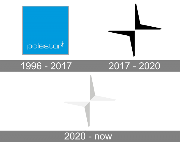
The history of Polestar started in 1996, yet it acquired the status of a standalone brand only in 2017. The Polestar logo has been modified once. Both the versions are the visual representation of the metaphor behind the brand’s name.
Meaning and history
The Polestar brand emerged from Flash Engineering, which was created in Sweden with the aim of racing the Volvo Touring Cars in the STCC. The original name “Flash Engineering” was replaced by “Polestar” in 2005, a year after the division was sold to Christian Dahl. The Polestar’s debut complete raceproject was C30 S2000 launched in 2009.
In 2015, both Polestar Performance and Polestar brand were bought by Volvo, while Polestar Racing (under the name of Cyan Racing) stayed in the property of Christian Dahl. In 2017, Polestar became Volvo’s sub-brand.
1996 – 2017
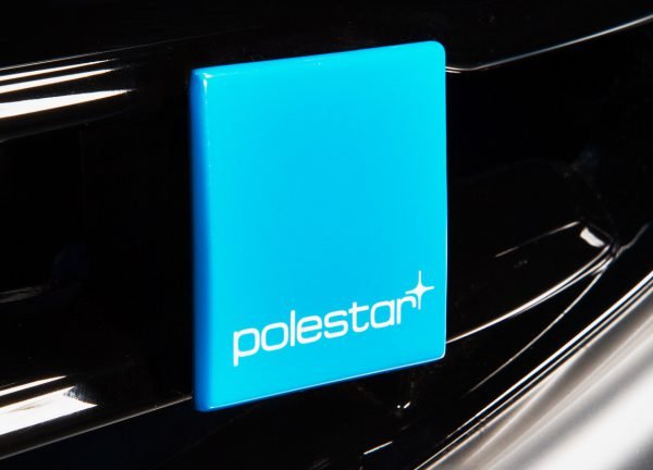
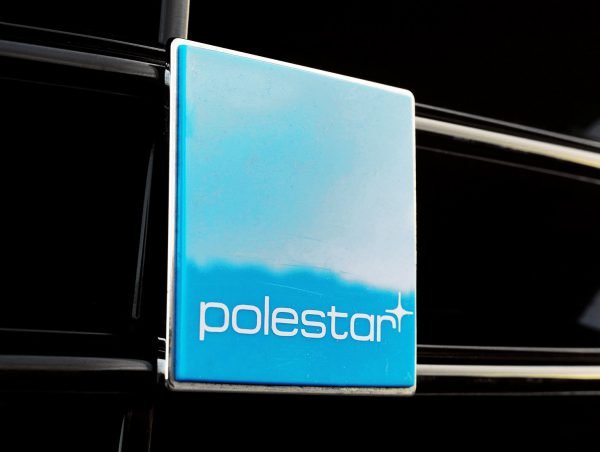
The Polestar logo, used by the company for more than twenty years, was composed of a so skid blue square with white stylized lettering in the lowercase written along the bottom side of the badge and accompanied by a delicate four-pointed star at its upper right corner. The inscription was set in an elegant sans-serif typeface with square shapes of the letters and rounded ends of the bars.
2017 – 2020
The redesign of 2017 has introduced a new minimalistic Polestar badge with no lettering on it. It was an abstract four-pointed star, formed by two mirrored ticks with straight angles inside and sharp peaks, pointing to the center. The composition was set in plain black and looked edgy, progressive, and very professional. This badge stayed with the company for a bit less than three years.
2020 – now
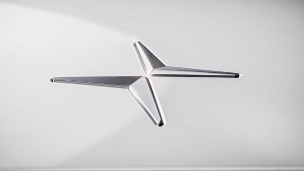
In 2020 the Polestar logo was refined, with the color palette of the emblem being changed tome medium and light shades of gray, with both ticks divided into two halves, looking voluminous and fresh, and perfectly depicting the name of the automaker. The Polestar emblem has no additional lettering or framing on it.
Original emblem
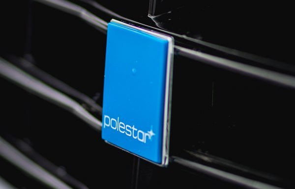
The earliest badge looked rather plain. It was just a sky blue rectangle with the word “Polestar” in silver lowercase letters. Next to the lettering, there was a stylized star with four rays and a circle in its center. The rectangle had a silver frame.
Most importantly, the first Polestar emblem was not used on its own. There was the regular Volvo badge on the front grille of the cars, while the blue rectangle, which was notably smaller in size, could be seen on the left.
Also, there was no reference to Polestar brand on the rear plastic bumper, just the regular Volvo script logo.
The 2017 symbol
In June 2017, when Volvo officially announced its plans to turn Polestar into a separately-branded high performance carmaker, the parent company emphasized that there would be no Volvo logo on the new cars, as they would be made under the Polestar Holding AB trading name.
The new logo was introduced simultaneously. Like the original one, it also featured a star, yet its shape, as well as the overall look of the logo, was completely different. It reminded the main element of the wind rose, where the “North-West” and “South-East” parts had been removed. The main part of the wind rose actually reminds a star, which creates a link between the logo and the name of the company.
Font of the Polestar Logo
When Volvo’s designer team was working on the script logo for the new car, they opted for a minimalistic, modern typeface with rounded corners. The letters are rather wide, but not high.
Color
The badge itself is silver, so it looks great no matter what the color of the car is. In the monochrome version, the Polestar logo is black, while the background is white.


