| Founded | 1862 |
| Founder | Adam Opel |
| Headquarters | Rüsselsheim, Hesse, Germany |
| Parent | General Motors |
| Subsidiaries | Vauxhall |
| Official Site | www.opel.com |
| Official Facebook Page | www.facebook.com/Opel |
Opel is one of the oldest European automaking companies, which was established in Germany in 1862. The brand is known as one of the most popular manufacturers of middle-class vehicles, including sedans, SUVs, and commercial transport. Opel operates all over the globe and has its subsidiaries in different continents.
Meaning and History
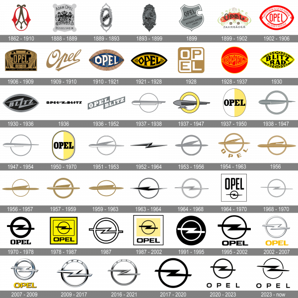
Opel is one of the world’s oldest car brands, dating back to the 19th century. Five Opel brothers founded the company for the production of sewing machines and bicycles. The first cars were built at the company’s headquarters in Rüsselsheim, west of Frankfurt am Main. Car production began in 1898. Over the long and intense company’s history, which started in 1862, the automaker has changed lots of logos and keeps modifying its badges to reflect the growth and the innovative approach of the company.
1862 – 1910
The very first Opel badge was created in the middle of the 19th century and stayed active for almost 50 years. It was a stylized elegant medallion in brown and red, with the initials of the company’s founder, Adam Opel. The brown “A” in a sophisticated ornate stately was inscribed into a bold wishbone “O” in red.
1888 – 1889
For just one year, in the ens of the 1880s, Opel has been using a badge in a crest shape, with both top and bottom parts triangular, and the four corners decorated by solid circles. The badge was set in solid gray, with a black heraldic symbol with two lions rampant in the center, the “Adam Opel” lettering arched on top, and the “Russelsheim” inscription at the bottom of the logo.
1889 – 1893
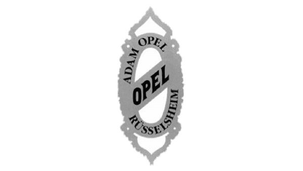
The gray and black color palette of the Opel badge remained untouched, but the composition was changed in 1889. The new logo featured a vertically-oriented oval gray frame, with the central part crossed by a diagonal banner with the “Opel” lettering in uppercase. The frame itself had the “Adam Opel” inscription at the top part, and the “Russelsheim” — at the bottom.
1893 – 1899
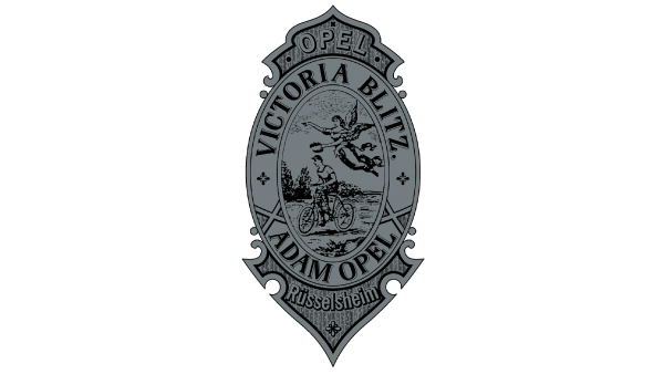
The Opel logo gets more ornate and sleek in 1893, with the gray oval getting solid and being decorated by sharp gray and black elements on top and bottom. The central part of the logo featured a black contoured image of a man riding a bicycle and an Engle flying above him. The image was enclosed into a thick frame with black lettering around its perimeter.
1899
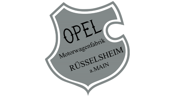
The redesign of 1899 introduced a cleaner and simpler version of the gray Opel crest, with a more traditional shape of the logo, a double gray and white outline, and delicate black lettering on four levels, with the uppercase “Opel” written in a wishbone-style typeface, and all others — in a traditional serif one.
1899 – 1902
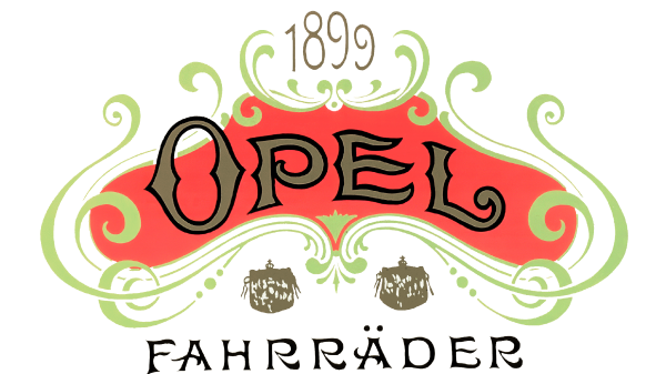
In 1899 the Opel badge becomes bright and ornate, with the solid red banner surrounded by light-green vignettes and decorated by a gold logotype, with each smooth wishbone character outlined in black. The top part of the badge contained a lightweight “1899l datemark, while the bottom part had a “Fahrrader” I script n in the uppercase written over it.
1902 – 1906
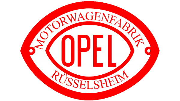
The redesign of 1902 introduced a more modern and minimalistic badge for the German automaker. It was a horizontally oriented badge in a shape of a rugby ball, set in a white and red color palette. The central part of the badge was taken by a bold uppercase “Opel” lettering in a simple sans-serif typeface, while the frame in a thick red outline, featured a lightweight serif “Motorwagenfabrik Russelsheim” inscription around its perimeter.
1906 – 1909
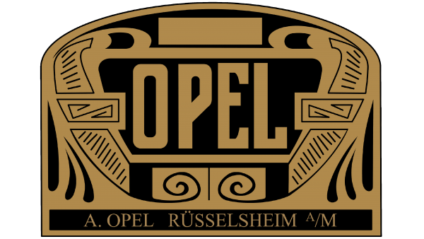
In 1906 a fancy and chic Art-Deco logo was created for Opel. It was a solid black banner with the upper corners rounded, and two bottom ones — straight. The badge was decorated by solid golden elements, surrounding a bold uppercase “Opel” lettering in a custom sans-serif font, with narrowed letters executed in bold smooth lines with straight cuts.
1909 – 1910
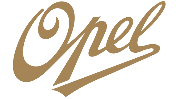
The redesign of 1909 simplified the Opel logo to just script lettering, which was set in bold gold letters over a transparent background with no additional elements. The lettering was set in a title case, and had the tail of the “L” elongated and bent to the left, underlining the whole wordmark up to the letter “P”.
1910 – 1921
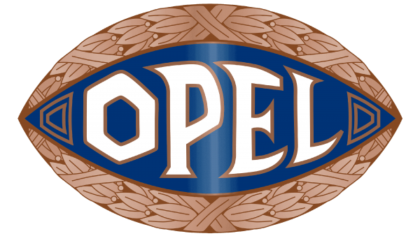
The version of the Opel logo, designed in 1910, looked very “Greek”. It was a horizontally oriented badge in a shape of a rugby ball, with the middle part set in gradient blue, and the frame decorated by light brown leaves. The uppercase logotype was written in bold white lines of a custom typeface and had each letter outlined in gold for a softer contrast.
1921 – 1928
The color palette of the Opel logo was changed to yellow and black in 1921. The logo was flat and looked very strong and modern, with its intense colors and thick massive elements. The lettering on the badge became geometric, gaining more angular contours.
1928
The redesign of 1928 created a very cool and modern Opel logo, with four letters of the company’s name written inside a square with rounded angles. The square was divided into four equal segments in gold and white, and the letters were placed in each of them, set in a contrasting shade.
1928 – 1937
A few months later, another logo was introduced by the German automaker. It was a badge from 1921, but executed in thin yellow lines, and placed over a solid red circle in a thin yellow frame. It was a very intense badge, with the yellow lines not very well visible. The badge stayed active for almost ten years.
1930
Another rugby-ball emblem was created for Opel in 1930. It was set in bright yellow, with geometric ornament in black, set around the perimeter of the logo, and a bold black “Blitz Rad” lettering in the center. The inscription was set in a heavy serif font, with two words repeating the contours of the badge, hence having its lines a bit arched.
1930 – 1936
The badge turned black, while the framing got simplified and change its color to gray later in 1930. The lettering now featured only the “Blitz”, with the “I” stylized as a lighting bolt. It was also set in gray, balancing the framing and making the whole logo look strong and confident.
1936
For a few months in 1936, the company has been using a stylish minimalistic logo with the bold black “Opel Blitz” in script j set in one straight line and executed in a heavy modern sans-serif typeface. The lettering was crossed by an extended lighting bolt in a Z-shape, with thin elongated lines and sharp angles.
1936 – 1952
The redesign of 1936 has created a sit rift and light badge, with two diagonally set rectangles forming the letter “Z”. The heavy white “Opel” was written on the left part of the structure, and the “Blitz” — was over the right one. Both parts of the inscription were set in an extra-bold extended geometric serif font. The badge stayed with the company for more than 15 years.
1937 – 1950
Another logo was designed for Opel in 1937. It was a vertically oriented oval in a thin black outline, with the body vertically divided into two halves — the left one in white, and the right one in light yellow. The bold black uppercase logotype was written over the medallion in a massive serif typeface with slightly softened contours.
1937 – 1947
A new concept of the Opel visual identity was created in 1937. The logo was composed of a gray rocket flying horizontally trough t a bold yellow ring. The logo had no letters or other additions and looked very brutal and strong despite its light color palette.
1937 – 1938
Another version of the flying rocket was executed in gray and white, with more minimalistic contours of the elements. The badge looked very cool and even futuristic, brilliantly reflecting the progressiveness of the Herman automaker and its professionalism. Although, it only stayed in use for several months.
1938 – 1947
The rocket badge got another redesign in 1938. With the shade of gray getting a bit more intense, the contours more even, and the frame — wider. The frame was now composed of a triple ring with thin white separation lines over a gray background. The rocket also had its accents drawn in thin white lines.
1947 – 1954
With the redesign of 1947, the rocket and the ring got even more minimalistic. All the unnecessary details were removed, the shade of gray got lighter, and the lines of both elements — were thinner. This badge stayed in use by Opel for seven years.
1950 – 1970
The white and yellow medallion, designed in 1937, got strengthened in 1950. The badge gained a double frame in a black outline, with the left part colored in yellow, and the right one — in white. This created an interesting “chess” image. The typeface of the black logotype was changed to a more narrow and geometric serif one, with straight strict lines and angles.
1951 – 1953
The rocket badge was redesigned again in 1951, with the main element drawn in two equal parts — in gray and white, and with a new detail added to it — a gray wing attached to its top part. The ring got redrawn too, with thin white lines coming through it and dividing it in two.
1952 – 1964
The sharp Z-shaped blitz came back to the Opel visual identity in 1952 and stayed for a decade. It was drawn in a Bakunin outs way, in gray and black, and had no additional elements. The badge looked strong and brutal.
1953 – 1956
The rocket, which now looked like a plane, got both of its halves colored in Grau now. They were separated by a very thin white line, supported by three white stripes of the same thickness drawn horizontally on the wing, and one on the solid gray frame of the badge.
1954 – 1963
The rocket badge changed its color palette to gold and got accompanied by a bold sans-serif “Opel” lettering in the uppercase, arched under the circular emblem. The lettering was set in a heavy geometric sans-serif typeface with straight cuts and clean contours.
1956
On the version of the Peugeot logo, designed in 1956, the rocket and the ring were also set in gold, but the lettering was absent. The Wong here got smoother and longer, and the white stripes on it — thicker and more visible. This version of the logo only stayed active for a few months.
1956 – 1957
A bit later in 1957, the new logo was introduced. It was, actually, the same golden emblem with the winged rocket flying through the ring, but with the color palette slightly darkened up, and the rocket stretched horizontally and getting narrower, looking progressive and powerful. The wing was also redrawn, becoming longer and sharper, with its right border cut diagonally.
1957 – 1959
The thin white stripes were removed from the wing of the rocket, while one thick smooth white element was added to the upper part of the flying element. As for the ring, it got emboldened and got two thin white lines around its perimeter, dividing the frame into three parts, with the central one thicker than the two side ones.
1959 – 1963
Another version of the Opel rocket was again set in solid gold, with the rocket horizontally separated by a thin white line into two equal parts. The wing was also drawn in a very minimalistic way — with no white accents, just a clean contour, and elongated shape.
1963 – 1964
The badge, designed for Opel in 1963 was something in between the rocket and the blitz. It was a sharp element in black with a silver outline, crossing a thin black ring, which featured the same gray outline. No lettering, no additional details. This abstract logo only stayed in use for a few months.
1964 – 1970
The abstract element from the previous badge turned into an extended Z-shaped blitz and got drawn in plain black. It was now placed under an enlarged black logotype, written in the uppercase of a bold narrowed sans-serif typeface against a white background. The whole composition was enclosed into a thin black square frame.
1964 – 1968
The logo, introduced in 1964, featured just a graphical emblem, with the blitz and the ring in gray, with thin white lines added to both elements. It looked very light, yet still powerful, and evoked a sense of confidence and progressiveness. This badge was used by Opel until 1968.
1968 – 1970
The contours of the Opel logo were refined in 1968, with both elements getting thinner, and the lighting bolt — longer and sharper. The thin white lines on the blitz and the ring were now almost invisible, as the gray elements were thin enough themselves.
1970 – 1978
The redesign of 1979 has redrawn the Opel badge in a black-and-white color palette, with the lines of the emblem getting extra-bold, and the blitz — shortened. The graphical part was joe accompanied by a heavy black logotype under it. The uppercase inscription was executed in a bold geometric serif typeface.
1978 – 1987
The blitz got its contours refined, with the ring becoming thinner, and placed on a solid yellow square, being enclosed into a black frame with rounded angles. The bottom part of the badge featured a black uppercase logotype, executed in a modern and sleek sans-serif font, with the letters slightly extended.
1987
The badge, used by Opel in 1987, only had a white lightning bolt in a black outline and a solid black ring, set on a plain white background. No lettering was present on the logo. Despite its simplicity, the Opel badge looked very progressive and powerful.
1987 – 2002
The logo, designed for Opel in 1978 got refined in 1987. The bright yellow background of the square was changed to white, with the rectangular, where the black emblem was set colored in a light and creamy shade of yellow, with no black outlines. As for the logotype, it kept its size and style and was written under the yellow rectangle, against a white background.
1991 – 1995
The Opel badge, used by the automaker at the beginning of the 1990s, featured bold white lighting in a ring, drawn over a solid black circle. The thick white lines of the elements and the straight sharp cuts of the blitz made this laconic logo look truly edgy and strong.
1995 – 2002
The colors on the Opel logo got swapped in 1995, with the emblem turning black, and the background — white. The iconic blitz symbol was joe accompanied by a bold black logotype, written under it in the uppercase of a modern heavy sans-serif typeface.
2002 – 2007
The redesign of 2002 made the Opel badge three-dimensional. The emblem was now voluminous, set in light silver gradients against a white background, and accompanied by a solid yellow logotype, executed in the super case of a custom sans-serif font, with the horizontal bars of the letters having its ends cut diagonally, which added a sense of motion and energy.
2007 – 2009
In 2007 even more gloss and volume were added to the Opel badge, with the lettering getting three-dimensional too, and gaining gradients on its yellow bodies. As for the emblem, it got emboldened, and now had some light blue color accents, which made the whole logo look brighter and more vivid.
2009 – 2017
The redesign of 2009 has introduced a stylish and sleek Opel badge, with both elements of the emblem getting thinner and more elegant, and the gradient silver surface — stricter and a bit darker. The lettering was moved from the bottom of the badge to the top part of the ring, being arched above the lighting and executed in a new sans-serif typeface, with the characters placed far from each other.
2016 – 2021
The shapes of the emblem’s elements got thinner and narrower, with the glossy surface turning matte and the silver gradients getting a bit warmer. As the ring around the blitz became thinner, the black sans-serif logotype, written on its top part, got its letters redrawn in a smaller size.
2017 – 2020
The redesign of 2017 has introduced a very minimalistic and laconic Opel badge, with the iconic Blitz redrawn in a flat manner, in plain black. The lettering was completely removed from the logo, and all the lines in the emblem featured the same thickness, which made the composition look perfectly balanced and professional.
2020 – 2023
The present-day logo (2020) is a circle crossed with a horizontal lightning. The company name is embedded in the top part of the circle. This version lives up to modern design standards.
2023 – now
The redesign of the Opel logo, held in 2023, has kept the contours of the iconic emblem, but elongated them and added some sharpness to the lines. The s-like lighting bolt is not formed of two similar parts, placed at a small distance from each other, and this slightly diagonal separation line creates a more geometric image. The circular outline of the bolt was also redrawn, becoming thinner than on the previous badges.
Font
The bold uppercase inscription with a lot of air between the letters from the primary Opel badge, designed in 2020, is set in a custom sans-serif typeface, which is called Opel Next. The bold lines and straight cuts of the bars perfectly balanced the iconic Blitz emblem with its sharp lines.
Color
The primary color palette of the Opel logo is black and white, a classic and timeless combination. But for advertising needs the company prefers to place its logo, executed in solid black lines, on a bright yellow background, as a tribute to old company logos. Yellow is a color, which stands for energy and motion, and it makes the badge of the brand stand out in the list of its competitors.

