Founded: 1921
Founder: Carlo Guzzi, Giorgio Parodi, Angelo Parodi
Headquarters: Mandello del Lario, Italy
Official website: www.motoguzzi.com
Moto Guzzi is the name of a famous Italian motorcycle manufacturer, which was established in 1921 and named after its founder, Carlo Guzzi. Today the brand is a part of Piaggio Group, a reputable prosecutor of motorcycles and scooters.
Motorcycle History
Moto Guzzi was founded in March 1921 in Mandello del Lario, Province of Lecco, Italy. The company’s first motorcycle, released right after the foundation of the brand, was the legendary Normale with an 8-hp engine. The Guzzi Normale was followed by successful motorcycles, such as the Moto Guzzi G.T. 1928, also known as the “Norge,” and the 1939 Airone 250, a very popular mid-cube model. It had been on the Italian market for more than 15 years.
From the beginning, Moto Guzzi made a loud name for itself as a successful racing company. The first racing victory was achieved in the Targa Florio race in 1921. Moto Guzzi won 14 world titles and 11 Tourist Trophy (TT) cups throughout their racing history, which ended for the company in 1957.
After World War II, the Guzzino 65 Cardellino motorcycle was produced. It was in demand in Europe for more than ten years. Also in that period, from 1950 to 1956, were the Moto Guzzi Galletto and Lodola 175.
At the end of the 1960s, Moto Guzzi had a V-Twin engine with a 90-degree cylinder angle. The engine later became a symbol of the company and the basis for the Guzzi V7, V7 Special, and Guzzi V7 Sport motorcycles. The legendary Twin was also adapted into the smaller V35 and V50 models.
On December 30, 2004, Moto Guzzi became part of the Piaggio Group, the leading motorcycle manufacturer in Europe and one of the largest motorcycle companies in the world. Following the Moto Guzzi adaptation program within the Piaggio Group, the Breva 1100 motorcycle was launched in 2005. It turned out to be quite a successful bike.
Brand Logo
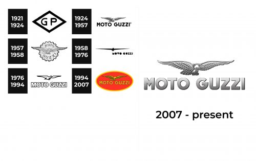
1921 – 1924
If it were not for a slightly uneven edge in all the elements, one would not even guess that this logo was designed over a century ago. The long consists of a diamond base with a thick black border and two letters. The latter are printed using a basic, sans-serif font and stand for “Piaggio Group”, which Moto Guzzi became part of.
1924 – 1957
This logo has a grand and breathtaking appearance thanks to the sophisticated black and white color palette as well as the flying eagle and bold strokes used to print the name. The eagle is a symbol of courage, power, authority, and the achievement of great goals. It stretches its wings above the “Moto Guzzi” inscription, which is written using a bold, geometric font and all uppercase characters. The font choice was just as impressive as the illustration above.
1957 – 1958
The majestic eagle was redrawn but still served as the representation of the brand. It now had a gear shape in the background, which made reference to the direction of the brand. The name was now split into two lines and curved across the top and bottom of the gear shape. The logo was still done in the black and white color palette, which gave it a professional and powerful feel.
1958 – 1976
The company used this interesting logo for almost twenty years. The eagle is depicted flying straight at you with exaggerated wide, narrow wings and looks like a completely solid image. The font choice was no less exquisite. It resembled Wisdom Teeth Rounded font but had a sharper top for the “M”, while the “X” resembled an hourglass. The inscription was not centered underneath the eagle image, which added another unique touch and showed the world that Moto Guzzi is extraordinary.
1976 – 1994
In 1976, the company returned to a more traditional and reserved logo. It continued to use a drawing of an eagle as its symbol, but this time it was white and had a thick black outline. The name was also done in white with a black outline. It featured bold, wide, sans-serif letters that were placed very closely next to each other, which created a solid and determined image.
1994 – 2007
For the first time in history, the brand introduced color and it went for a bold and energetic color combination that included red, yellow, and some black for accent. The eagle was now done in yellow and had a lot more details. The company name underneath was also printed in yellow with a black outline and had a font that was similar in style to the previous inscription but with more spacing between the characters. The red was used in the form of an oval base with a yellow border to match the elements in the center.
2007 – now
The Moto Guzzi badge looks very Italian. Elegance and style can be seen in every line of the badge, which is composed of a monochrome emblem placed above an enlarged black logotype in the uppercase.
There is a very good balance between the light and flying upper part of the logo and its massive basement, and it represents the principles and essence of the brand. Speedy yet reliable and safe.
Emblem and Symbol
The Moto Guzzi symbol is a flying eagle, which symbolized freedom, strength, grace, and nobility. The bird is drawn in a pretty detailed way, but with all the bold lines clean and neat. It looks powerful, covering the whole Moto Guzzi logotype with its wings, widely spread to the sides.
Font and Color
The capitalized Moto Guzzi logotype is executed in a bold modern sans-serif typeface with clean contours and massive shapes. The font, used by the brand, was created exclusively for Moto Guzzi, though looks a little similar to such types as Thicker Bold Upright and Casagrande Antifascista Bold, with the lines modified.
As for the color palette, the Italian brand uses a classic monochrome combination, which lion sophisticated and timeless, evoking a sense of progress and determination.
The Legends
The 2008 launch of the V7 retro bike was extremely successful for Moto Guzzi. Its small air-cooled V-Twin is a virtually unchanged direct descendant of the V50 that saw the light of day in the 1970s. Its creator was engineer Lino Tonti, who also had a hand in the Sport Telaio Rosso, the Moto Guzzi superbike that inspired the modern model.
The 2008 V7 turned out to be a great bike that successfully competed with the Kawasaki W800 and Triumph Bonneville. But its responsive, torquey engine developed only 42 hp and for 2012 it underwent a major facelift, not least of which was the power increase.
A new cylinder head, pistons with an automotive-type center throttle, improved engine management, and redesigned cooling fins helped to increase power to 50 hp and surpass the W800, and after increasing torque at low rpm it reached 2,800 rpm.

