| Founded | 1993 |
| Founder | Horst Keinath |
| Headquarters | Reutlingen, Deutschland |
Keinath is the name of a German automaking brand, which was established in 1983 and day is mostly known for its sports modifications of some Opel and Vauxhall car models. The marque also has two original convertible-coupe models in its portfolio.
Meaning and History
German automobile brand Keinath from family tuning studio, since 1983, has turned to specialized small-scale production of racing cars on the basis of Opel. And therefore the main symbolic meanings, enclosed in the logo, can be considered speed, aerodynamics and modern design, both internal and external.
The monochrome logo of the brand, developed by Edag Engineering & Design AG, is characterized by the rarely used effect of horizontal “prolongation” in both directions. The elements of the first and last letter, extending horizontally, enhance the “blurring” effect of the image, which is characteristic for movement at high speed. And this is understandable, because even the very first cars of the brand moved at a speed of more than 240 kilometers per hour. Diagonal arrangement of letters also contributes to the creation of the effect of amplification, acceleration, speed. In turn, the obvious difference in height between the letters at the beginning of the history of the brand is a reference to the first model of the brand – the cabriolet.
In 2010, before the premiere Keinath GT / C, there was talk about a possible change in the logo, but the manufacturer decided to refrain from significant changes in the visual reflection of the brand.
1983 – 1988

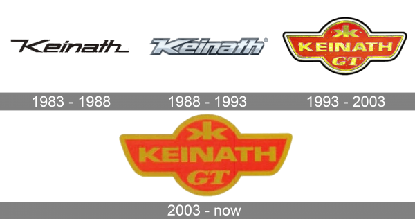
The very first Keinath badge was introduced in 1983 and stayed with the company for the first five years of its history. It was a sharp title case lettering in a custom square typeface, with the letters slanted to the right and the tails of the “K” and the “H” elongated and stretched to the left and the right respectively. The logotype was set in black and looked very strong and progressive.
1988 – 1993

The redesign of 1988 has introduced a three-dimensional version of the Keinath logo. With the typeface slightly refined, the bars emboldened, and the color palette switched to silver. The tail of the “K”, coming out of the top point of its vertical bar was still extended to the left but got shorter. As for the “H”, it does not feature a regular shape, with the tail completely cut.
1993 – 2003

In 1993 the Keinath logo was completely redrawn, with an adoption of a new, red and gold color palette, and more elements on the badge. Now it was a stylized banner with a rounded central part and two abstract wings spread to the sides. On the solid red background of the badge, the gold uppercase wordmark was set in a strong and distinct sans-serif font. Above the logotype, the “KK” monogram was drawn in gold, with the two letters mirroring each other and placed back-to-back. Under the main wordmark, the smooth and bold italicized “GT” was placed in the same shade of gold, but in a different font. The badge featured a double outline in black and white.
2003 – now

The redesign of 2003 has kept the concept of the previous Keinath badge, but refined its contours and removed the double outline from the badge. The golden frame became a bit thicker, and the KK monogram was enlarged, so now all the characters on the logo feature the same size. The color palette of the badge was also slightly modified, with the red getting lighter, and the gold, on the contrary — darker.
Font
The bold and strong Keinath lettering from the official version of the company’s logo is set in the uppercase of a modern sans-serif typeface with straight bars and cuts of the lines. The closest fonts to the one, used in this insignia, are Benzin extra Bold and Rifton Norm.
Color
As for the color palette of the Keinath logo, it is based on a combination of red and gold, two shades, which always worked well together as a representation of chic, excellence, and sophistication. Red is a very powerful color on its own, but with the addition of gold, it shines even brighter.


